We Dream In Black

Policy reads better when it is designed to be read.

We Dream In Black, a program of the National Domestic Workers Alliance, partnered with the Institute for Policy Studies on a two-volume policy report calling for industry standards in care work. Workhorse set aside the usual policy-paper format and built the report as a magazine. Five themes (Empowerment, Professionalizing, Unapologetically Black, Comfort and Care, Community) ran through the cover, the type, the photography, and the survey spreads in Atlanta and Durham. The same system then carried into a companion website at wedreaminblack.com.

The argument was the form.

We Dream In Black is a program of the National Domestic Workers Alliance. With the Institute for Policy Studies, they had spent months gathering survey data and worker narratives across Atlanta and Durham, and arrived at a 101-respondent dataset on Black domestic workers in the South. The deliverable was a two-volume report titled Pay, Professionalism, & Respect.

The risk in the form was inheritance, because a policy document looks like a policy document and policy documents do not get read. Workhorse came in with one move: the report would be a magazine, with a hardback cover, portraits running to the edge of the page, body type in two columns, and orange boxes holding the lines that mattered.

01Cover
Cover of Pay, Professionalism, & Respect Volume 2 Durham, with two Black women in portrait beneath display-sans title in navy on cream

Navy on cream. Orange on the spine.

The cover does most of the system's work: the title pulled at full weight in the tall narrow sans, a soft cream panel holding the type, and a small italic serif line running underneath it ("Black Domestic Workers Continue the Call for Standards in the Care Industry"). Orange appears on the spine and on the city label and nowhere else. Below the title, a portrait of two workers carries the rest, and the template holds across both volumes with only the city changing on the spine.

02Editorial
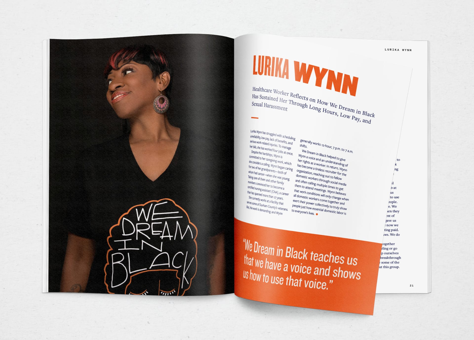
Two-page editorial spread with a portrait of healthcare worker Lurika Wynn on the left and a story headlined LURIKA WYNN in compressed display type on the right, with an orange callout quote panel

Five themes, one spread template.

The creative brief came down to five words: Empowerment, Professionalizing, Unapologetically Black, Comfort and Care, Community. Every profile runs the same template against those themes, with a portrait of the named worker filling the left page, a deck at the top of the right, two columns of body type below it, and an orange box holding the line of testimony that page turns on.

Lurika Wynn is the spread that anchored the brief. Healthcare worker, certified nursing assistant of twenty-seven years, photographed in a We Dream In Black tee against a soft black surround. The line pulled out at the bottom right reads, "We Dream In Black teaches us that we have a voice and shows us how to use that voice." Being seen at that level is the case the report is making.

03Data
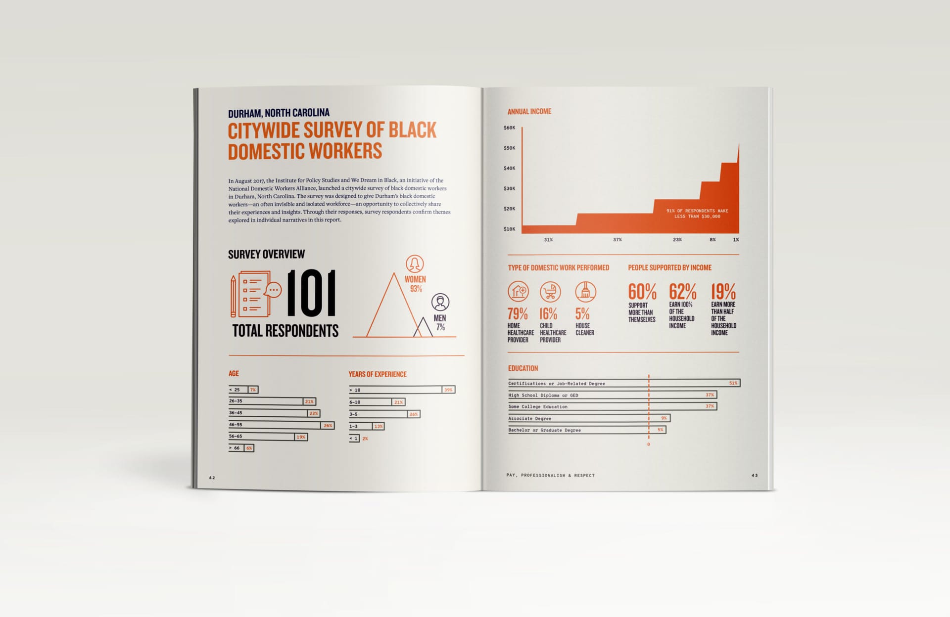
Editorial spread titled CITYWIDE SURVEY OF BLACK DOMESTIC WORKERS, with a 101-respondent summary, annual-income chart in orange, demographic bars, and category icons for type of work

A 101-respondent survey, told as one spread.

The Durham citywide survey held the report's numbers: 101 respondents, 93 percent of them women, 91 percent earning under $30,000 a year, and 79 percent working as home healthcare providers. That data would normally end up as an appendix table at the back of the book. Workhorse ran it across two facing pages instead, with flat orange fills against the cream paper, line icons drawn for the survey categories, and monospaced figures set large, so the survey sits beside the worker profiles instead of behind them.

04Site
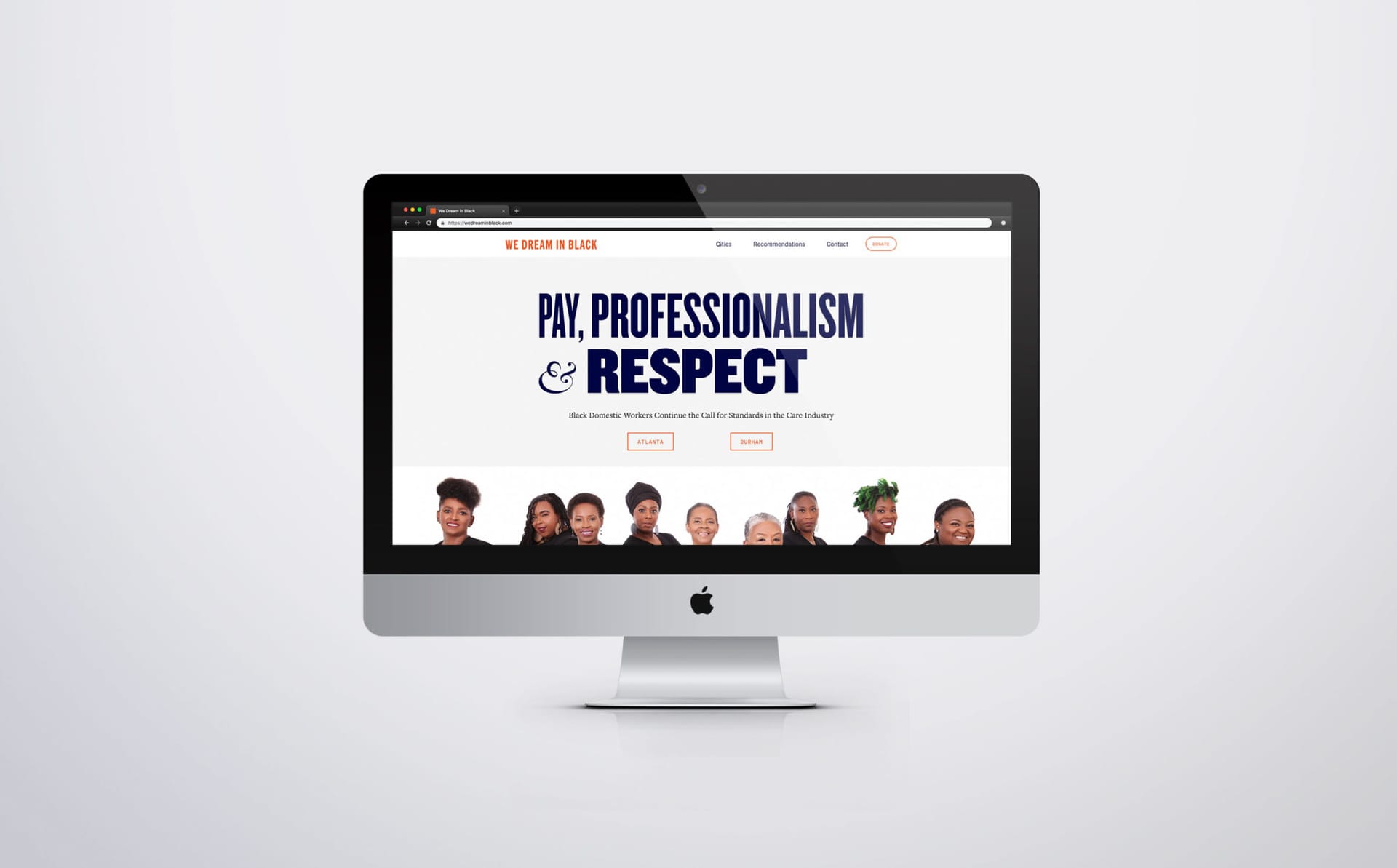
Homepage of wedreaminblack.com on an iMac, with the title PAY, PROFESSIONALISM & RESPECT in navy compressed display, Atlanta and Durham city buttons in orange outline, and a row of cut-out worker portraits below

The same book, on a screen.

The companion site at wedreaminblack.com carries the report onto the screen without giving anything up. The title sets in the same tall narrow sans, the Atlanta and Durham buttons sit directly below it in the same orange outline used inside the book, and a row of worker portraits cut out from their backgrounds holds the homepage together, featuring the same people who appear in the printed pages.

Anyone landing on wedreaminblack.com sees the workers before they see the recommendations, which is the order the report argues for.

What are you working on?

Studio for founders, experts, and the institutions they run.

Living, working brands. Built with your team to keep growing.

© 2026 Workhorse Collective, LLCPrivacyTerms