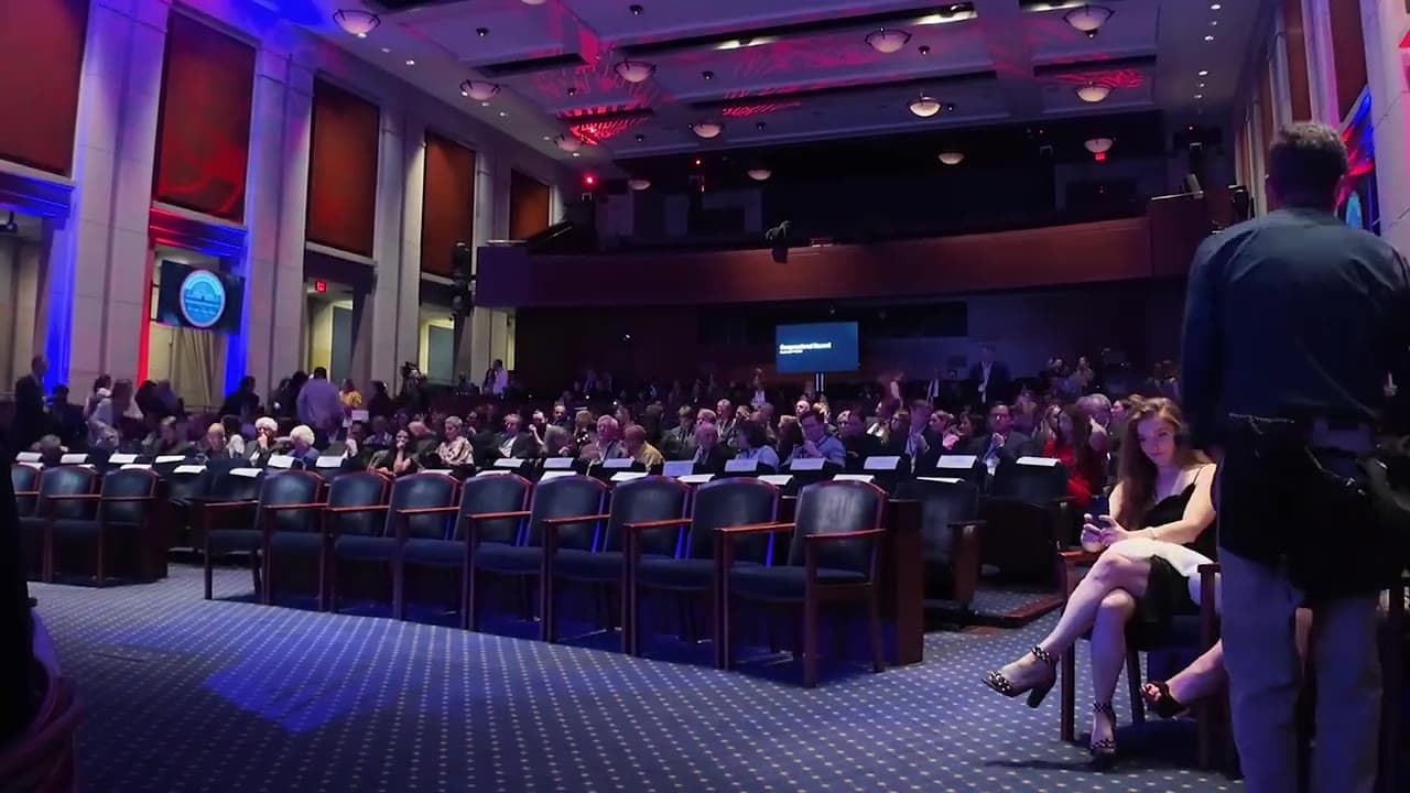
Mobile Future

Untethered Potential.

Mobile Future speaks for wireless carriers, technology companies, and a set of non-profits pressing for investment and innovation in the wireless industry. We were brought in to rebrand the coalition and rebuild everything the public sees: a working session on 1/31/18 to settle the position, a complete identity by spring covering the logo, the typefaces, the colors, the pattern, the stationery, and a report cover, then a WordPress newsroom on the test server in June 2018. It launched, and the communications team ran it for the rest of the year.

The coalition.

Mobile Future is an association of cutting-edge technology and communications companies and a diverse group of non-profit organizations working to support an environment that encourages investment and innovation in the dynamic wireless sector. Their mission is to help inform and educate the public and key decision-makers in business and government on the broad range of wireless innovations that are transforming our society and the nation's economy.
In early 2018 they brought us in to rebrand the coalition and rebuild everything the public sees. The first working session was 1/31/18, the identity was presented by spring, and the WordPress site reached the test server in June, which is where the communications team took it over.

01Kickoff

The card sort.

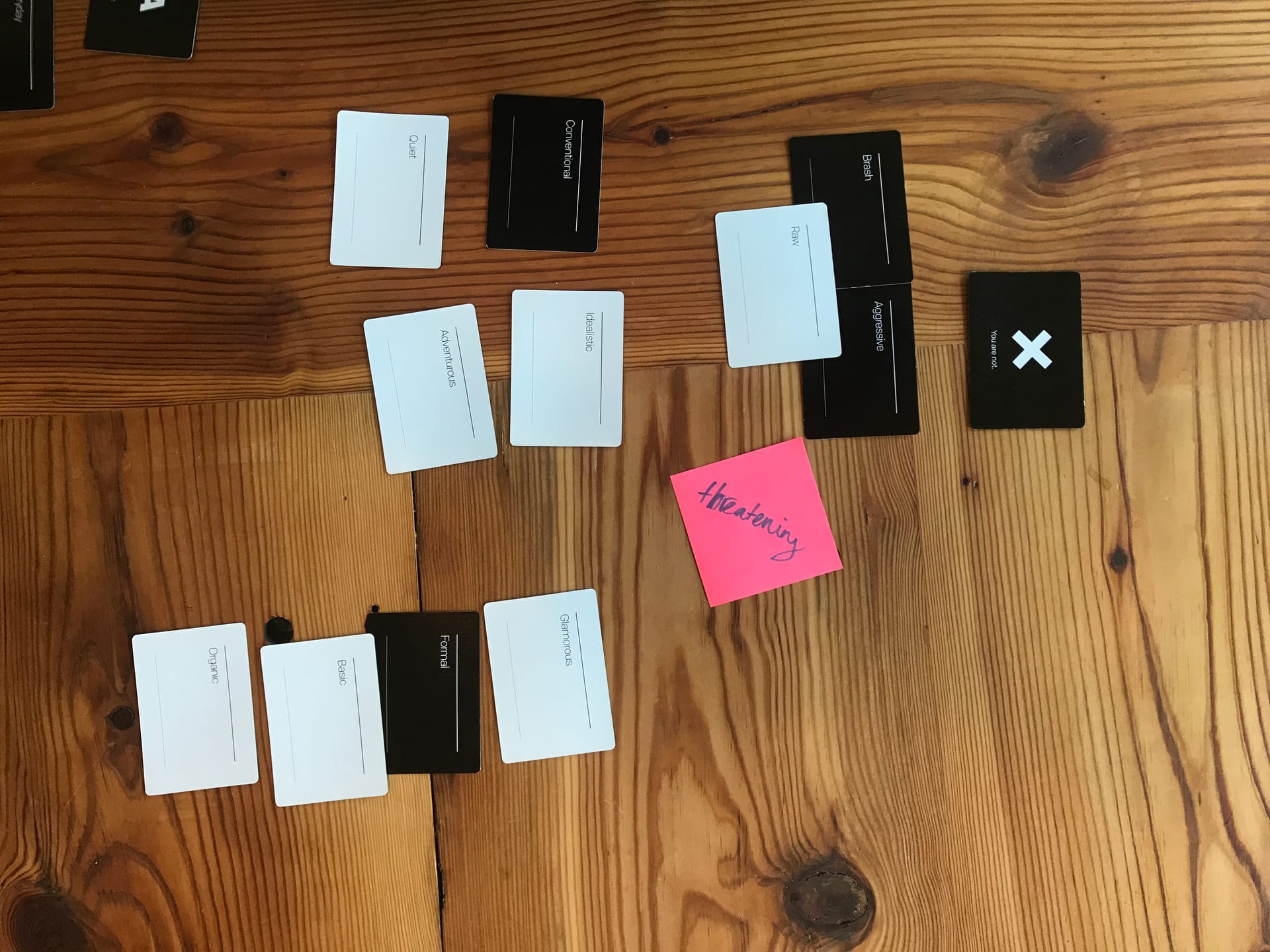
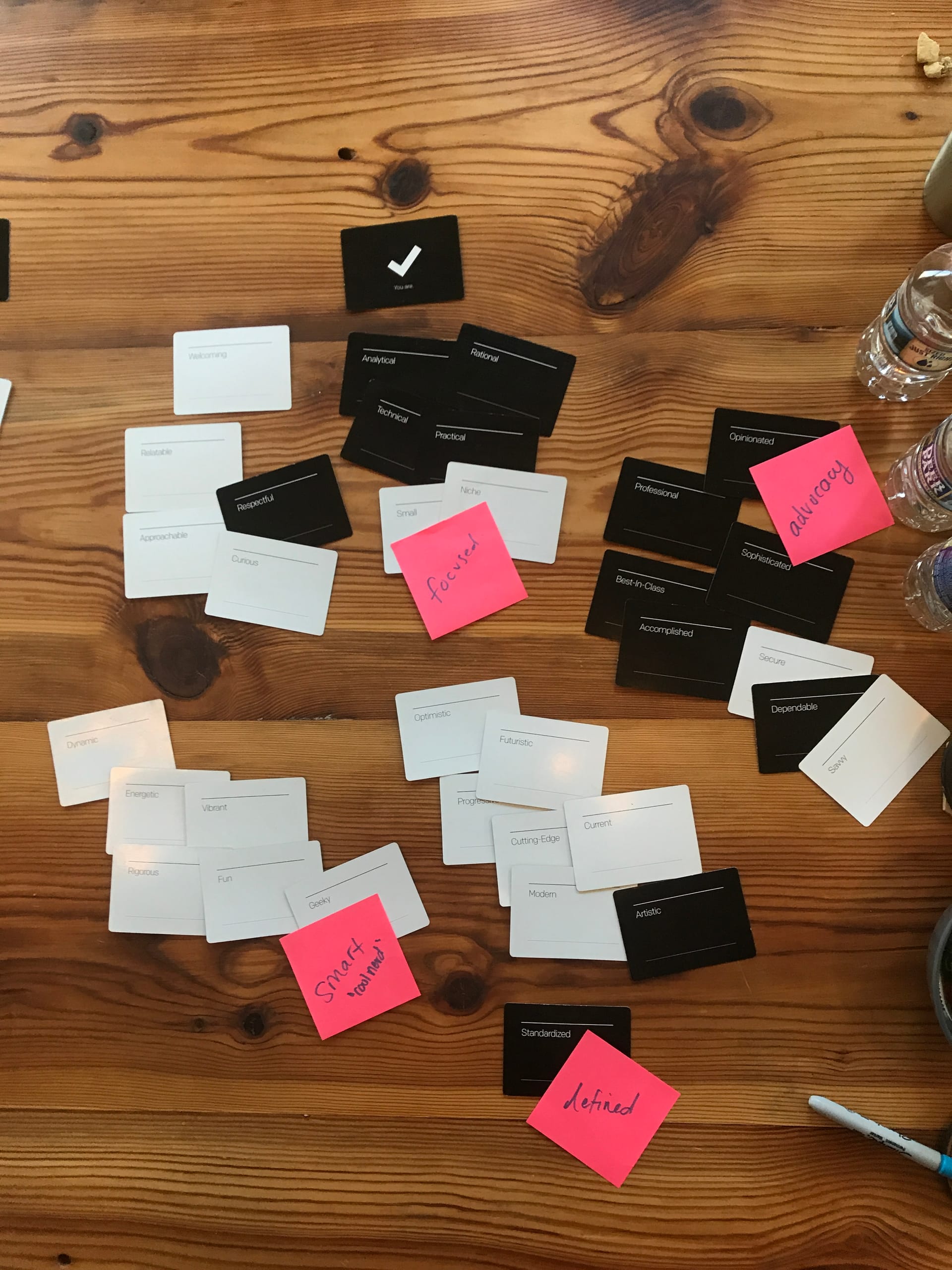
The 1/31/18 session ran on a deck of brand-attribute cards, dealt onto a "you are" pile and a "you are not" pile and then grouped on sticky notes. The reject pile got long fast: Brash, Aggressive, Raw, Conventional, Quiet, Formal, Theatrical, Standardized, Professional, Best-in-class, which between them cover every word that sounds like an old-line lobbying shop or a generic trade group.

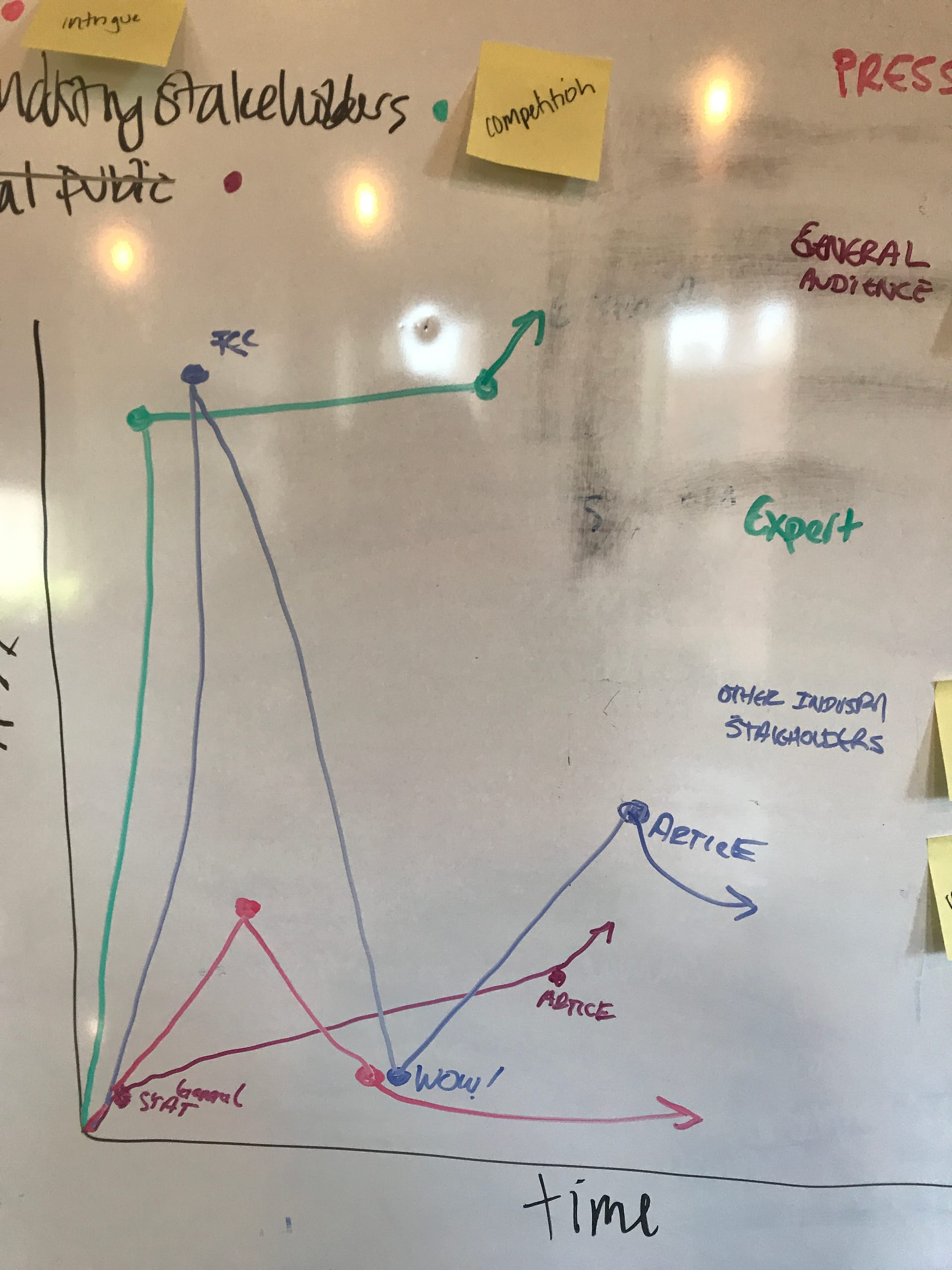
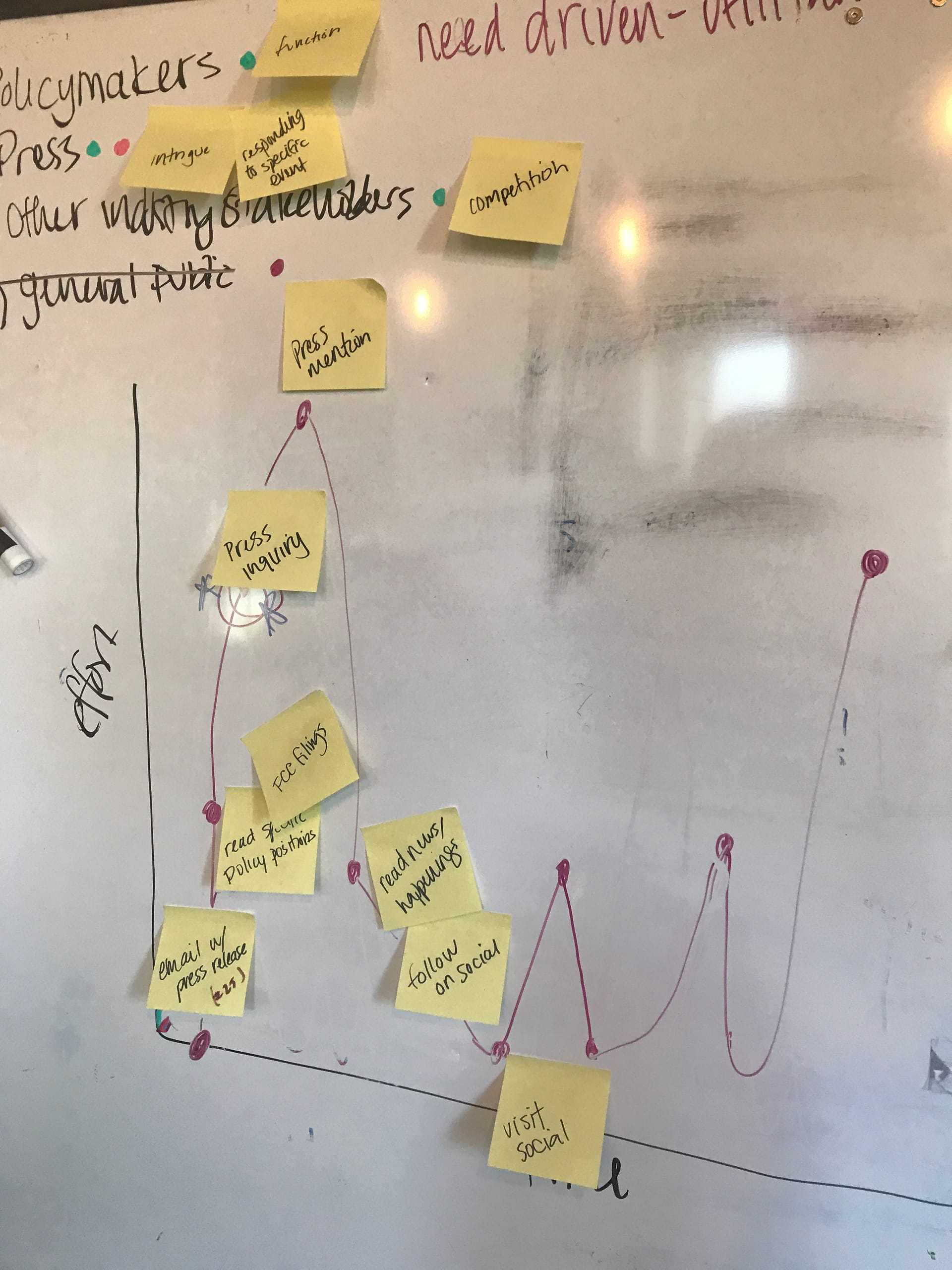
What survived grouped into five ideas the rest of the work had to pay off: Advocacy, Focused, Defined, Smart, Refined. They were the filter every design went through, and they were said out loud in review. Does this read Refined? Is that label Defined enough? Which of the six beats does it belong to? The same session produced the audience map, four groups (policymakers, press, other industry stakeholders, general public) followed from press release to FCC filing to article to a share on social.

Card sort · themed keepers
Card sort · "You are not Theatrical"
Audience axes · time × effort
Journey · press release to social
02Brand

MobileFuture™, as a system.

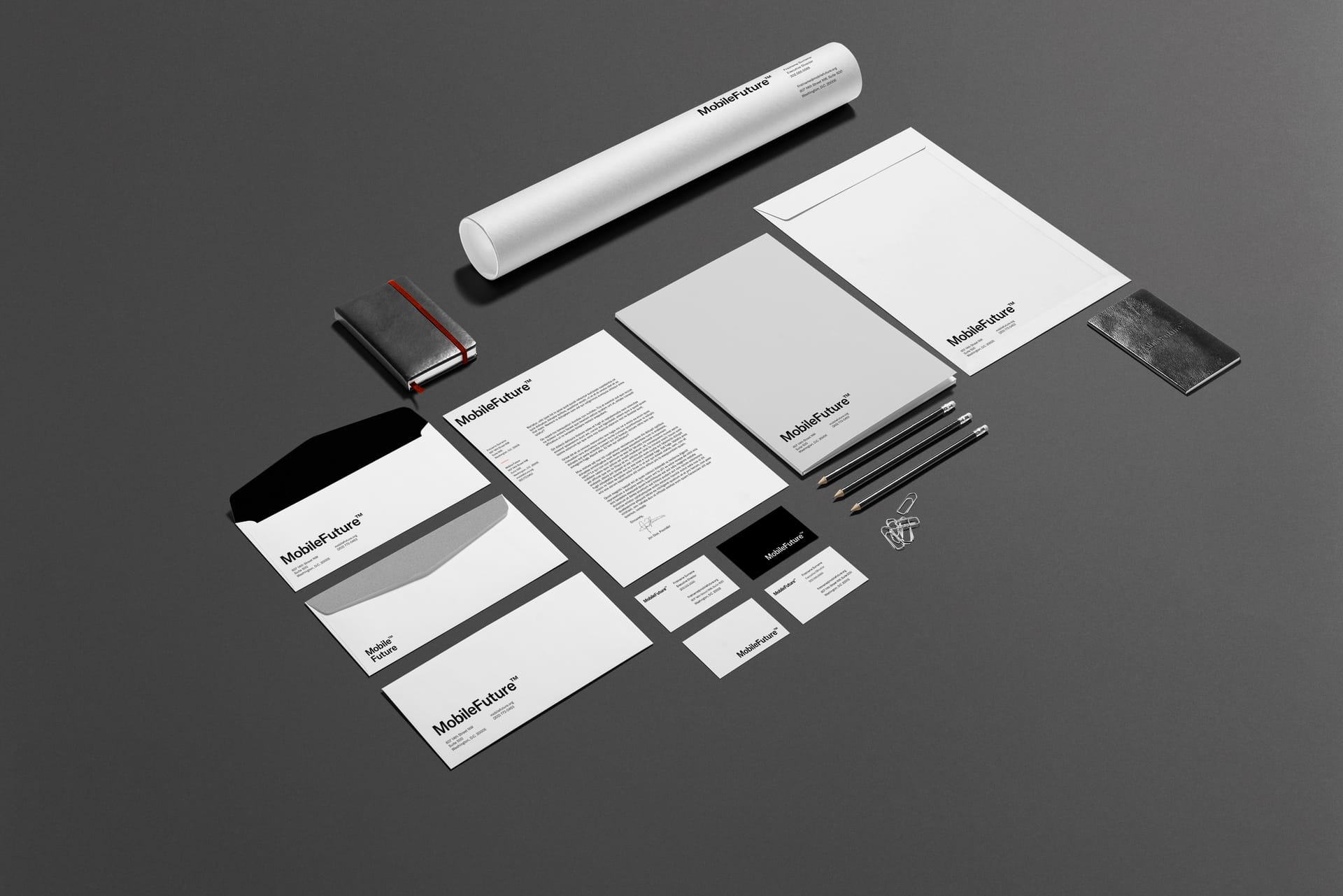
The presentation came back in five chapters, covering the logo and its variants, the typefaces, the color and pattern, the stationery and the report, and the photo treatments. The logo is the name set in GT America with a raised registered-trademark mark, approved in four color pairings (white on black, black on white, white on Signal Orange, white on Field Navy) plus a stacked Mobile™ over Future version for narrow spaces.

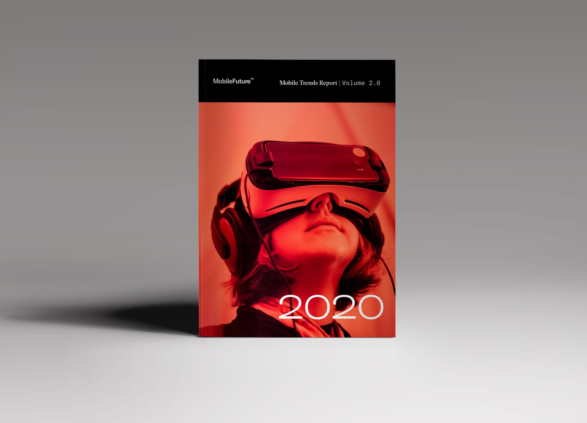
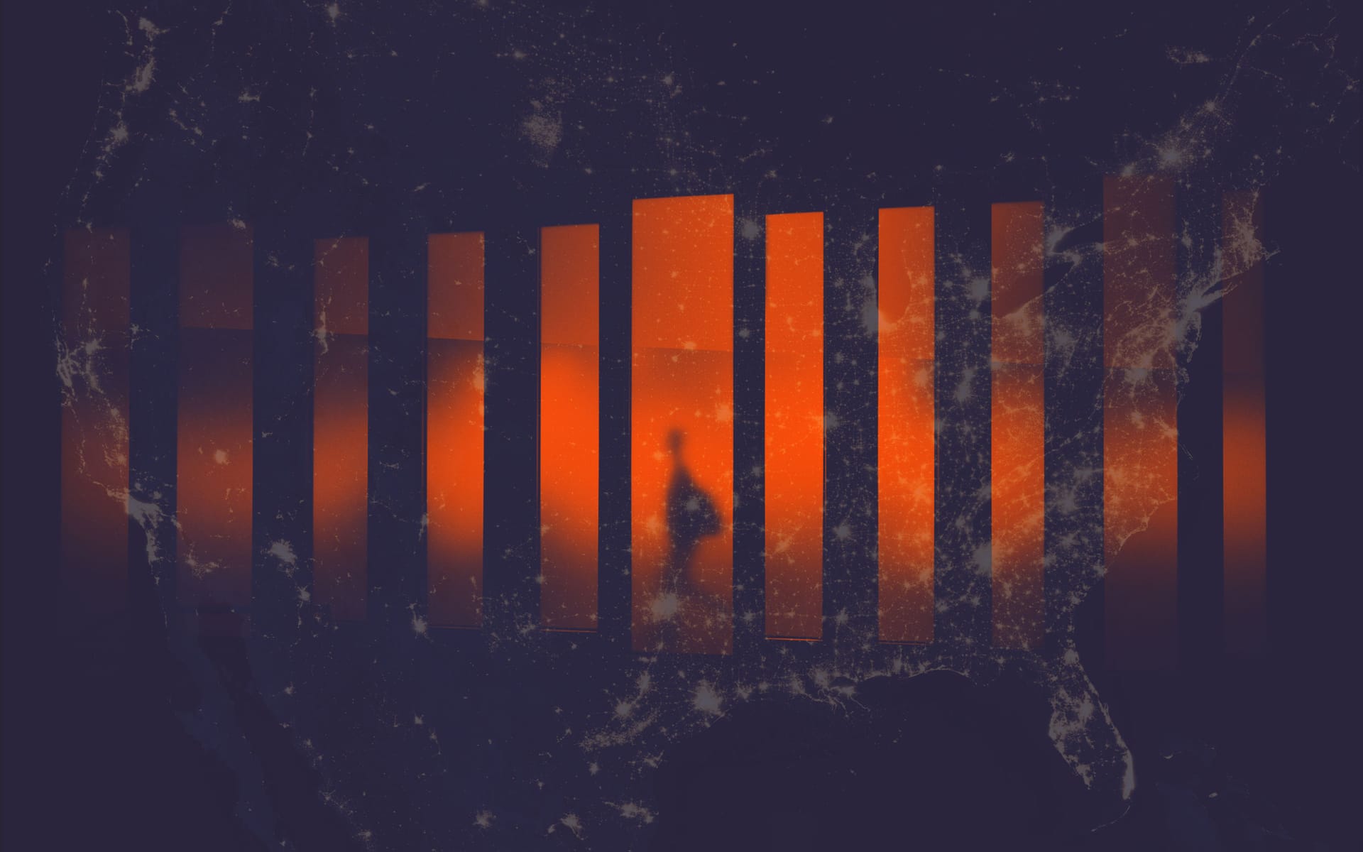
Three faces from Grilli Type carry the whole thing. GT America handles menus, body copy, and the logo. GT Sectra is the serif, saved for the largest lines and the "2020" on the Trends Report cover. GT Pressura Mono sets the numbers. Behind all of it runs a triangular network pattern, large on the printed presentation and quiet in the background online, and the line that came out of the kickoff: "Untethered Potential. Shaping the Connectivity of Tomorrow."

Stationery suite
Mobile Trends Report Vol 2.0
03IA

The newsroom, first.

Most trade-association sites bury the newsroom four clicks deep behind an About page. Mobile Future publishes constantly, and every one of the four audiences from the kickoff arrives looking for a story, so Newsroom took the top spot with three categories underneath it, Statements and Releases, Articles, and Filings, which are exactly the three things the team writes.

Issues holds the six policy beats every story files under: 5G, Infrastructure, Spectrum, Open Internet, Economic Impact, Resources. About moved behind them with the coalition pitch and the press contact, and search covers everything. There is no home page in the old sense, because the home page is the Newsroom.

Site structure · 2018 sitemap

Newsroom first.

The six Issues beats organize the whole site. Every Statement, Filing, and Article files under one of them.

Wireframe · IA
MobileFuture™mobilefuture.org
Newsroom
  • Statements + Releases
  • Articles
  • Filings
Issues
  • 5G
  • Infrastructure
  • Spectrum
  • Open Internet
  • Economic Impact
  • Resources
About Us
  • Press Resources
  • Contact
Search
Stay Connected@mobilefuture
100%
04Build

The site that shipped.

The build ran on WordPress at WP Engine, with mobilestaging.wpengine.com as the address for review. Two formal rounds in June 2018, on the 12th and the 15th, walked every page type against real published work: FCC Reauthorization, the Ray Baum Act, the Senate Omnibus package, the House AIRWAVES Act, an RCR Wireless op-ed, and a Net Neutrality Day of Action page the team was preparing for July 12 2018. After that it was theirs.

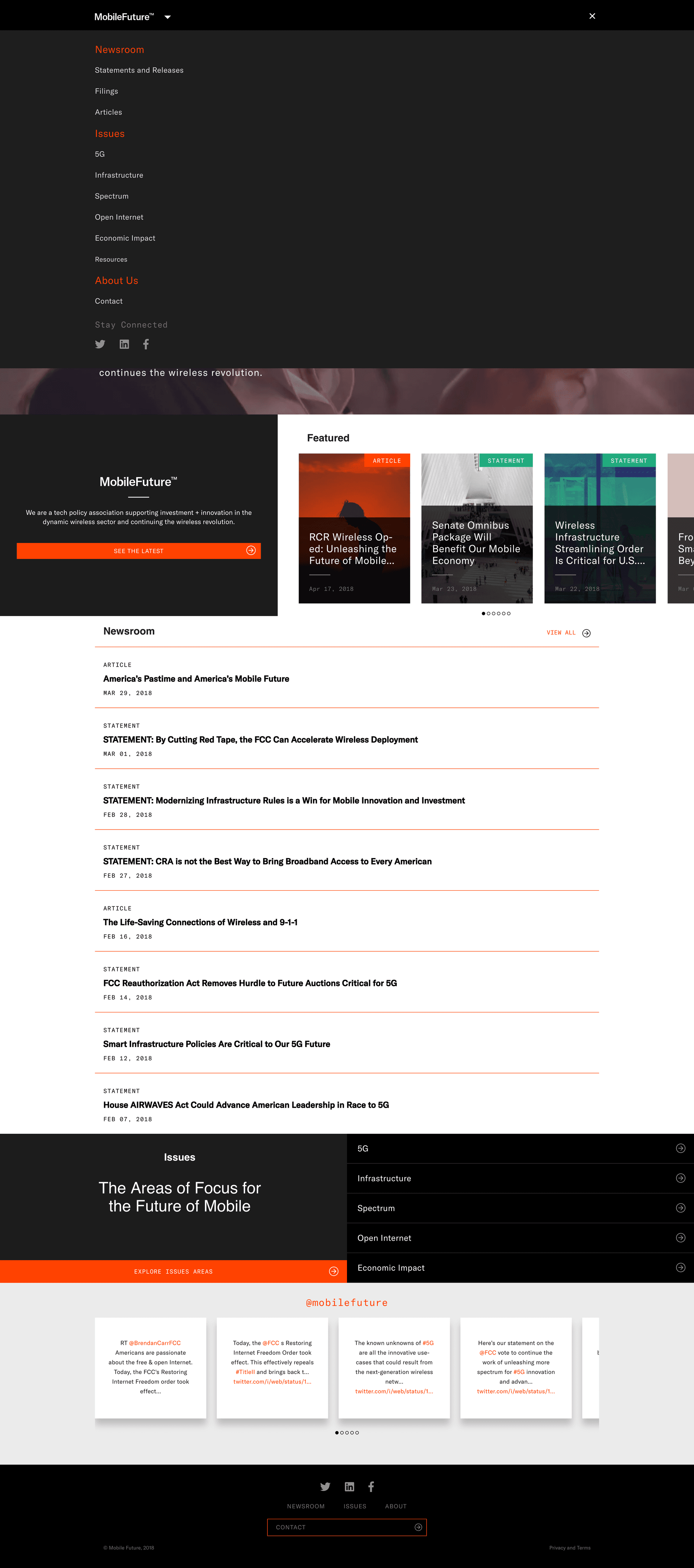
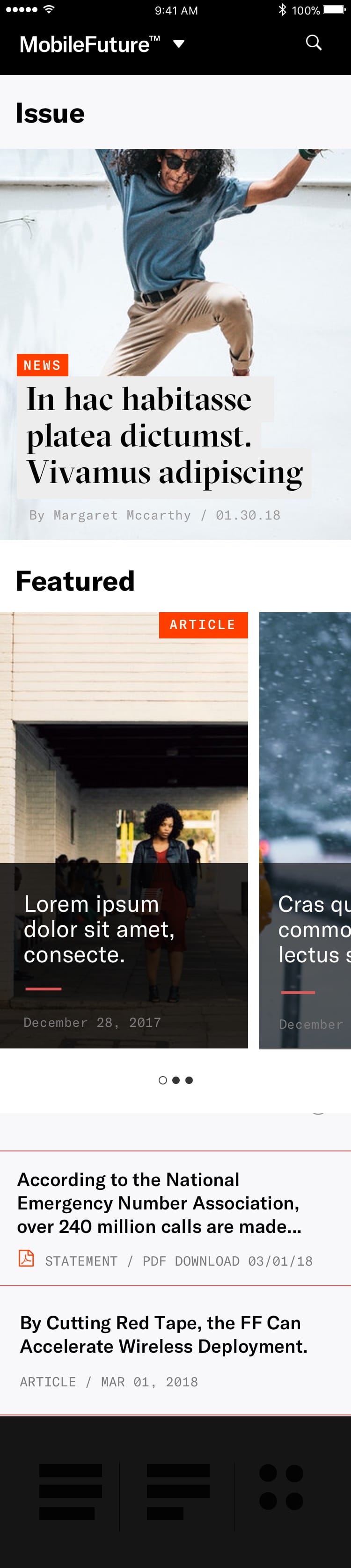
The home page opens on a black MobileFuture™ card with the coalition pitch printed word for word and an orange "See the Latest" button, then rotates through three featured stories labeled ARTICLE, STATEMENT, or FILING. Keep scrolling and you get the newest posts with their labels and dates, the six Issues on a dark background, a #mobilefuture Twitter column, and the footer. It was designed for phones first, and on a phone it collapses to one column with every label intact.

Live · home (6/12/18)
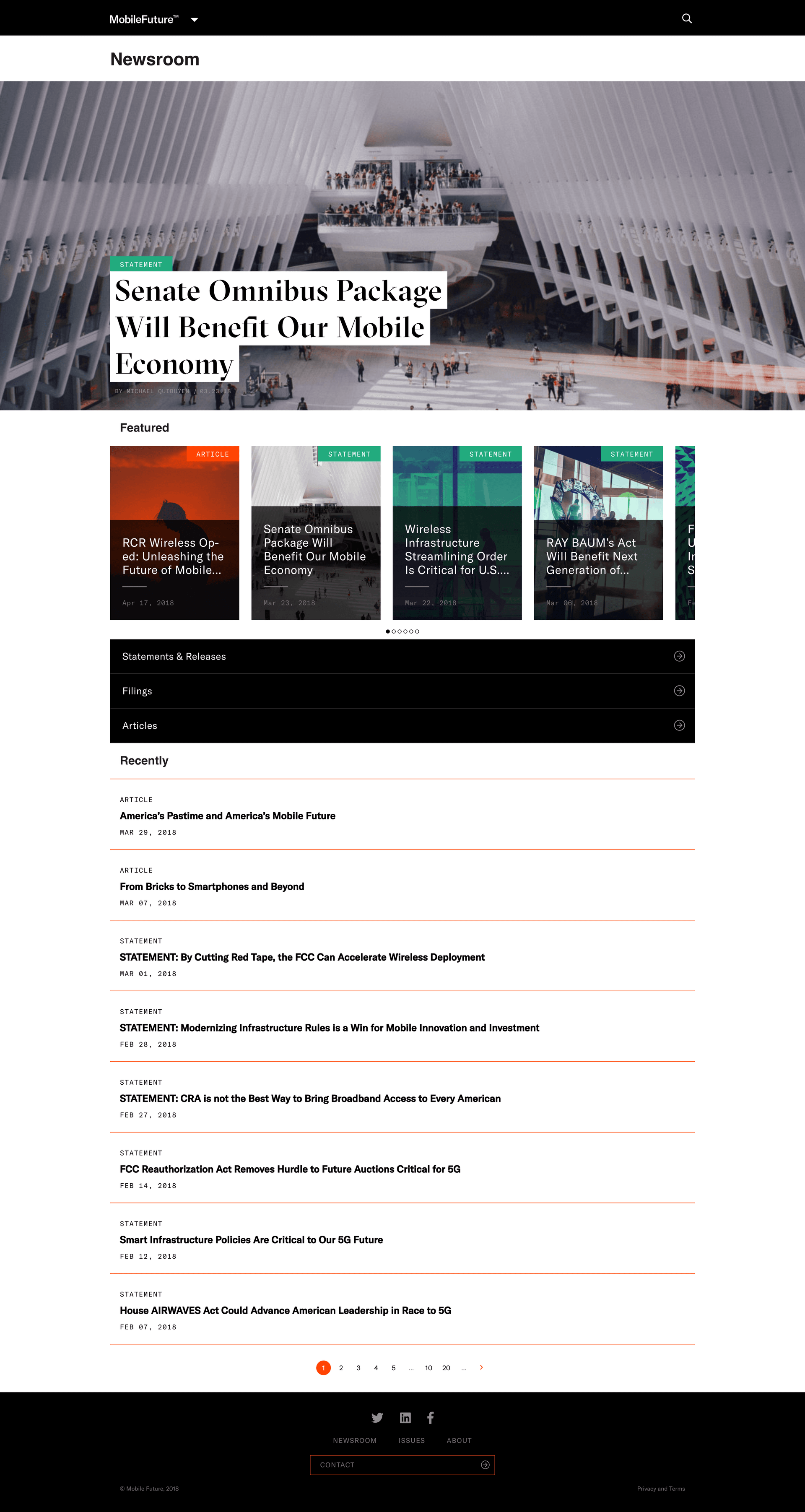
Live · newsroom
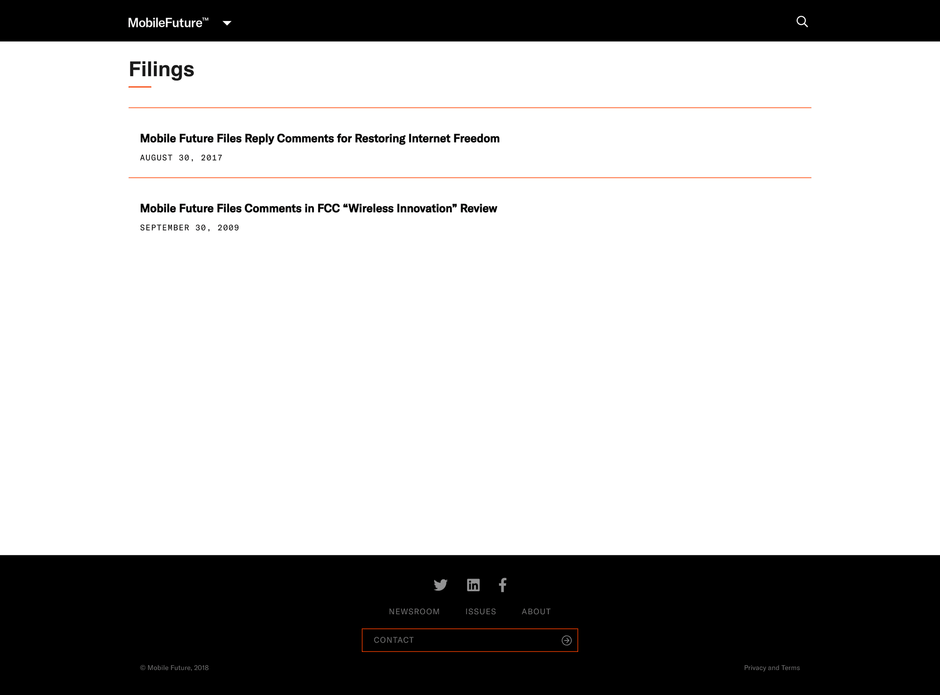
Live · filings index
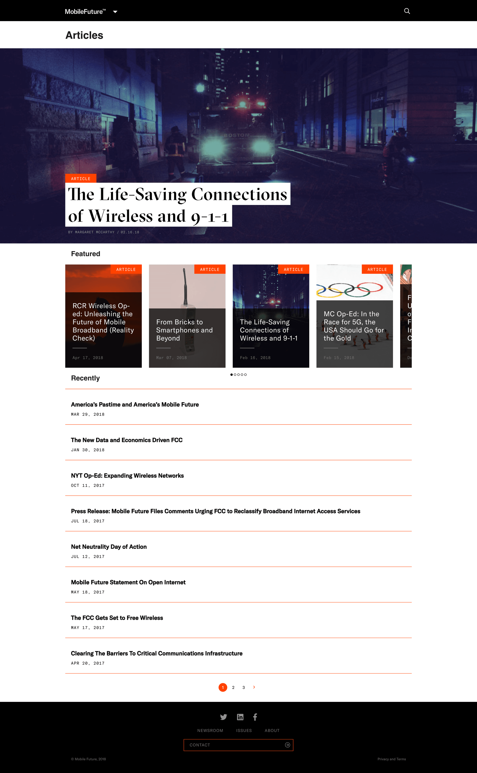
Live · articles index
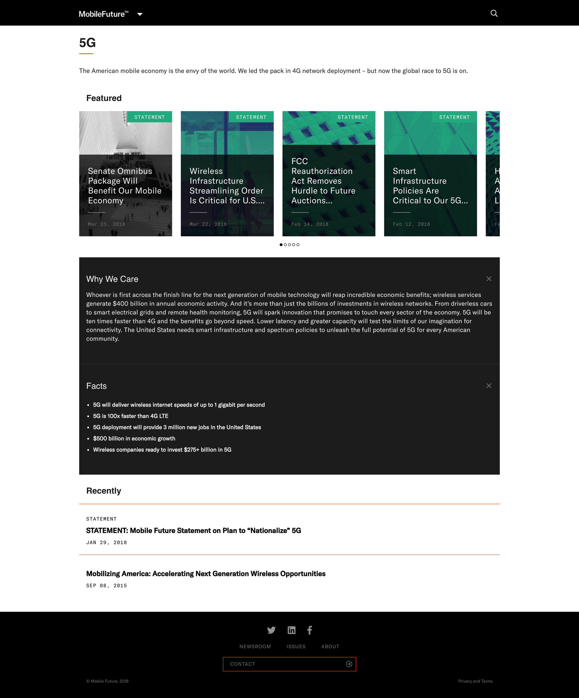
Live · 5G beat
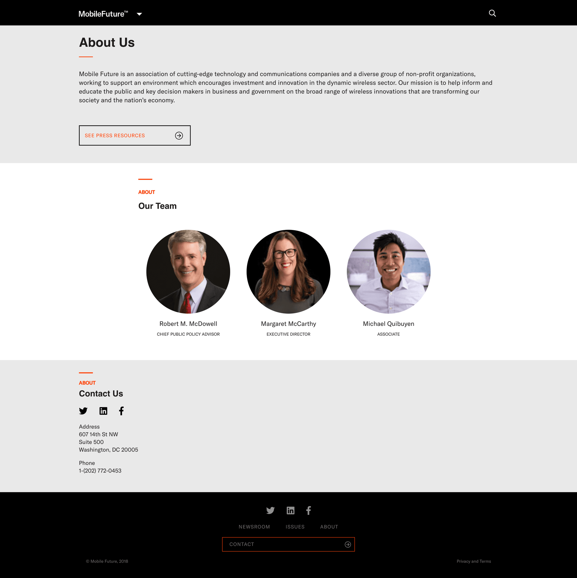
Live · about
05Photography

The story images.

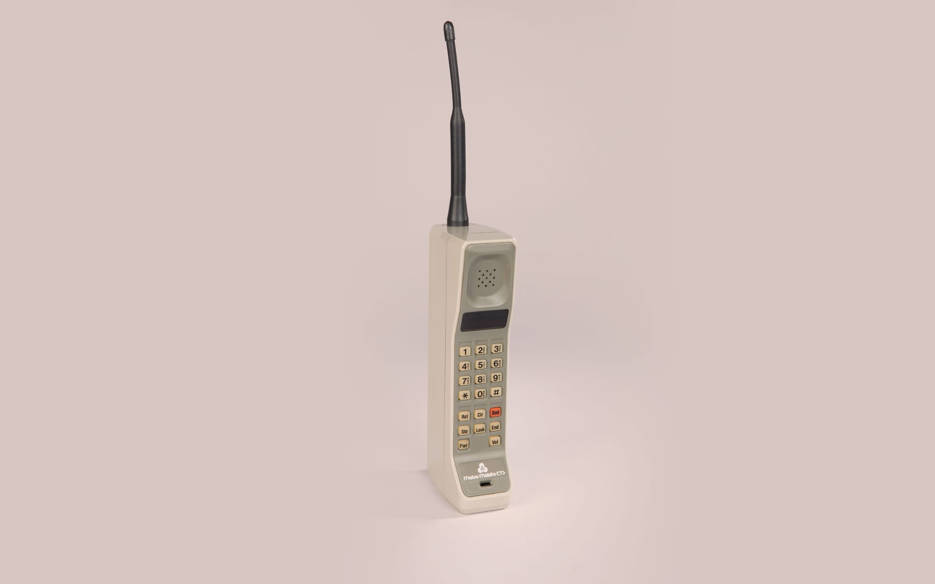
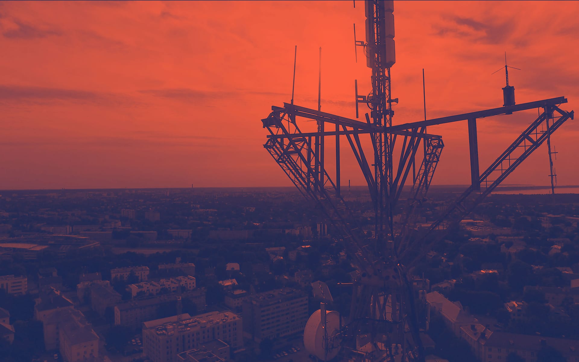
The story images are what let a two-person team publish daily. Eighteen shipped at launch, one for each story that comes back every year: the mobile economy, the brick phone as history, going green with wireless, lifesaving 9-1-1 connections, infrastructure streamlining, modernizing infrastructure rules, the FCC freeing wireless, the Ray Baum Act, clearing the barriers, small business, the FCC’s new data. Each one exists in three brand-color washes (Signal Orange, Wireless Teal, Field Navy), so the same picture can serve a filing and a feature without commissioning new art.

Three plain textures per color cover everything with no photographic subject, like a procedural statement or a docket update. The communications team picks one from a drop-down and WordPress does the rest.

Mobile economy (teal)
Mobile economy (orange)
Brick phone
Going green
Lifesaving 9-1-1
Infrastructure streamlining
Modernizing rules
FCC frees wireless
Ray Baum Act
Clearing barriers
Small business
New data, FCC
Texture · 01 teal
Texture · 02 orange
Texture · 03 blue
06Comps
The comps.

Design · Newsroom hub (desktop)

The comps.

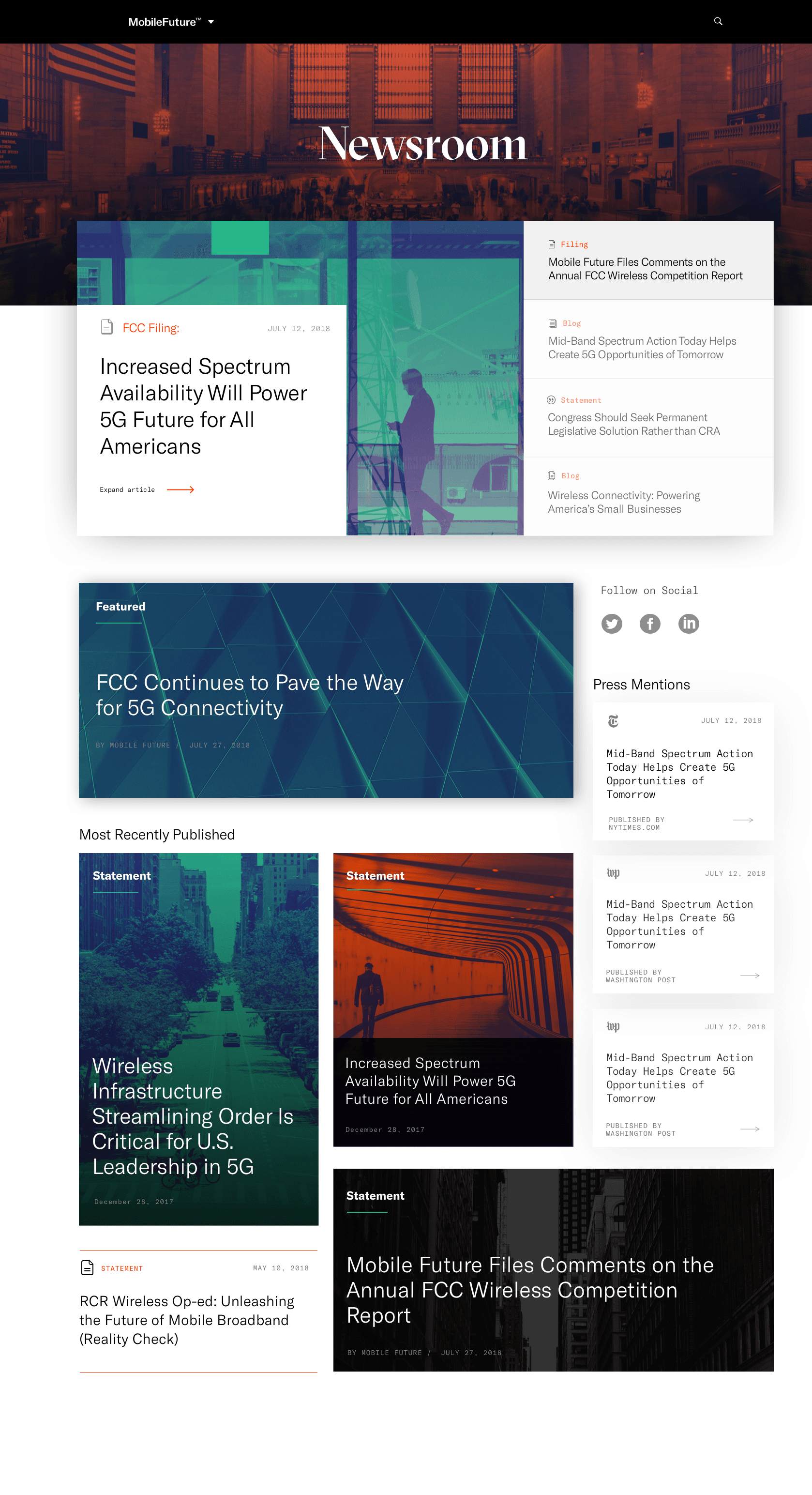
The finished design for the Newsroom hub: one featured story in a large two-tone frame, a column of the four most recent posts beside it with their labels, and a press-mentions strip below carrying the New York Times and Washington Post logos.

This design settled every label, every small heading, and every spacing rule. The site that shipped in chapter 04 keeps all of it and replaces the side column with rotating featured stories on a phone, which is how most of the traffic actually arrives.

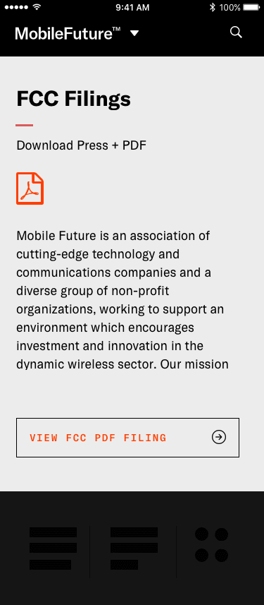
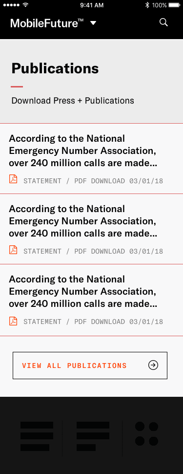
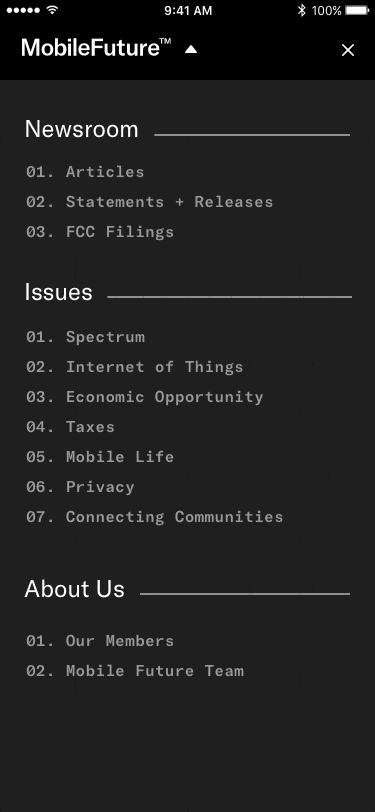
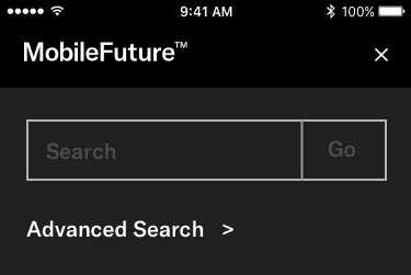
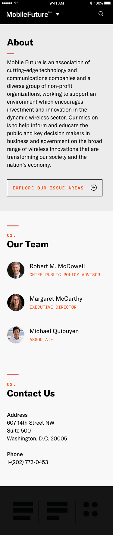
The rest of the set covers the FCC Filings list, the Issues list and each Issue page, a news story, publications, a blog post, a statement, search results, About and Contact, and the phone menu.

FCC Filings · index
News · story
Issues · index
Issue · detail
Publications · index
Blog · single
Statement · single
Nav · menu
Search · results
About · contact
07Motion

The motion prototype.

A working model built in Principle settled how the page loads and how the featured stories turn over, all before the WordPress build began: the side column arrives, the featured story opens, the stories advance on their own. Two versions survive, a 0:12 first pass and a 0:18 third pass carrying the timings the developers built against.

08Rebuild

Design against shipped.

Two pieces of the 2018 work rebuilt here in HTML and CSS, so you can move around in them instead of squinting at a screenshot. The first is the original Newsroom design, the one that won the project. The second is the WordPress site as it reached the test server on 6/12/18. Both are faithful except for the typefaces: Inter stands in for GT America and Cormorant Garamond for GT Sectra, because we do not hold Grilli Type licenses in this repository.

./Design · 2018 vision

The top of the Newsroom, as designed.

Open the comp

A dark header, the word Newsroom in italic GT Sectra, a two-tone featured story with four recent posts beside it, the dark Featured card, the Press Mentions list, and the Recently Published grid. This is the design that pitched the project.

mobilefuture.org/newsroom
Token scopebrand:mobile-future
Desktop · 1280w
./Shipped · 6/12/18 staging

The WordPress site the team actually ran.

Open the live build

The 6/12/18 review capture rebuilt at phone width: the black MobileFuture™ card with the coalition pitch word for word and the orange "See the Latest" button, three featured stories rotating, the Newsroom feed with its labels, the dark Issues block, and the #mobilefuture Twitter column. A different shape from the design, and the same brand.

mobilestaging.wpengine.com
Token scopebrand:mobile-future
Mobile · 420w
09Shipped

What shipped.

Five months from the first session to a live WordPress site the communications team owned outright. Along the way: the card sort that named the work, the registered MobileFuture™ logo in four color pairings plus a stacked version, three Grilli Type faces, the triangular network graphic, five stationery pieces and the Mobile Trends Report 2.0 cover, a site organized around six policy beats with the newsroom in front, ten page designs, eighteen story images in three color washes each, and an animated model that set the timings. The June 2018 captures show all of it running on real published work.

What are you working on?

Studio for founders, experts, and the institutions they run.

Living, working brands. Built with your team to keep growing.

© 2026 Workhorse Collective, LLCPrivacyTerms