MLK Memorial Library
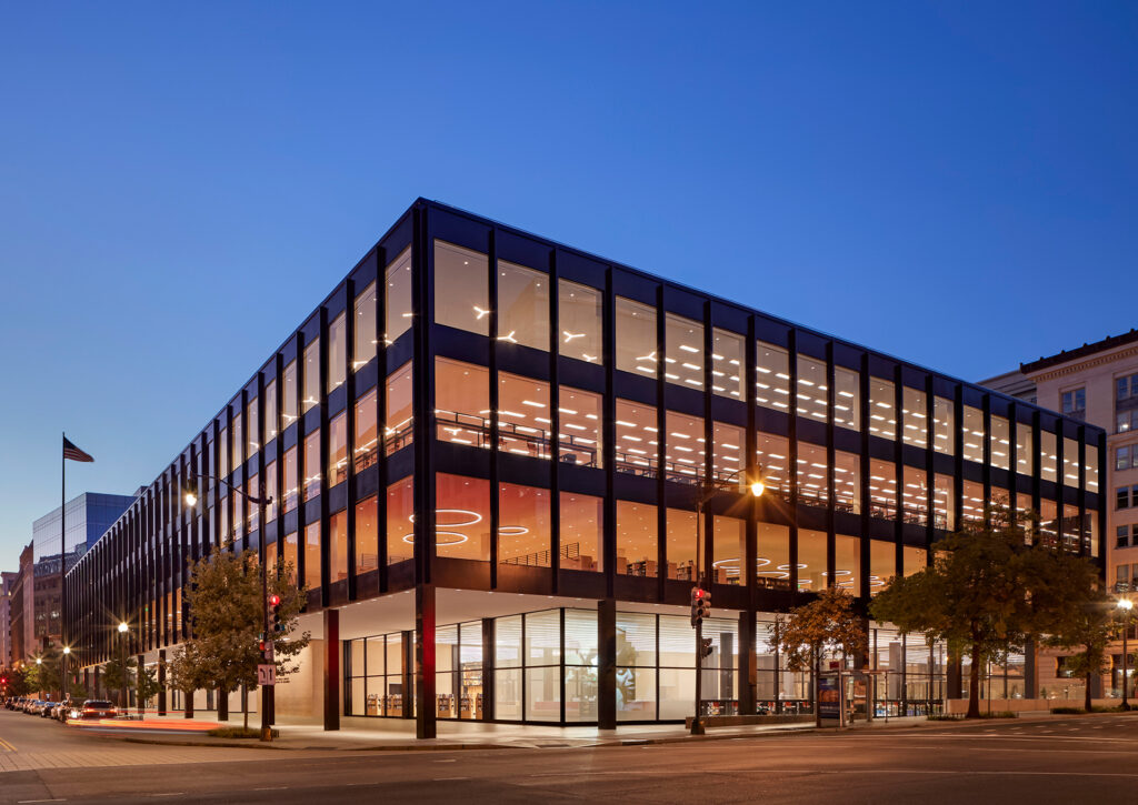
DC Public Library
A renovation and a revolution.
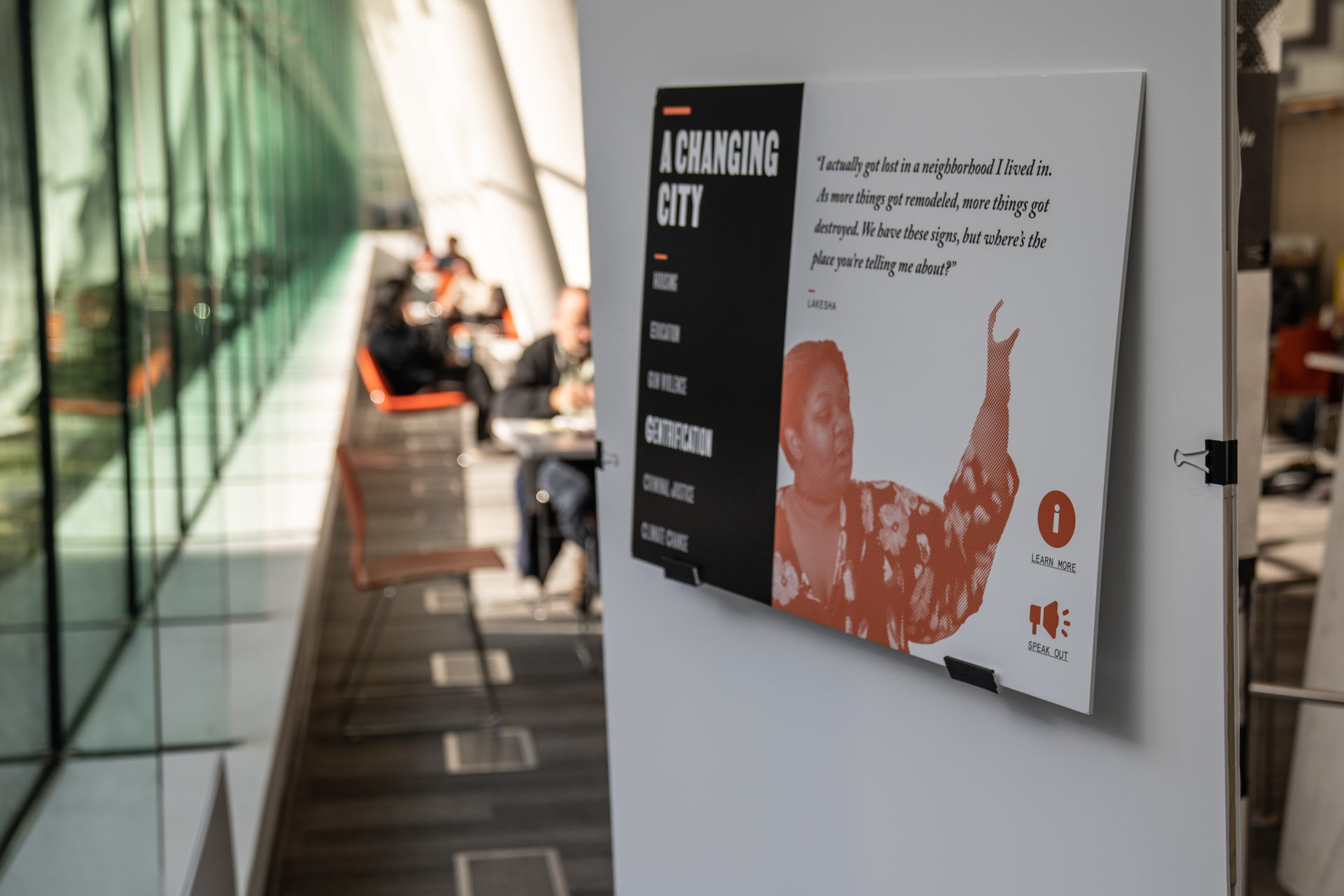
The exhibition connects Dr. King’s local activism with the broader activist landscape integral to the city’s deep history of revolution, culture, and change.
In early 2019, Workhorse began designing the permanent exhibition for the Martin Luther King Jr. Memorial Library, Washington D.C.’s central library.
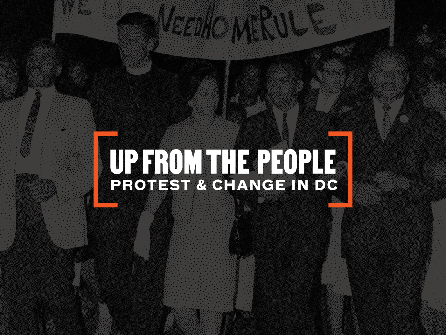
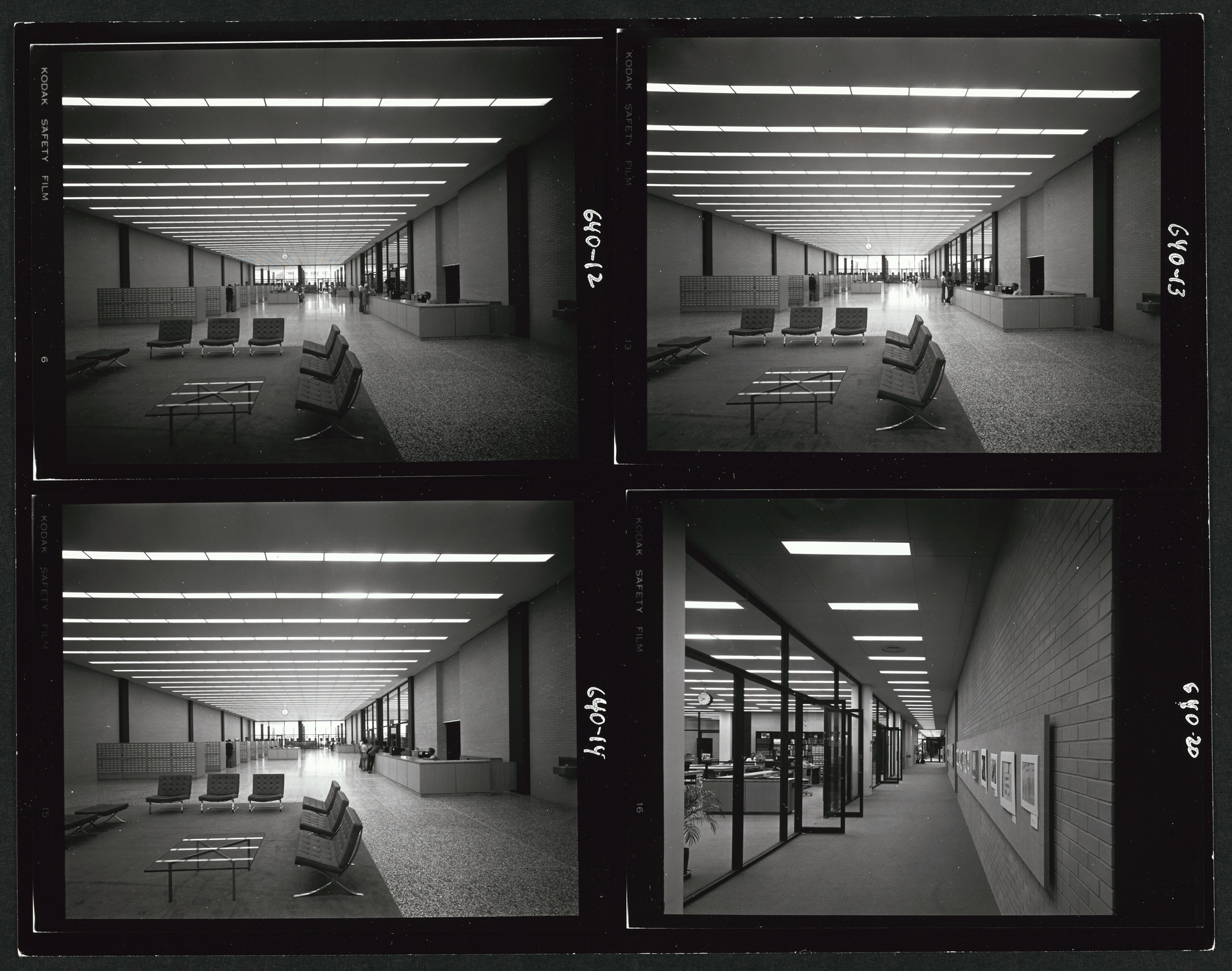
The permanent exhibition Up from the People: Protest and Change in DC is part of a decades-long renovation completed in 2020 by Mecanoo and OTJ Architects.
Archival images courtesy the DC Public Library Archives.
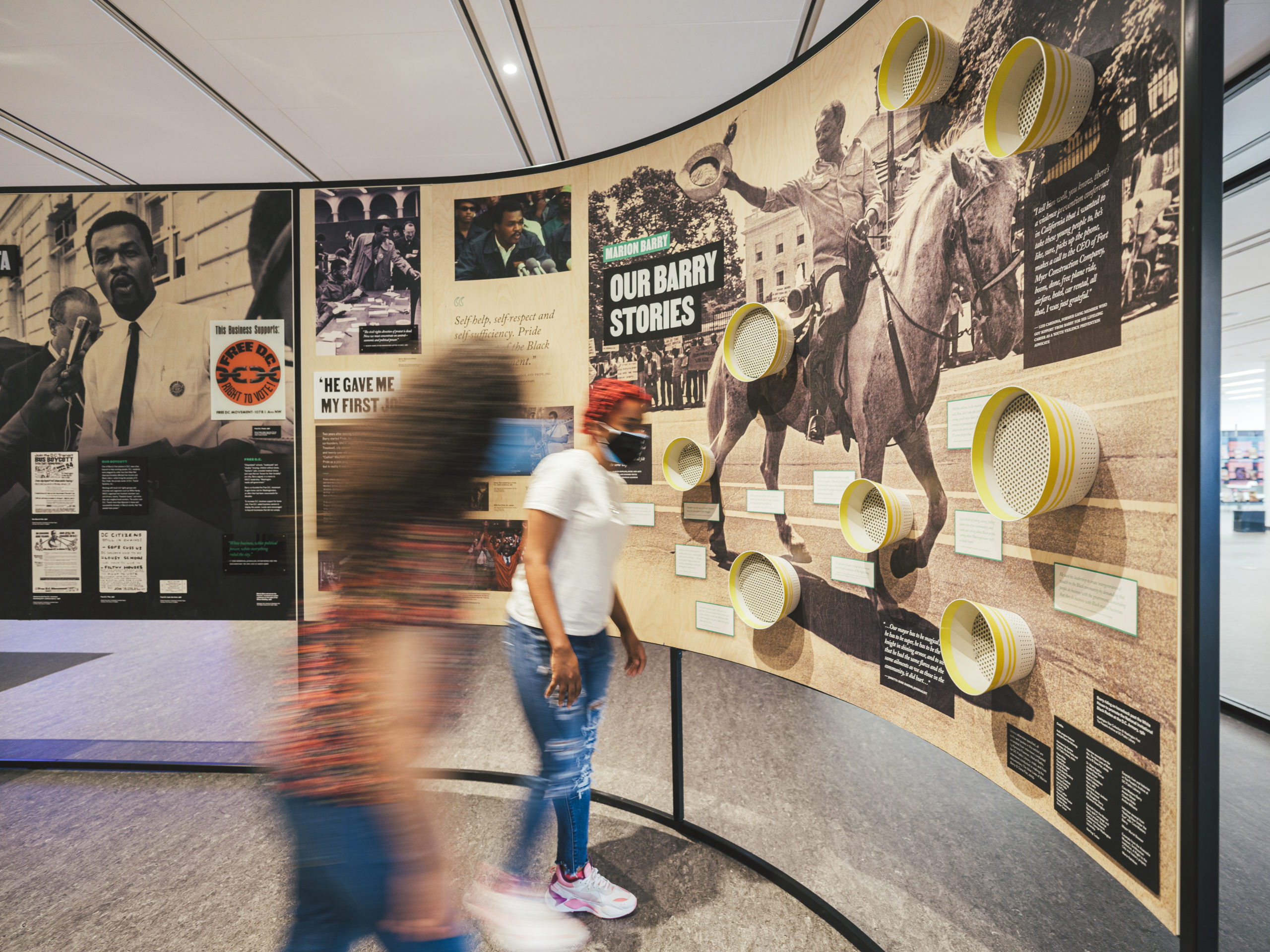
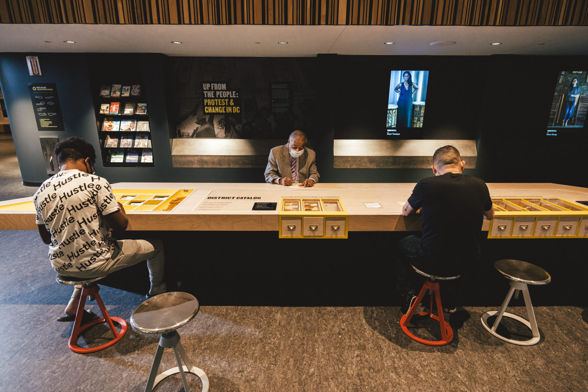
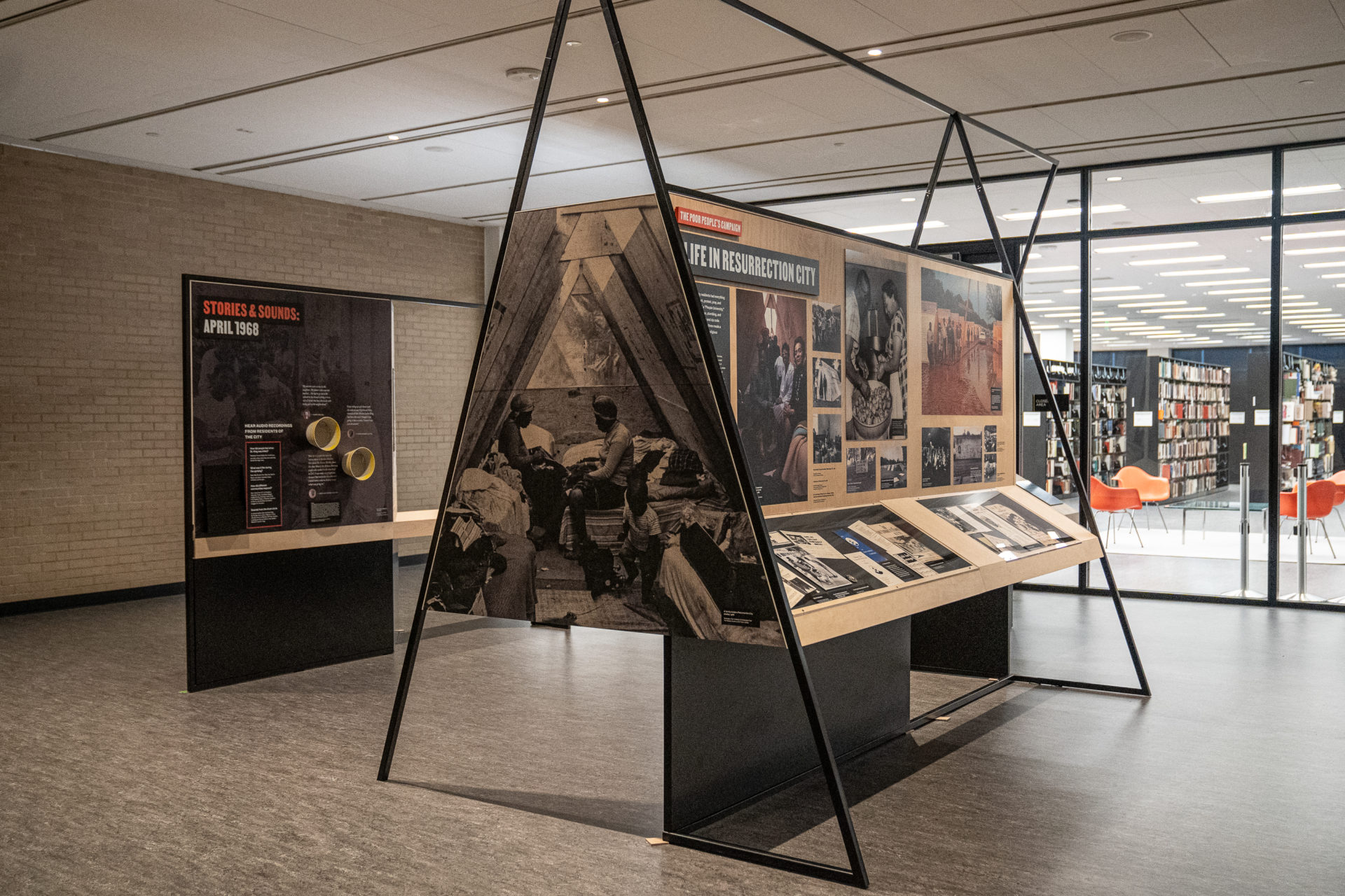
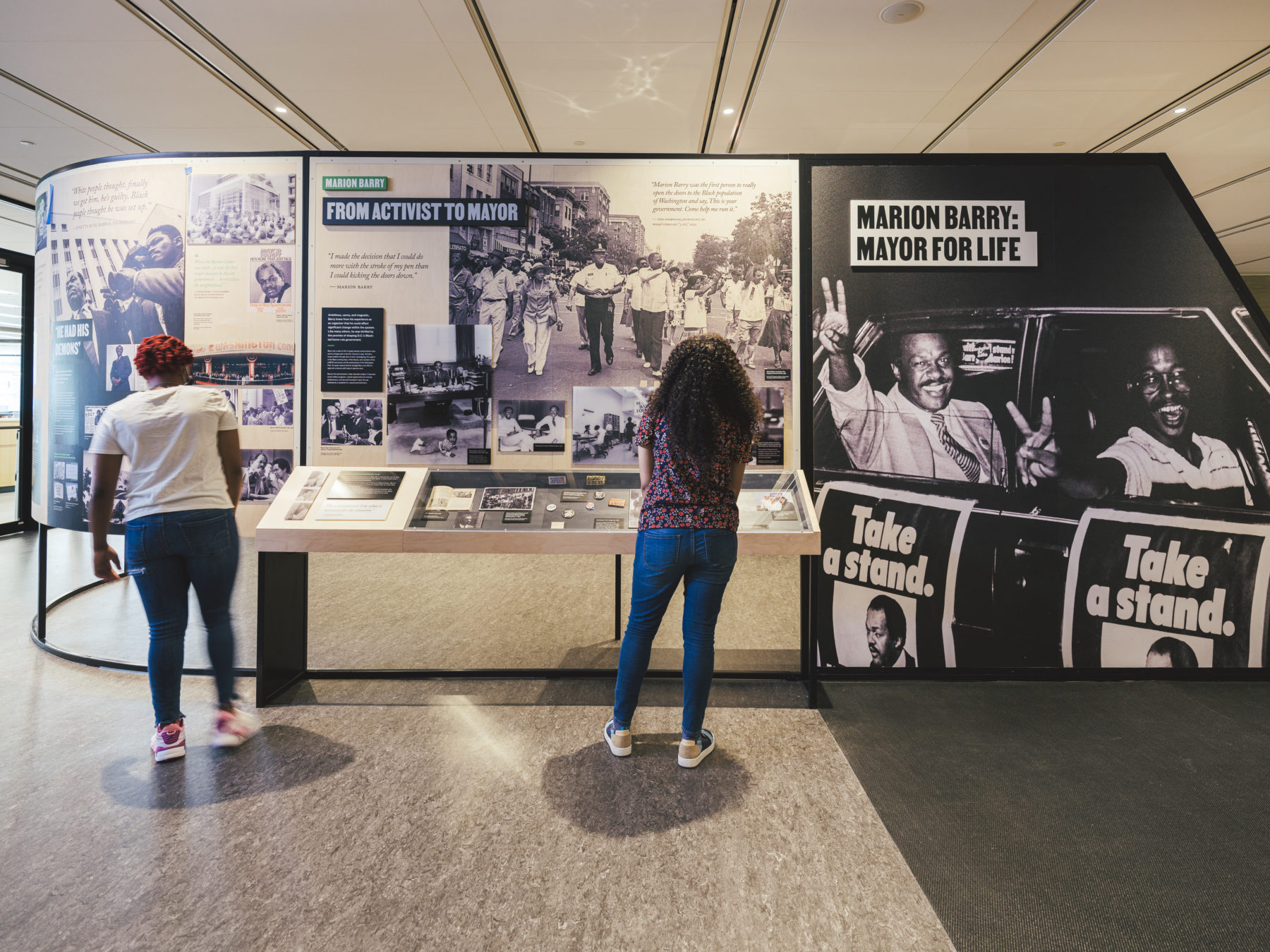
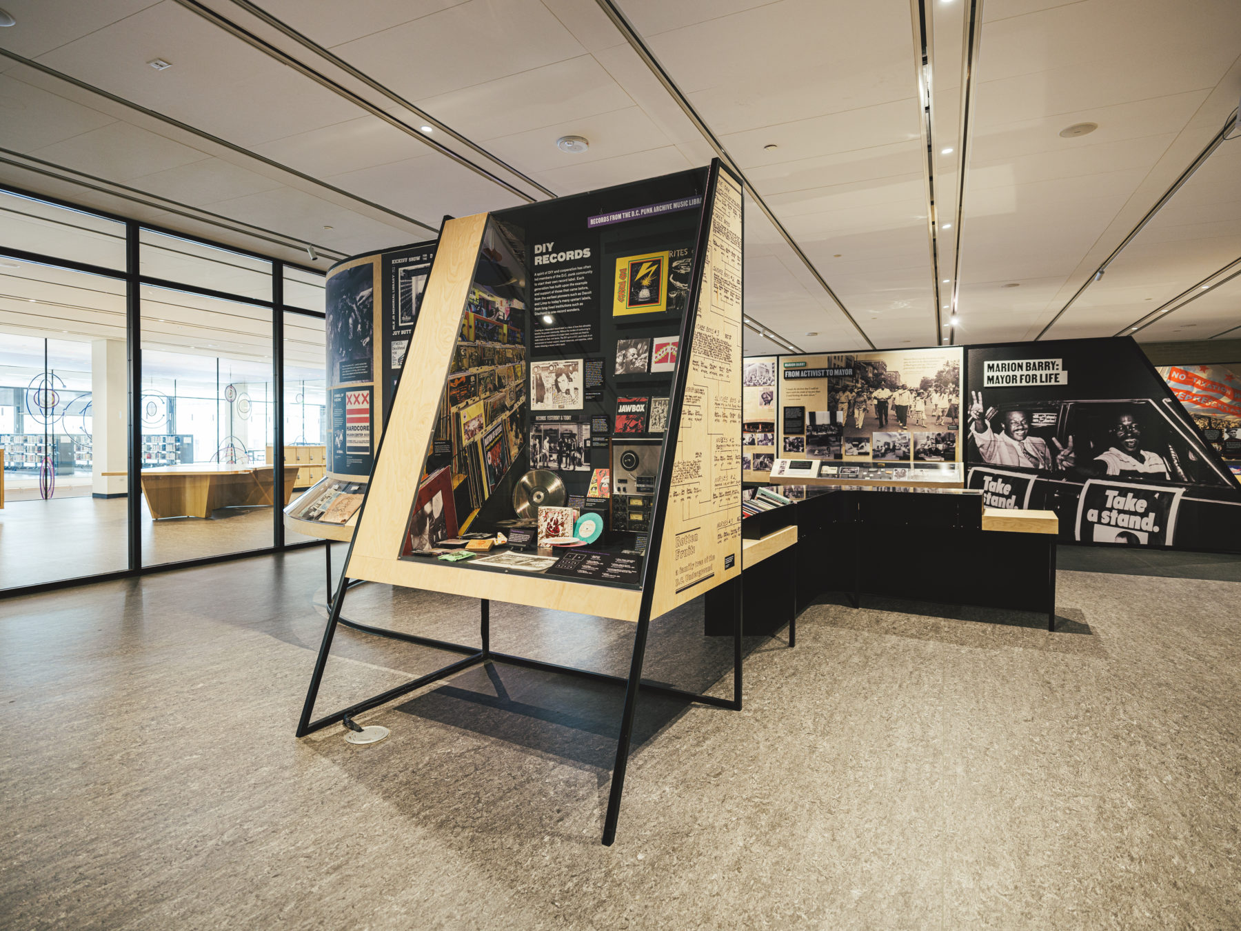
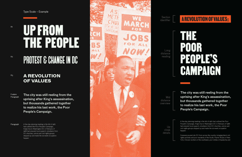
Up from People: Protest & Change in DC
A permanent exhibition at the Martin Luther King Jr. Memorial Library.
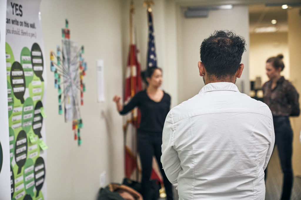
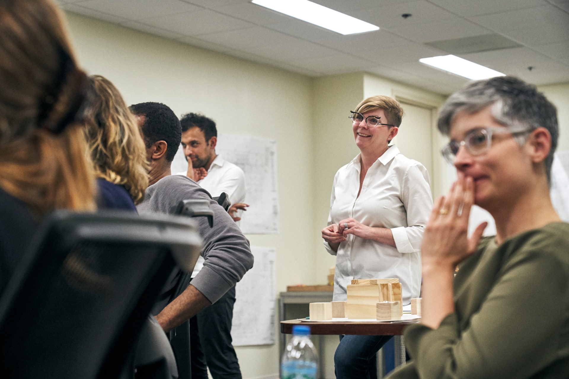
The exhibition we designed seeks to reflect the stories of the individuals who were instrumental in shaping not just the modern architecture of the library but also the culture and identity of modern Washington, DC.
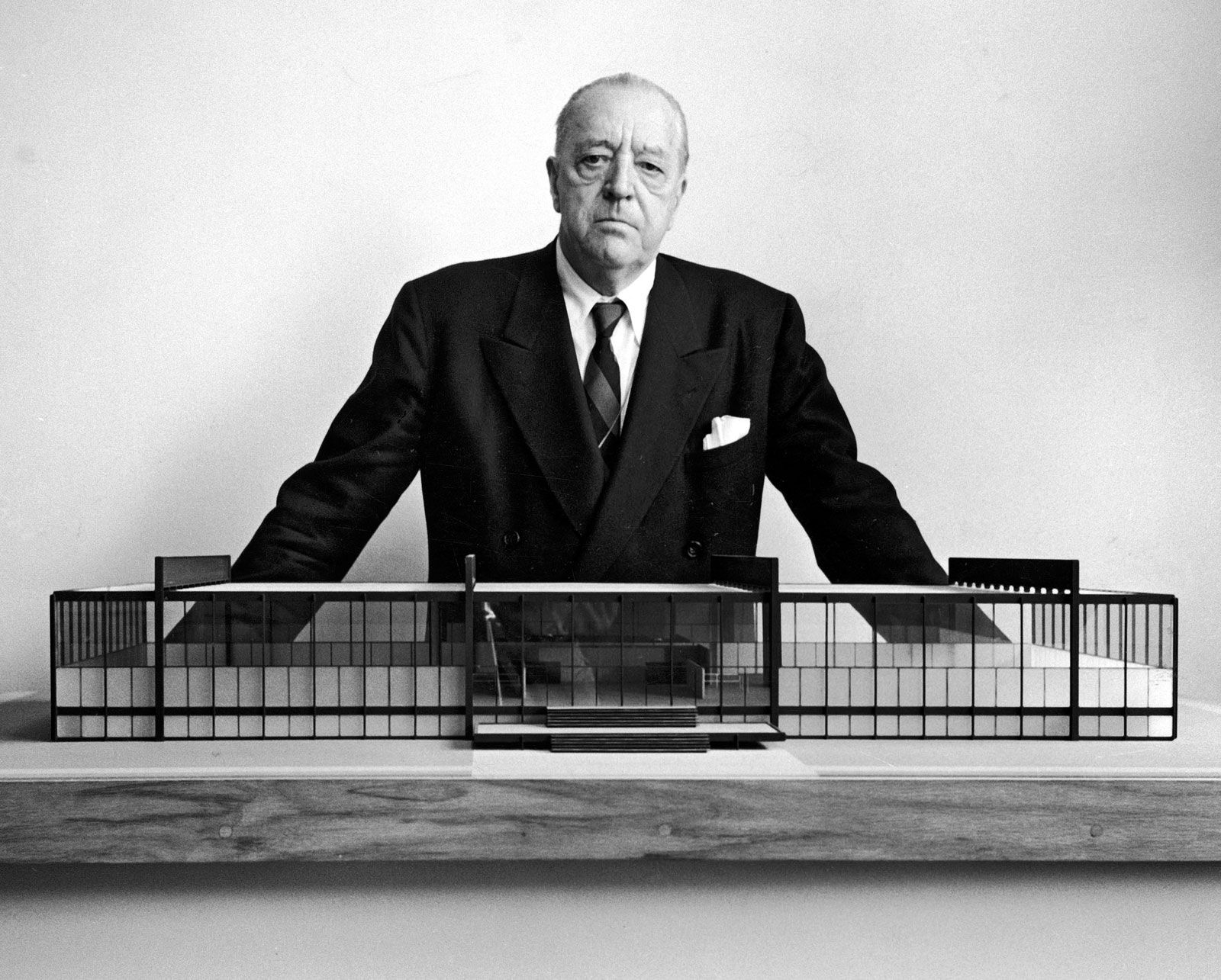
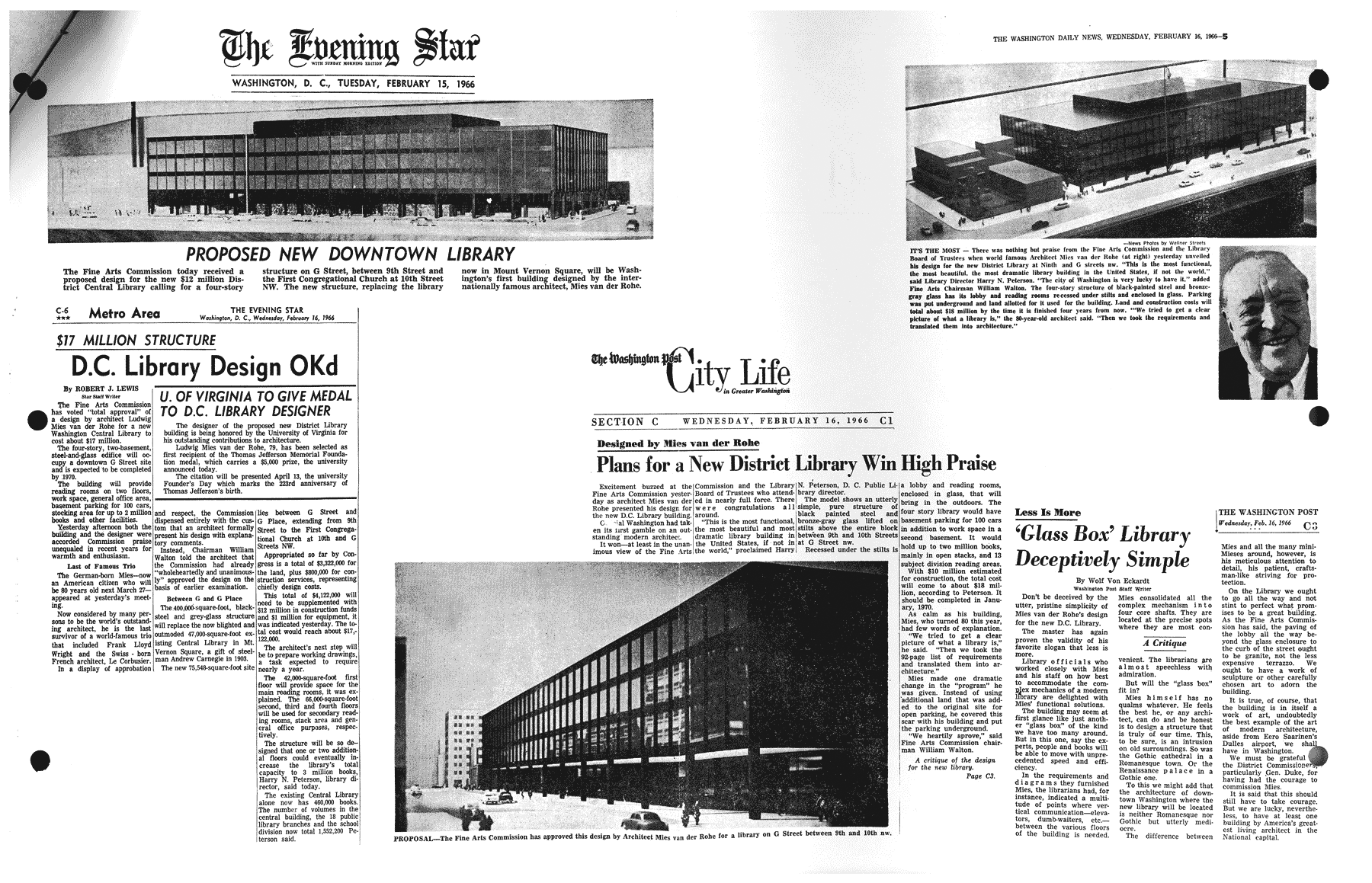
Architect Ludwig Mies van der Rohe
‘Mies’ was the last director of the Bauhaus and one of the century’s most influential architects.
The Bauhaus redefined design and art education and gave birth to the modernist movement that still prevails today.
The MLK Library is the only public library ever designed by Mies.
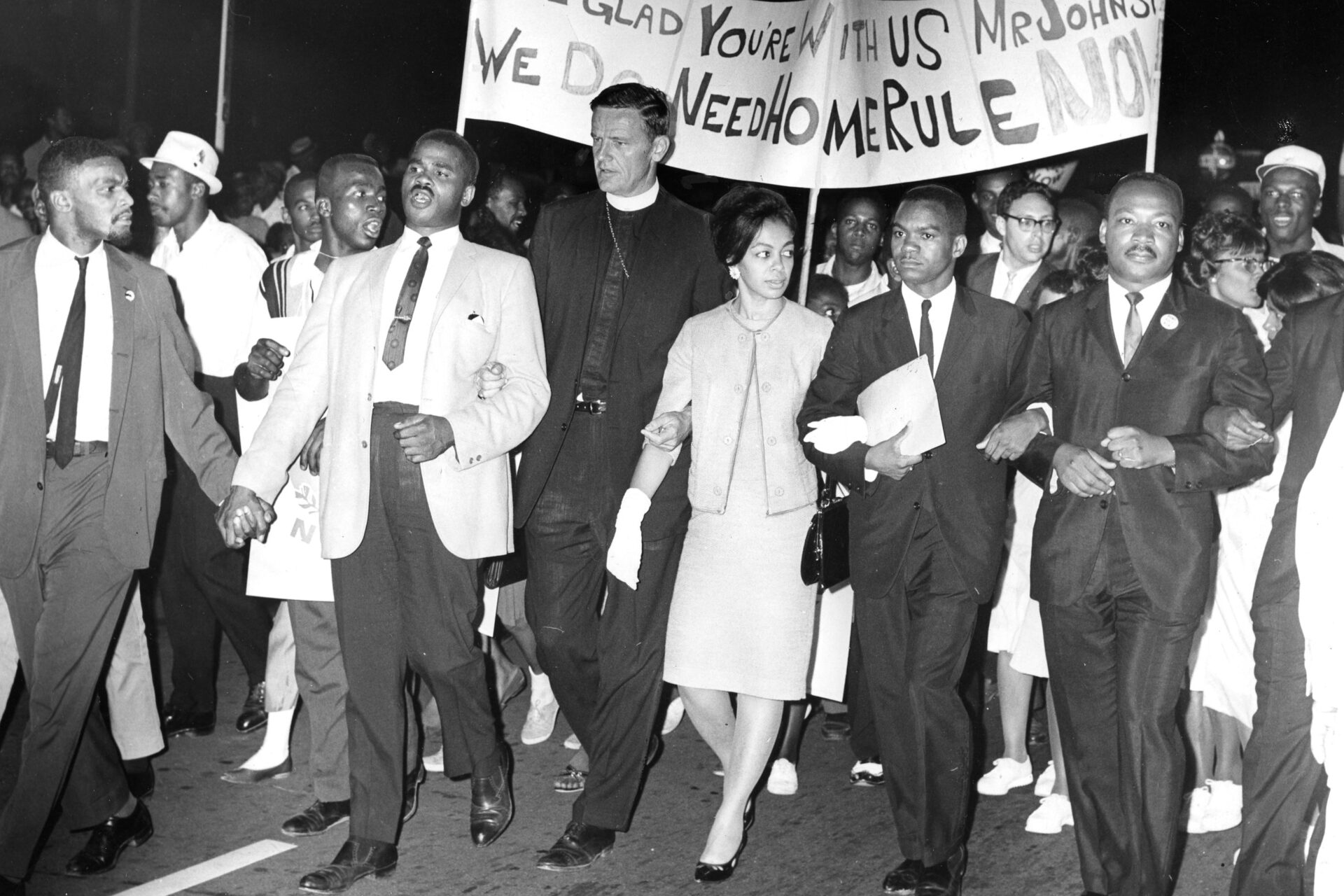
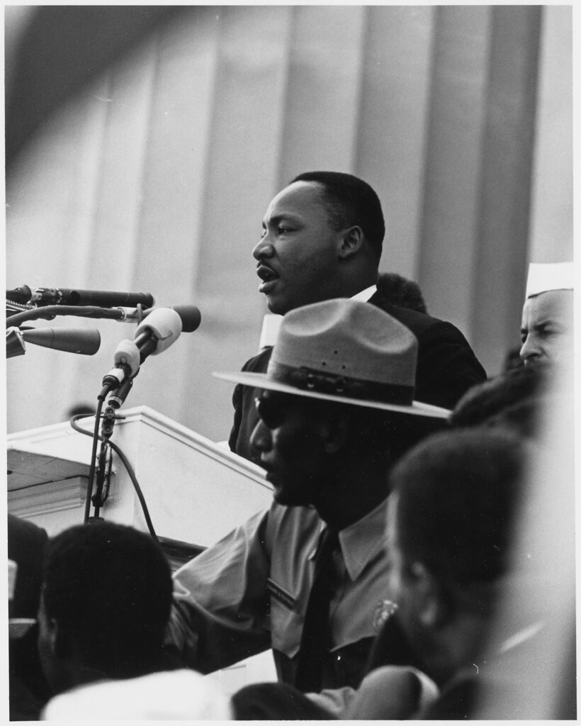
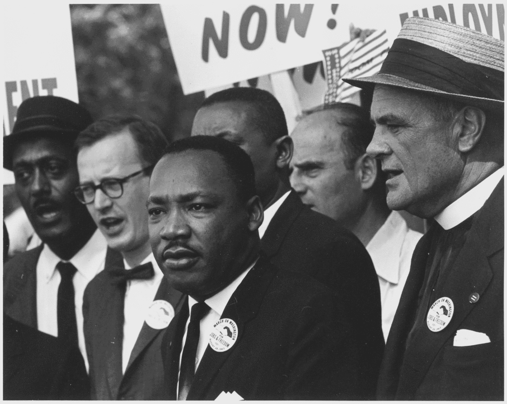
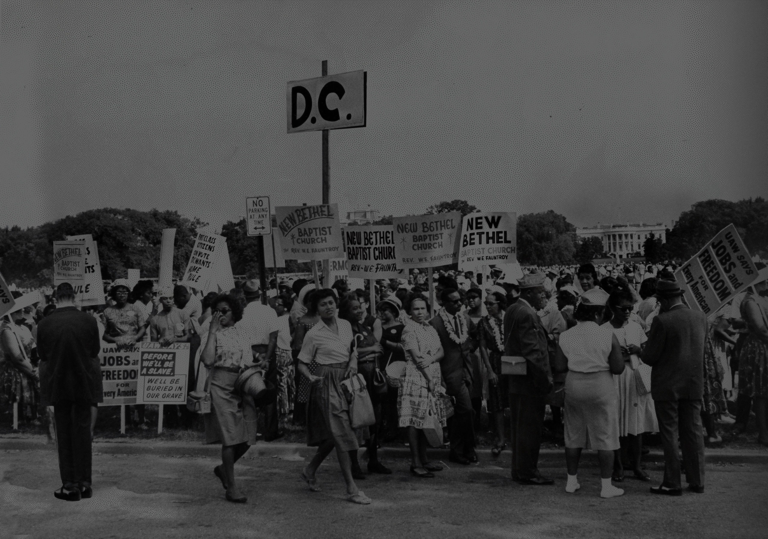
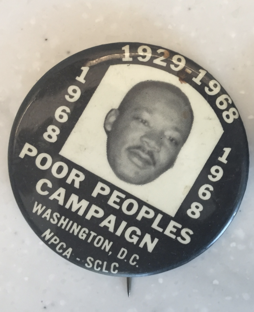
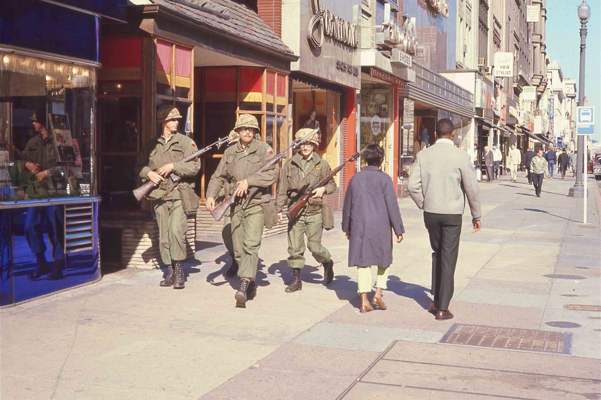
Martin Luther King Jr. in DC
Dr. King had long-established ties with local clergy, activists, and students, specifically those fighting to create autonomy for the district.
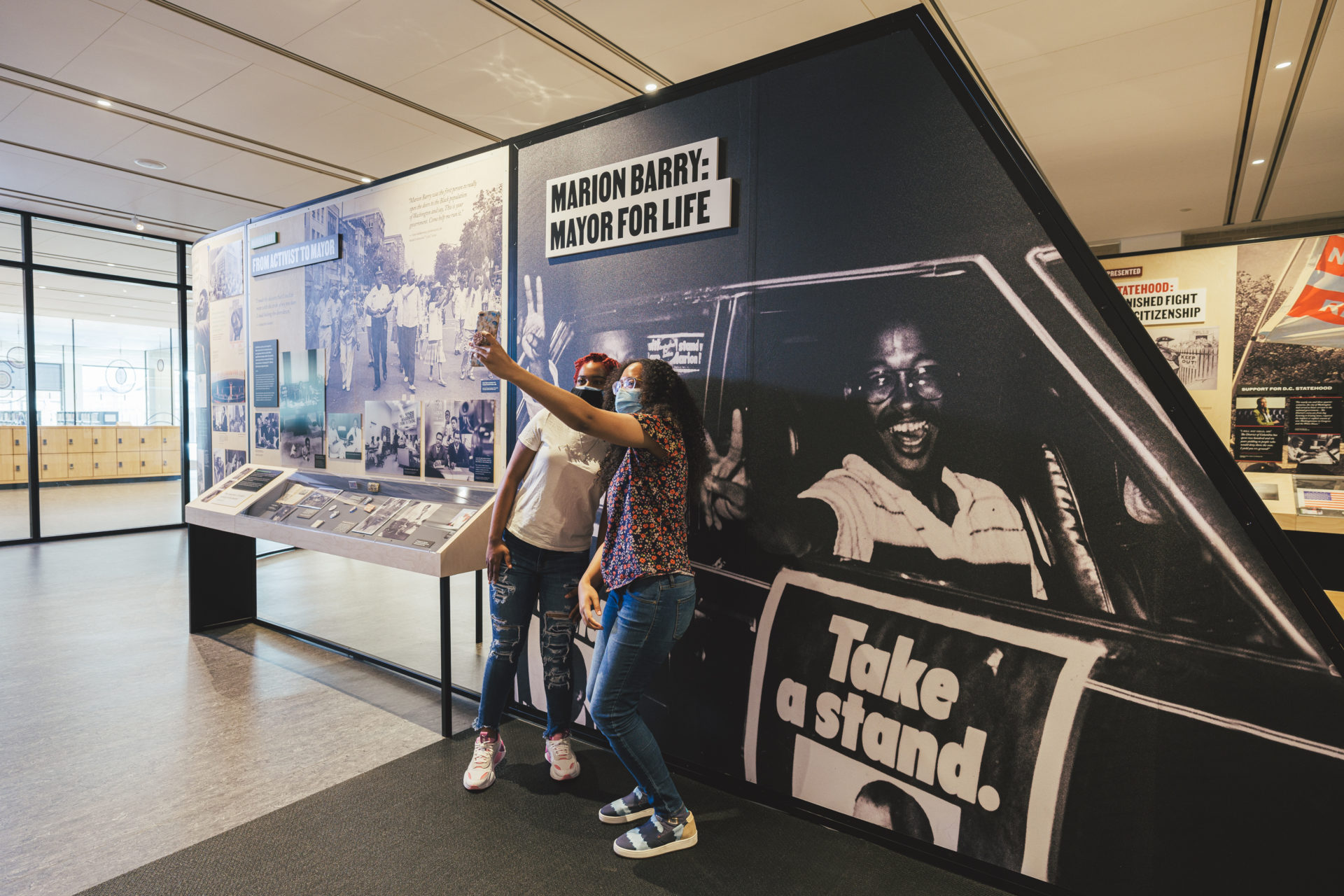
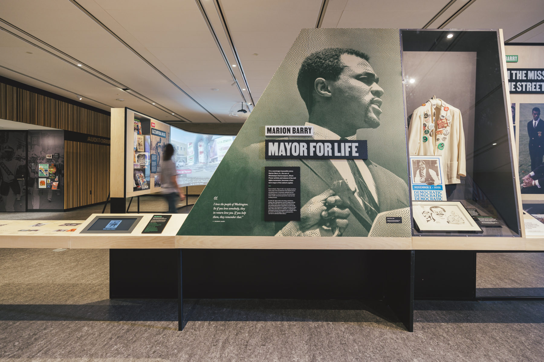
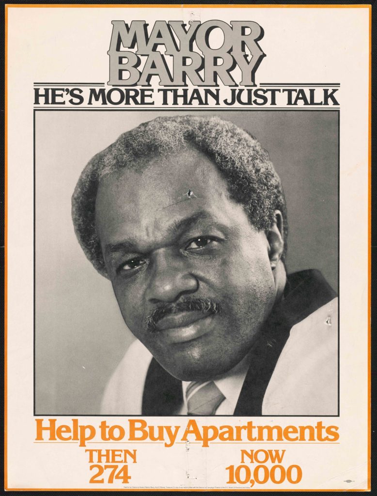
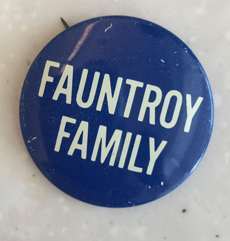
These people included a young pastor named Walter Fauntroy, who became the first representative in congress for the District of Columbia. Also, the young chairman of the Student Non-Violent Coordinating Committee (SNCC), and later Mayor for Life, Marion Barry.
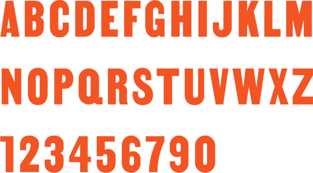
MARTIN
“”Tré Seals, Vocaltype
MARTIN is our nation’s typeface masterfully created by Tré Seals of Vocaltype. Inspired by the signage from the 1968 Memphis Sanitation Workers Strike, led by Dr. Martin Luther King Jr. Seals created the typeface to honor his grandfather, who was one of the 1,300 Black men who fought for their rights as public sanitation workers.
ABCDEFGHIJKLM
NOPQRSTUVWXYZ
1234567890
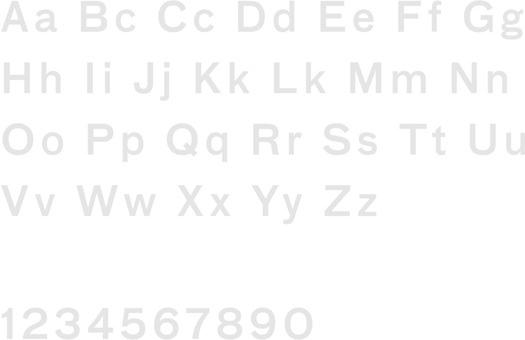
FF Bau
“”Christian Schwartz, FontFont, 2002
FF Bau is a large neo-Grotesque family of sans-serif typefaces designed by Christian Schwartz. It started as a custom font for the German architecture magazine Baumeister in 2002, and evolved into a comprehensive family.
Aa Bb Cc Dd Ee Ff Gg
Hh Ii Jj Kk Ll Mm Nn
Oo Pp Qq Rr Ss Tt Uu Vv
Ww Xx Yy Zz

1234567890
Designing for our city
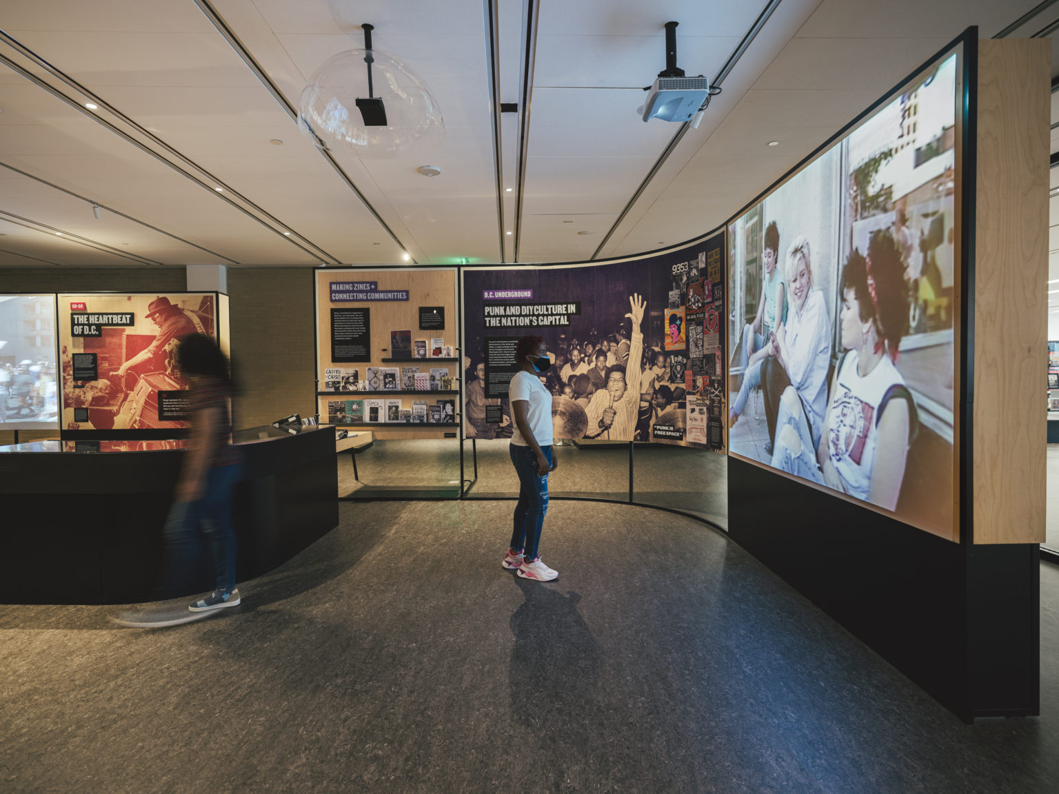
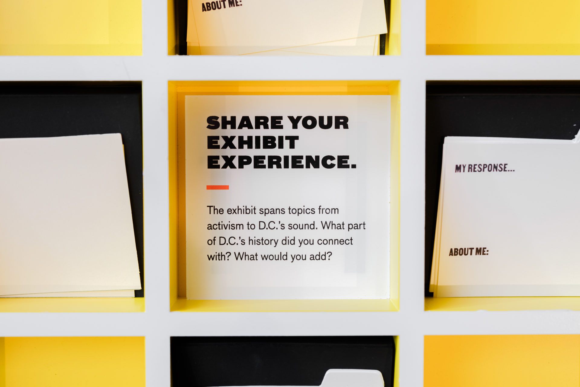
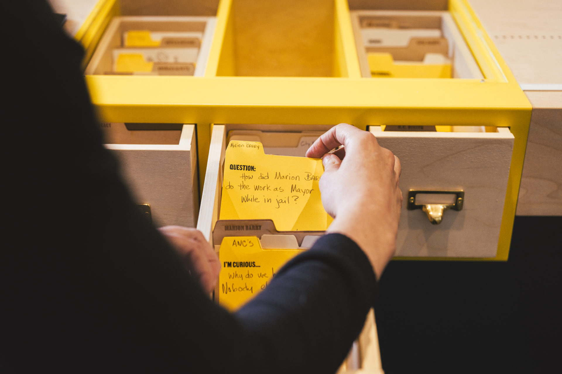
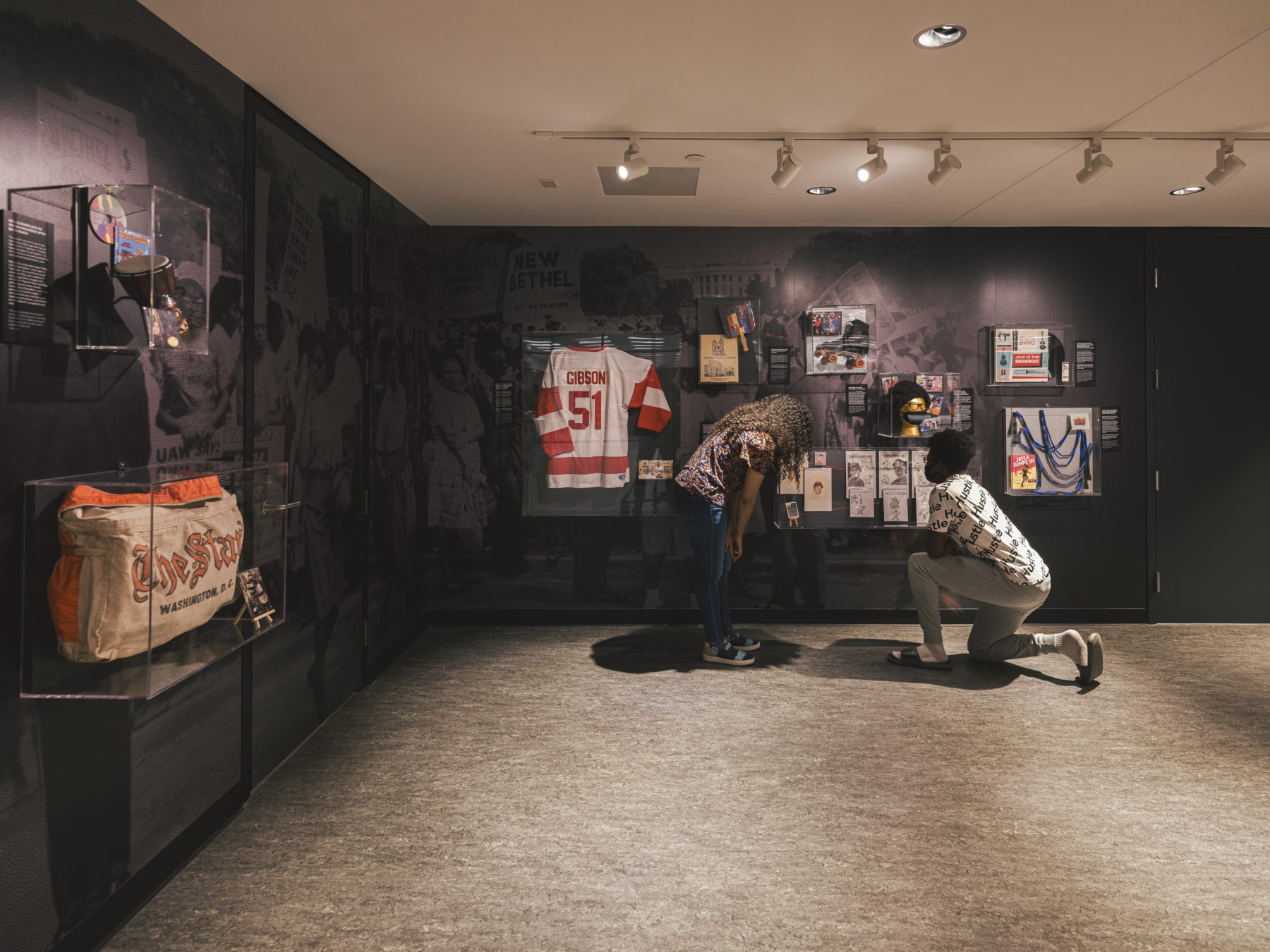
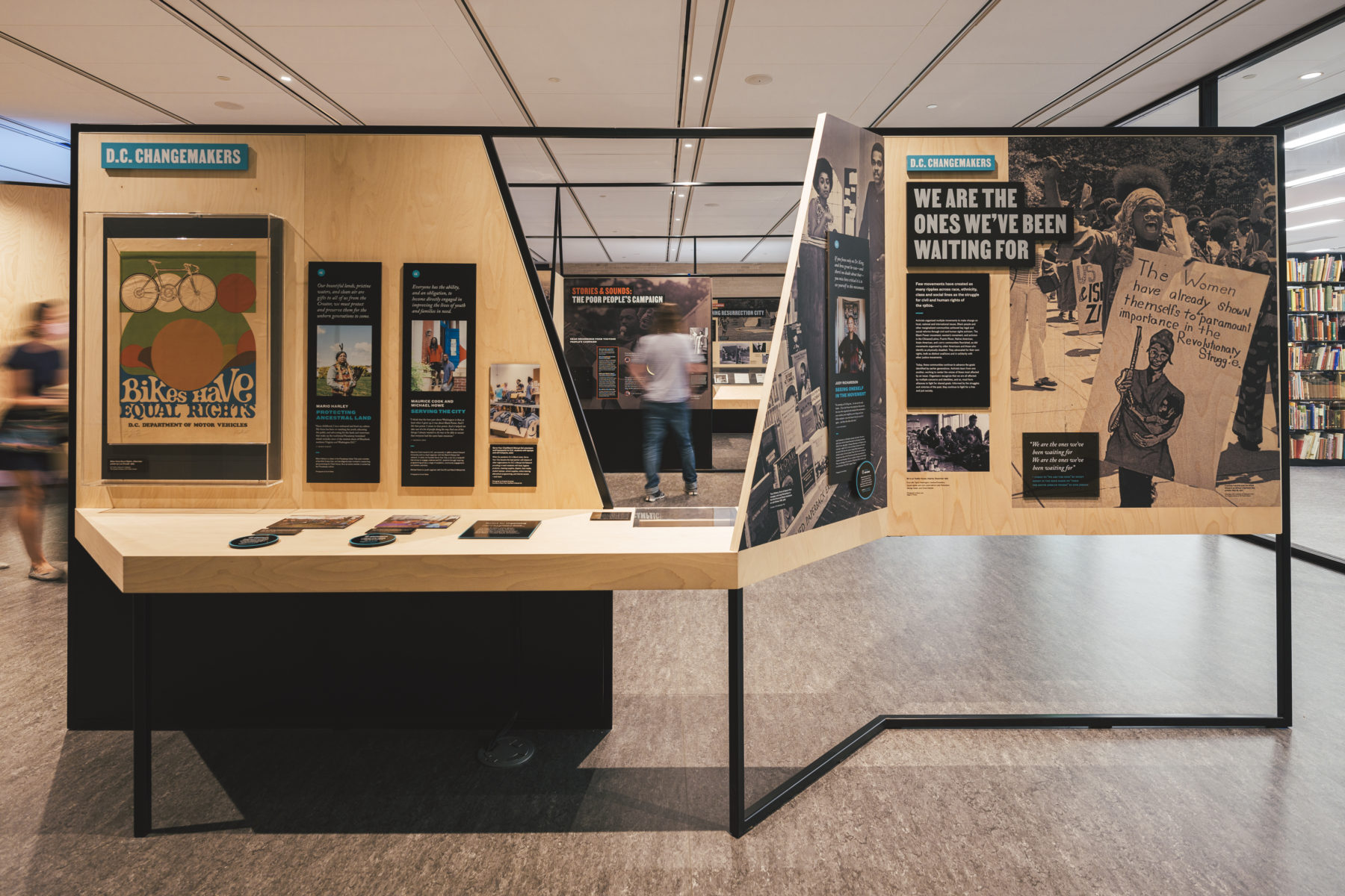
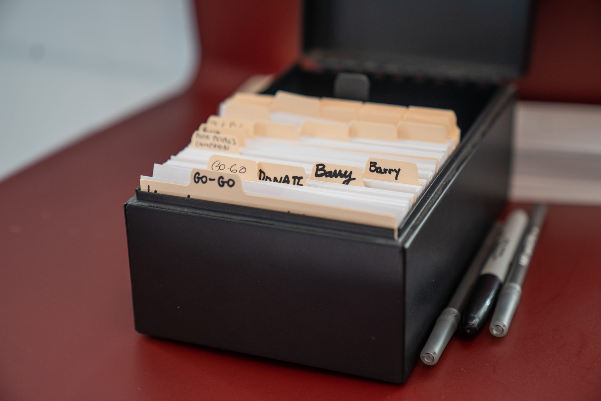
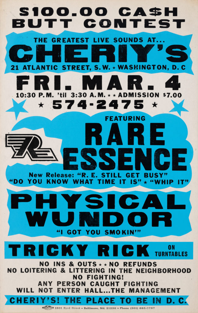
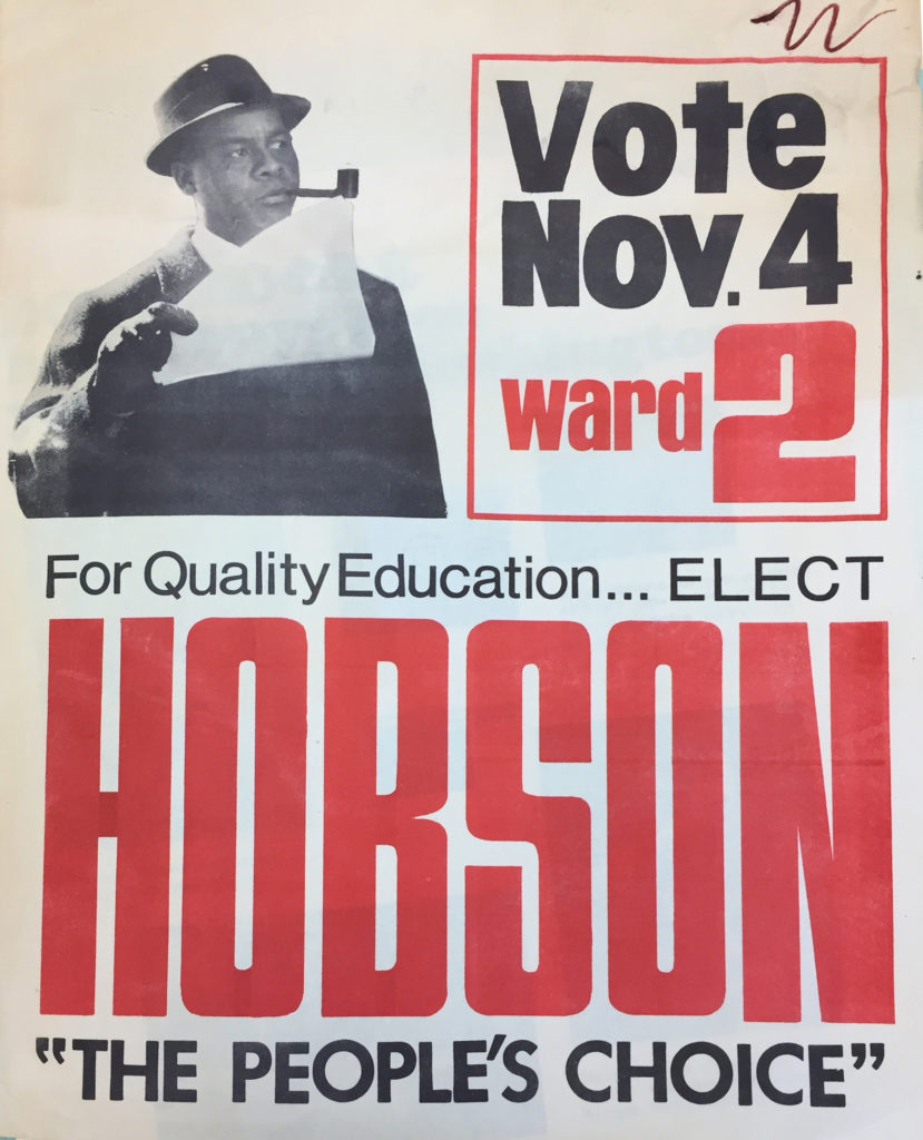
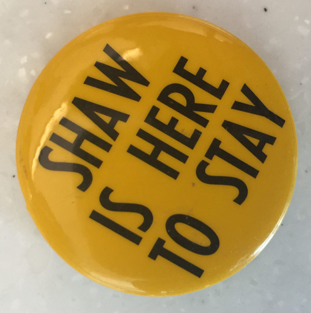
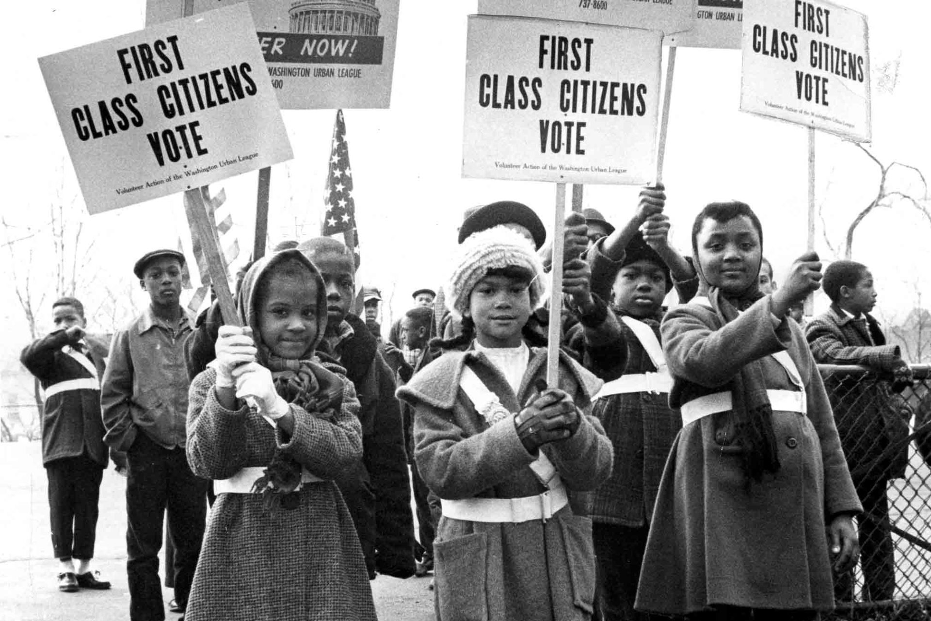
The exhibition also showcases the library’s in-depth public resources, such as The People’s Archive, the library’s special collections which collects and shares D.C. historic documents and stories dating back over 60 years.
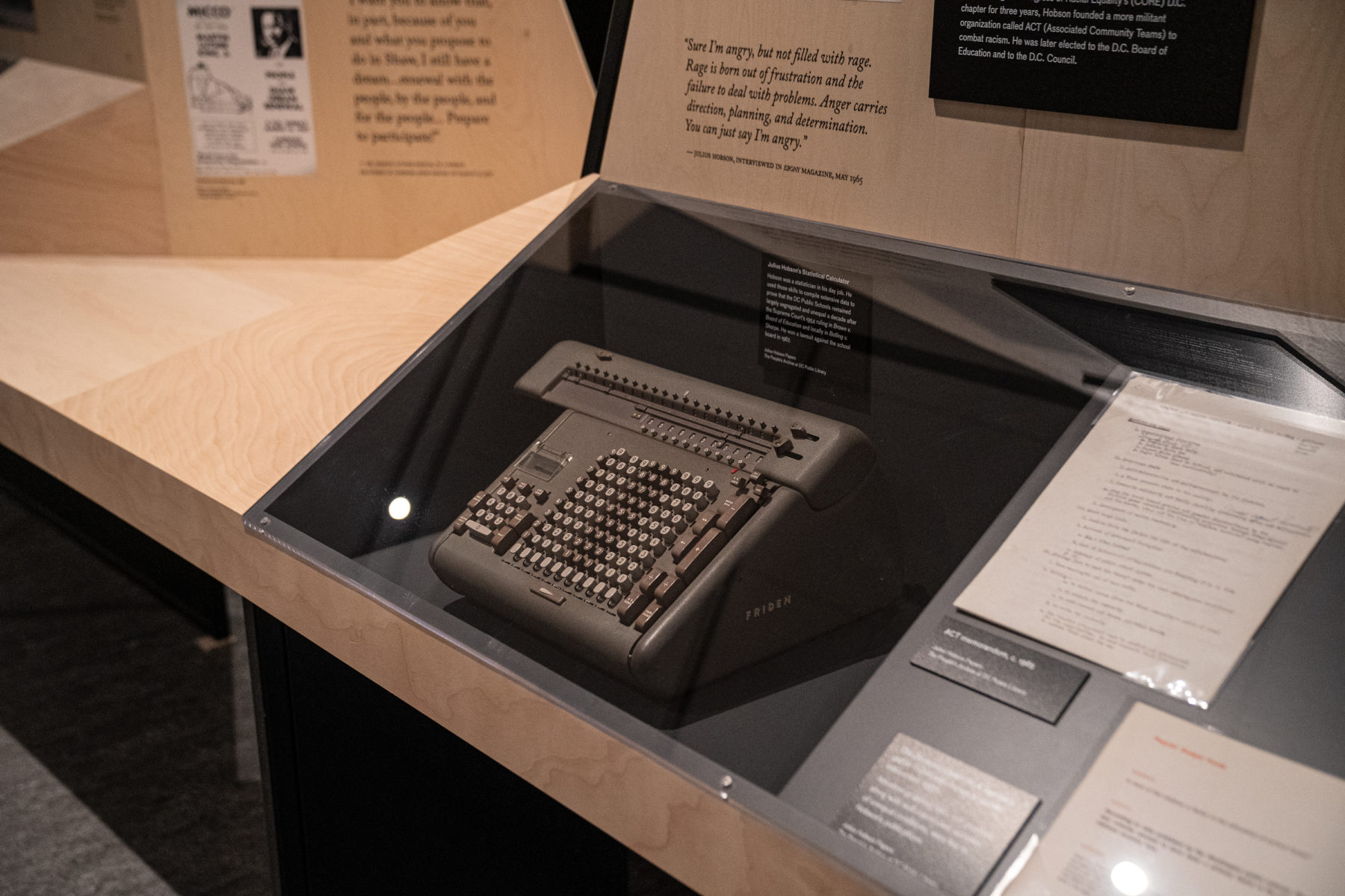
Working as the exhibition brand and visual design partner agency, Workhorse helped the library curate activist and cultural narratives using stories, artifacts, and ephemera from the library’s expansive special collections.
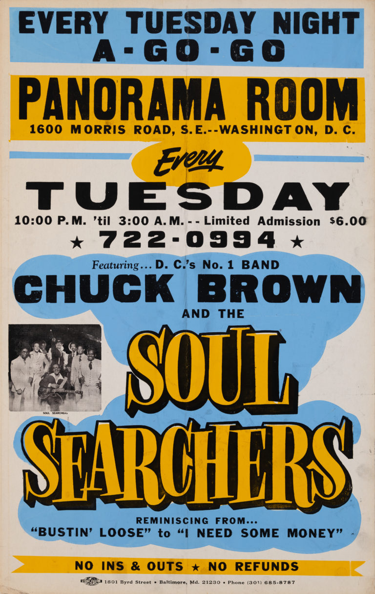
Artifacts and ephemera
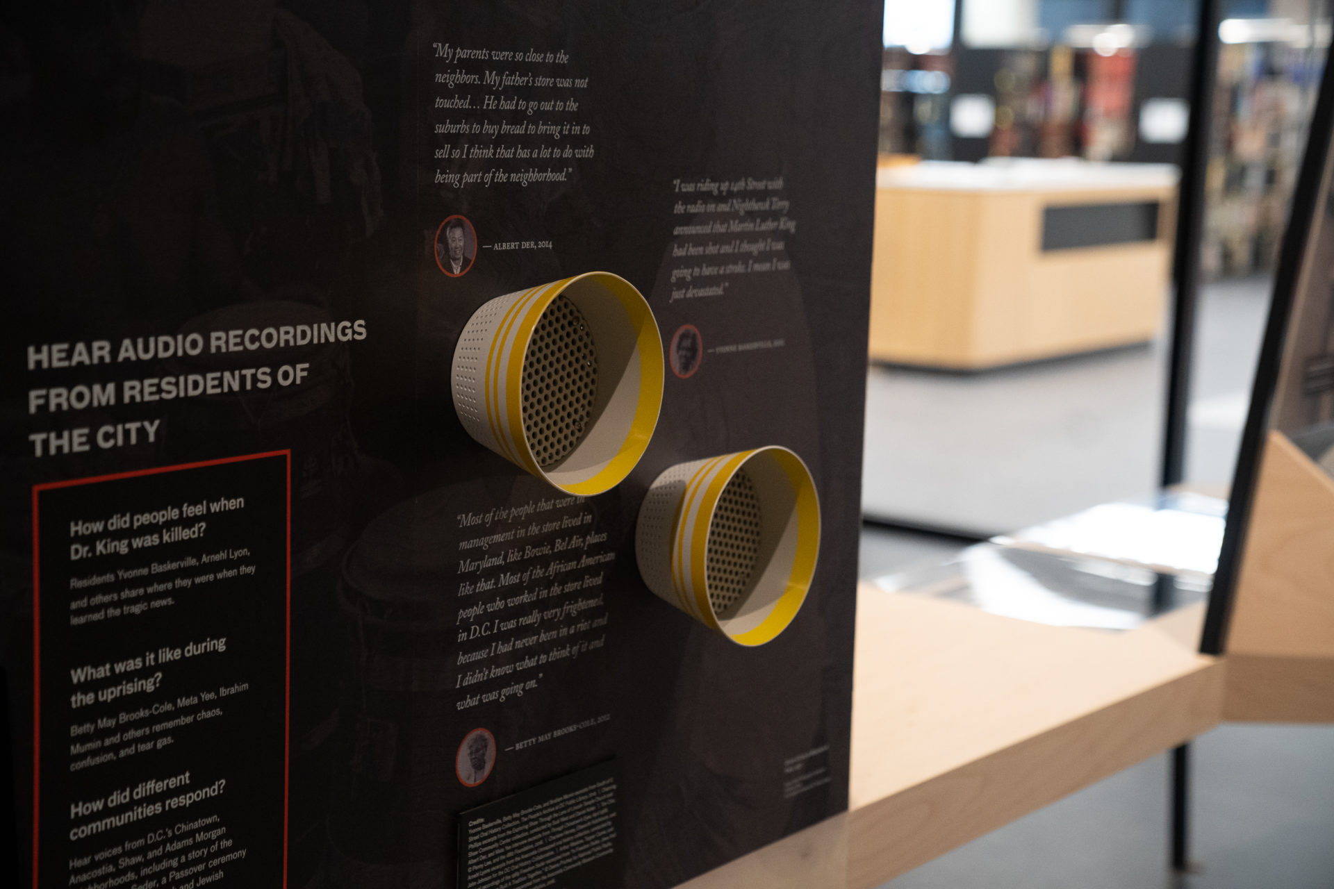
Workhorse worked with library staff to curate photography, news clippings, rally fliers, and letters that properly tell the story of the ties that bind Martin Luther King, DC, and the fight for justice.
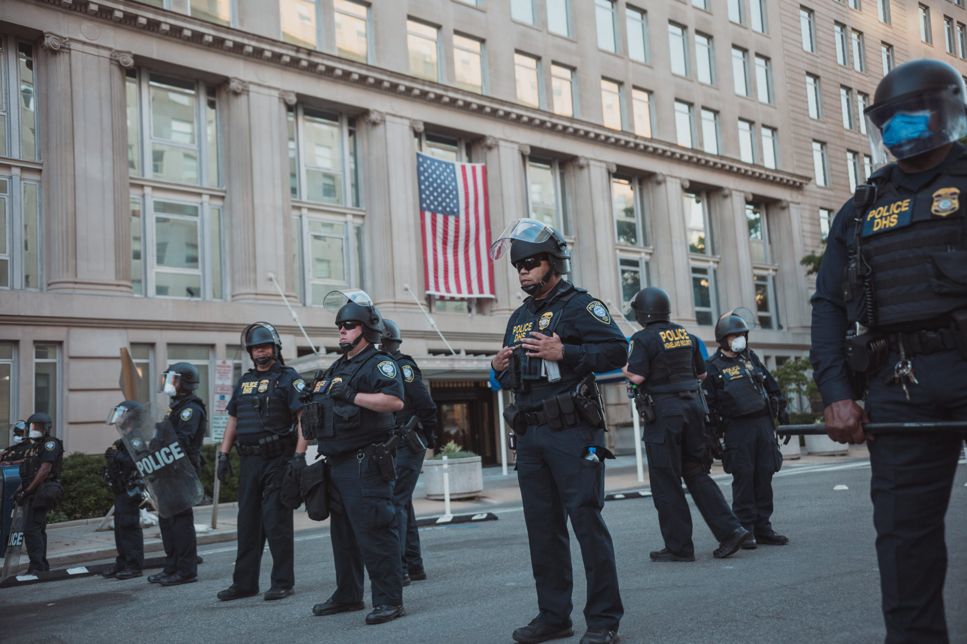
2020: A Pandemic and Political Upheaval
The exhibition opened during a year of unprecedented upheaval—a global pandemic and a national reckoning with racial justice that echoed the very history the exhibition documents.


Everything this brand is made of.
The marks, the palette, the type, and the designed work that carries them. One source feeds the live brand and this wall. Click any tile to open it.

