Meaning Layer

Design, returned to its depths.

Meaning Layer is original research and writing on meaning-making and designing for meaning. It started in 2024 as a newsletter. In 2026 it became a library: the texts behind the writing, set as readable editions, with every connection between them anchored to a passage a reader can open and cite. The same library is the classroom for the courses Abe Garcia teaches.

The project

Meaning Layer began in May 2024 as a newsletter about design and meaning. In 2026 it became a library as well, and that library now hosts the courses Abe teaches. The newsletter is still running beside it.

01Question

Where the meaning went

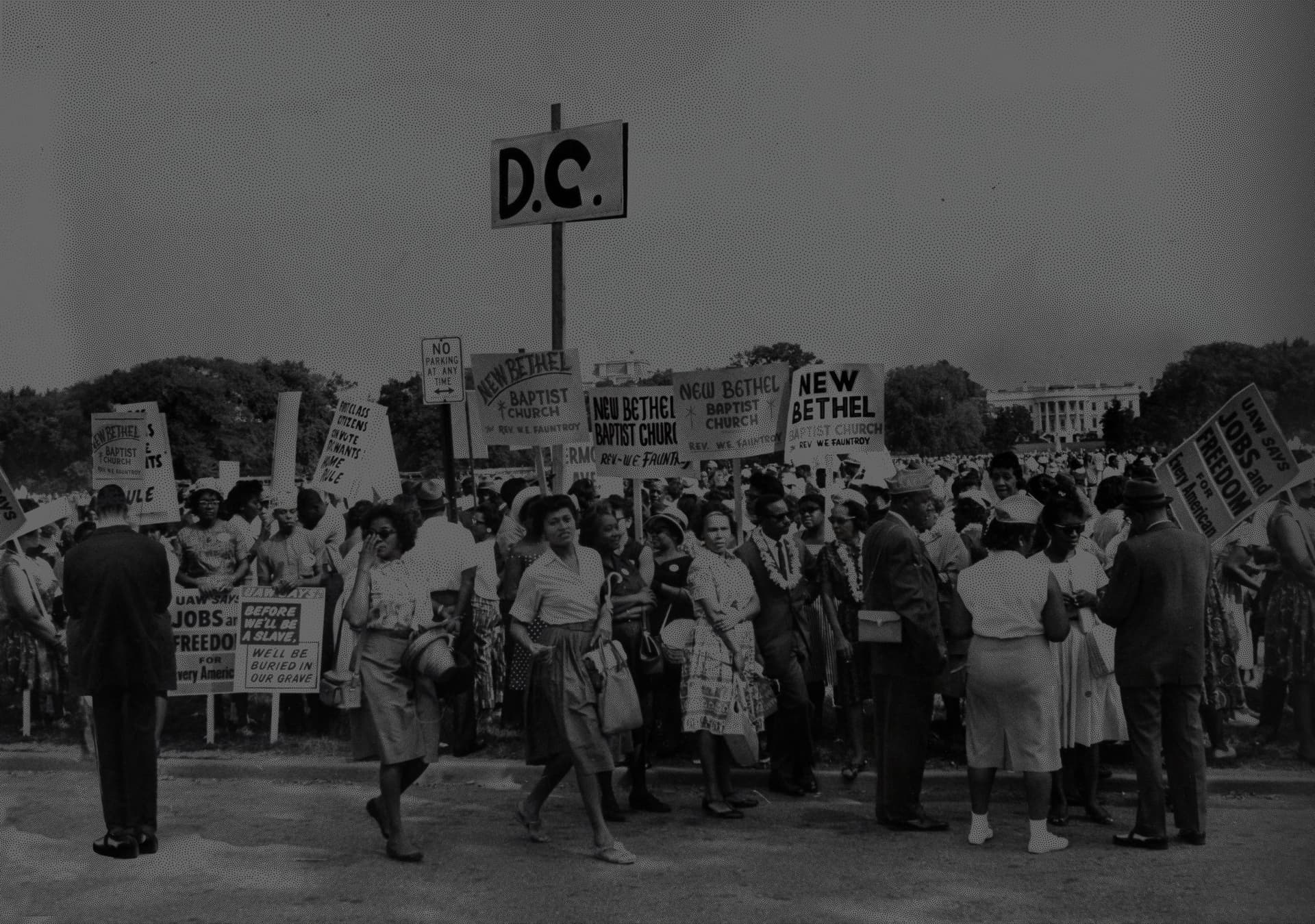
Design began as a way of making meaning visible. The depth psychologists treated symbol, archetype and the collective unconscious as working material, the stuff a life is made from, and for a long stretch designers read them and took them seriously.

The field grew efficient. User experience and human-centered design kept the vocabulary in circulation, yet the depth behind it fell to the edge of the field’s attention, and the person at the center of human-centered design became the person who could be measured.

The conversations that move people now circle the same material: myth, story, theology, psychology. Most of the people in them do not know how deep the tradition runs, or that the writers they quote were answering one another. The project puts those writers back on the table in their own words.

For the seers who want to hone their craft, and for the crafters who want to sharpen their vision.

Meaning Layer, founding statement

02Commitments

Every connection points to a passage

A library of connections is only useful if a reader can check them. The project holds itself to four promises about its texts, and each one is written into the data model.

Commitments

01

Text is addressable

Every passage has a permanent identifier and a human reference, so it can be cited, linked, and found again a year later.

02

Annotation sits beside the text

Commentary, connections and machine-found patterns are anchored to a span and stored apart from it. The edition stays as its author left it.

03

One source for every surface

The same edition renders to the screen, to narration, and to the printed page.

04

The machine proposes

A model can suggest connections at a volume no reader could match. Each one enters as an annotation with its passage, labelled machine-found in words, and a person decides whether it stays.

From the project thesis, rewritten August 2026.

03Library

Reading comes first

The reading page is set the way a good book is set: a justified serif at fifty-five to sixty-five characters, notes in the margin, old-style figures. Everything around the page is plainly a machine, with mono labels, hairline rules and an exposed grid. The two registers share the screen and are never blended.

Two editions can be heard as well as read. The Aims of Education and Why I Am Not a Christian carry narration that follows the text sentence by sentence, and the player keeps going while the reader moves through the library.

The Aims of Education, Alfred North Whitehead, 1929
A picture record, with the machine’s label in its own colour

Pictures arrive through passages

The library holds 13,108 pictures from museum collections, and each one is there because a passage occasioned it. The workshop of Hieronymus Bosch’s Temptation and Fall sits beside Genesis 3:1-7. Every record keeps the museum’s own description and links back to the text that brought the picture in.

04System

System

A book page delivered by a visibly modern machine.

Three colours and an ink scale. The machine gets its own blue, always paired with a word, so a reader can tell a model’s proposal from a person’s note at a glance.

Color
--ml-accent-ink. Accented TEXT: links, current nav, the speaking passage. 7.6:1 on paper. Must clear 4.5:1 against the paper it sits on.
#8c1a10
--ml-machine under night paper. 8.3:1.
#7fb2d4
--pg-ink-soft.
#1f1f1f
ink-soft
#cfc8bc
ink
#fffdf7
surface-night
#1b1815
Type
primary
freight-text-pro
Design, returned to its depths.
Freight Text Pro (Joshua Darden, Darden Studio, via Adobe Fonts kit jfm1mdd). --pg-font-text. Reading matter on both tiers. Serves 400/400i/600/600i/700/700i. Carries onum, lnum and smcp, which is why it is here. x-height 446, cap 625.
display
freight-big-pro
Design, returned to its depths.
Freight Big Pro. --pg-font-display. The largest optical size in the family: x-height 422, the narrowest and highest-contrast cut. Serves 300/300i/400/400i/600/700/700i. There is NO 800 or 900 anywhere in Freight.
condensed
freighttextcmp-pro
Design, returned to its depths.
FreightTextCmp Pro. --ml-serif-cond. Structural type: part heads, day numerals. Serves 400/400i/700/700i. NOTE: declared but currently consumed by no rule.
editorial
stratos
Design, returned to its depths.
Stratos (Production Type). --ml-ui. THE INTERFACE VOICE, and deliberately NOT Freight Sans, which was available and declined: Stratos is geometric and machined where Freight Sans is humanist and bookish, and the interface is meant to read as an instrument beside the reading voice, not as more of it. Weights 400/600/700 plus italics; there is NO 500.
mono
Maison Neue Mono
Design, returned to its depths.
Maison Neue Mono. --ml-mono. The machine's voice: every folio, timecode, and reference. Data only. The one self-hosted face left in the house.
masthead
freightbigcmp-pro
Design, returned to its depths.
--ml-font-mast. FreightBigCmp Pro, the compressed cut of the largest optical size. Set TIGHT and fitted to the sheet: the fit is carried by size, not letterspacing (--ml-mast-size-max is 18vw so masthead.mjs's size solve absorbs the whole target, and tracking stays at a 0.02em hair). Freight's cap height is 625 against Benton's 684, so the nameplate's capitals come out about 9% shorter at the same solved width; accepted. check:masthead measures the INK against both trims across eleven widths.
Voice

Declarative · Specific · Plain

The setting is part of the claim

The setting is part of the claim

A project about what made things mean cannot set its own material carelessly. The type grammar follows Mark Argetsinger’s A Grammar of Typography, and the source cites it by folio: measure, leading, letterspacing and the progression of the margins are written as engineering constraints.

The design system is published on the site itself, rendered from the same values the pages use, so a wrong swatch is a wrong token and can be traced.

05Classroom

Two courses taught from the library

In Fall 2026 the library became the classroom for two courses at Charleston Southern University: ART 418, The Business of Design, and ART 220, Digital Illustration. Each runs twenty-eight dated sessions. Students open the day’s session, its brief and its handout on the same site as the library.

The syllabus prints from the same source as the screen, and the lecture decks are built as pages beside the course, so a change to the schedule reaches every copy at once.

ART 418, The Business of Design
ART 220, Digital Illustration
06Build
Built ahead of time, from one source

Built ahead of time, from one source

Every reading, record and course session is built ahead of time from the same source files and served as a static site. Search runs on the passages themselves; a separate picture search finds images by subject.

The library can also export itself as a dated release for other collections to read, in Linked Art, IIIF and W3C Web Annotation formats. Only reviewed readings go into it, and the release lists what it left out and why.

The library is open

Read Meaning Layer.

Start with an edition, a picture record, or one of the two courses. Everything on this page is live.

Live brand book

The Meaning Layer system is live and navigable.

Tokens, voice, components, and patterns rendered from the source on disk. The same record powers this engagement, the product, and the agents on stack.