01Trait
Substantive
Intelligent
Programming that assumes the audience reads, thinks, and pays attention. No hand-holding, no dumbing down.
We worked directly with the festival founders from day one. The identity had to feel as serious as the journalism it celebrated.
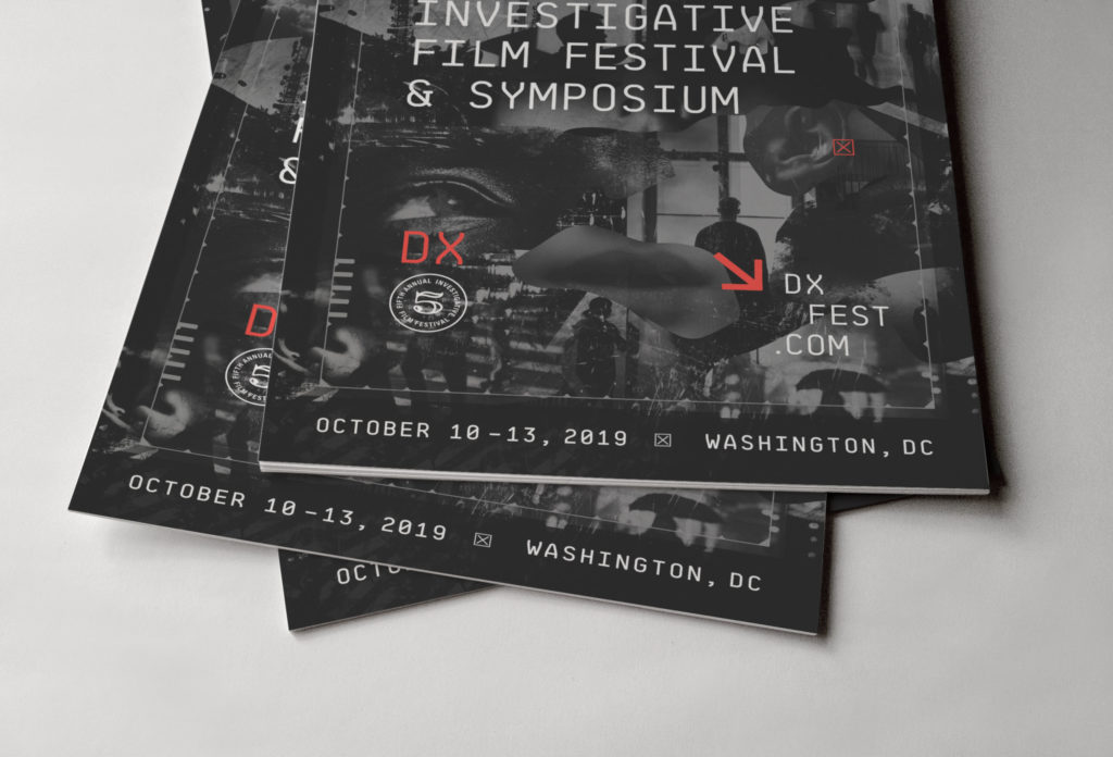
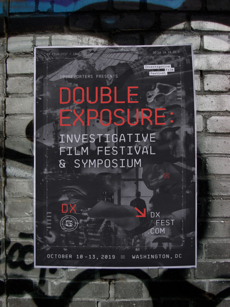
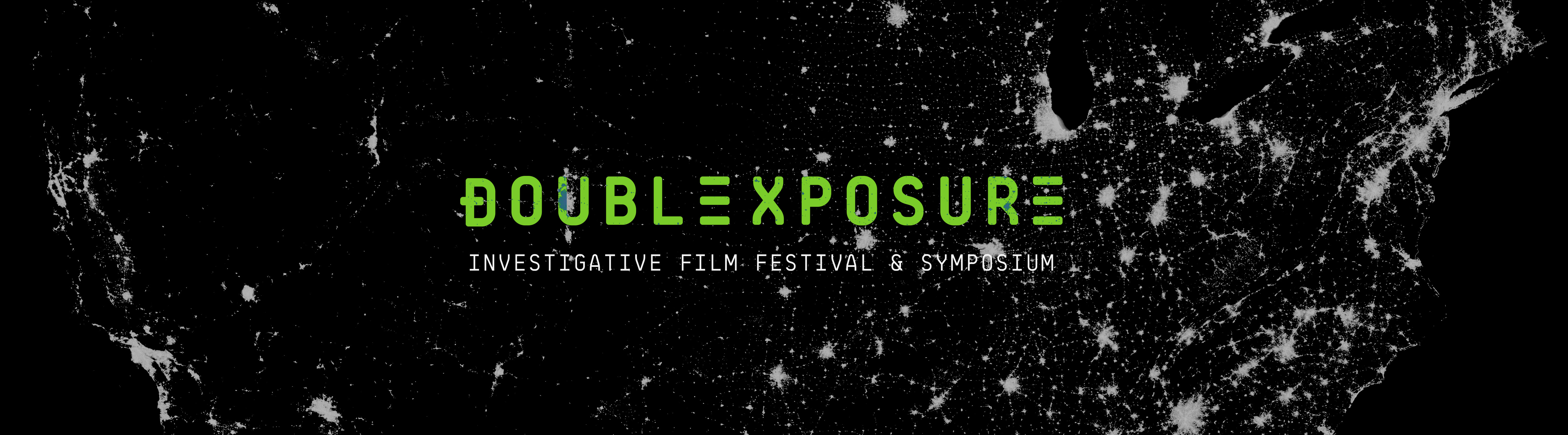
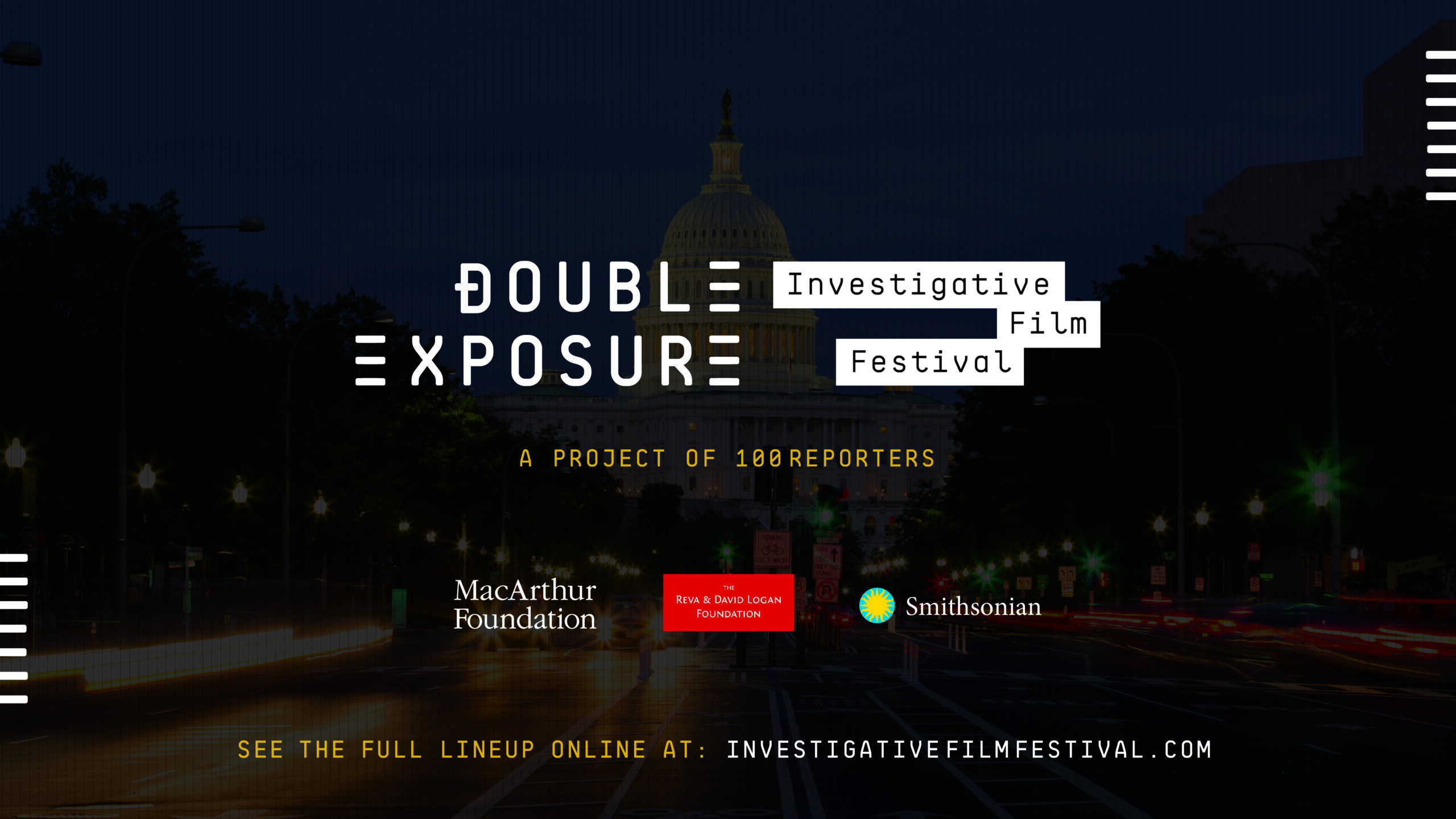
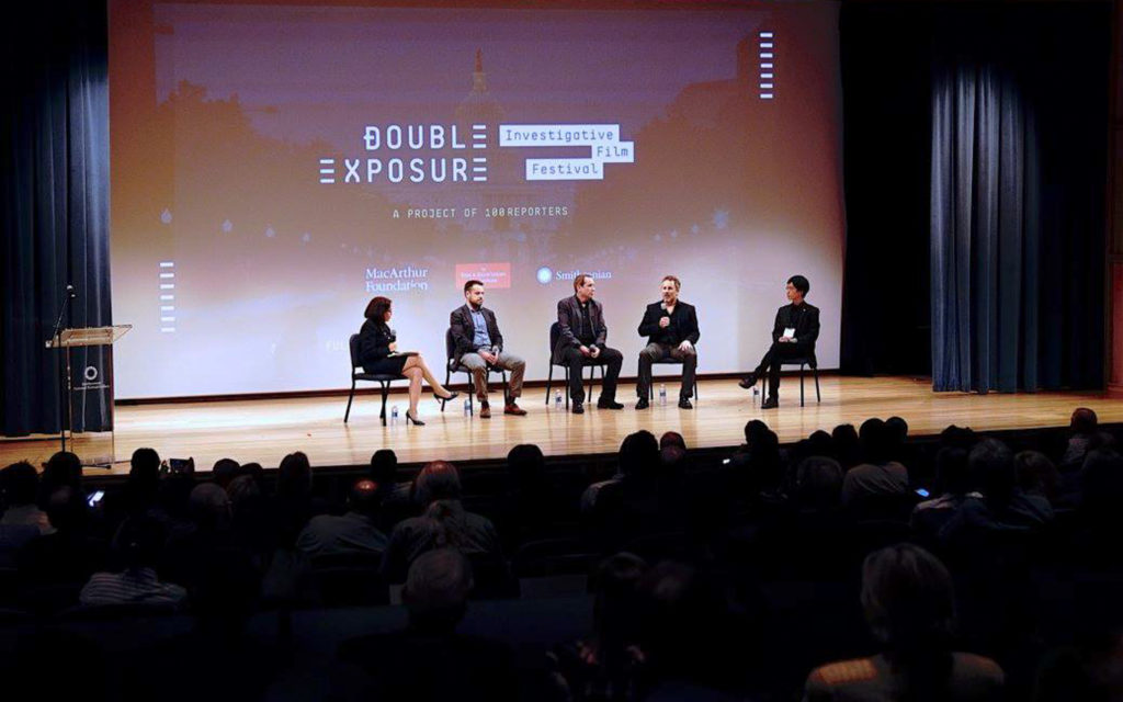
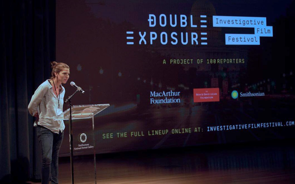
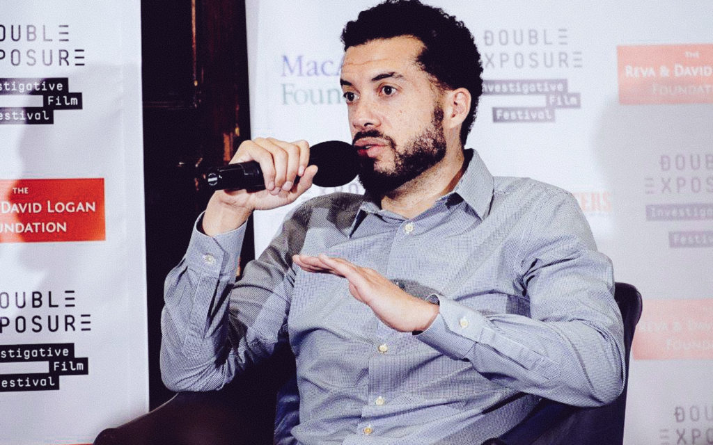
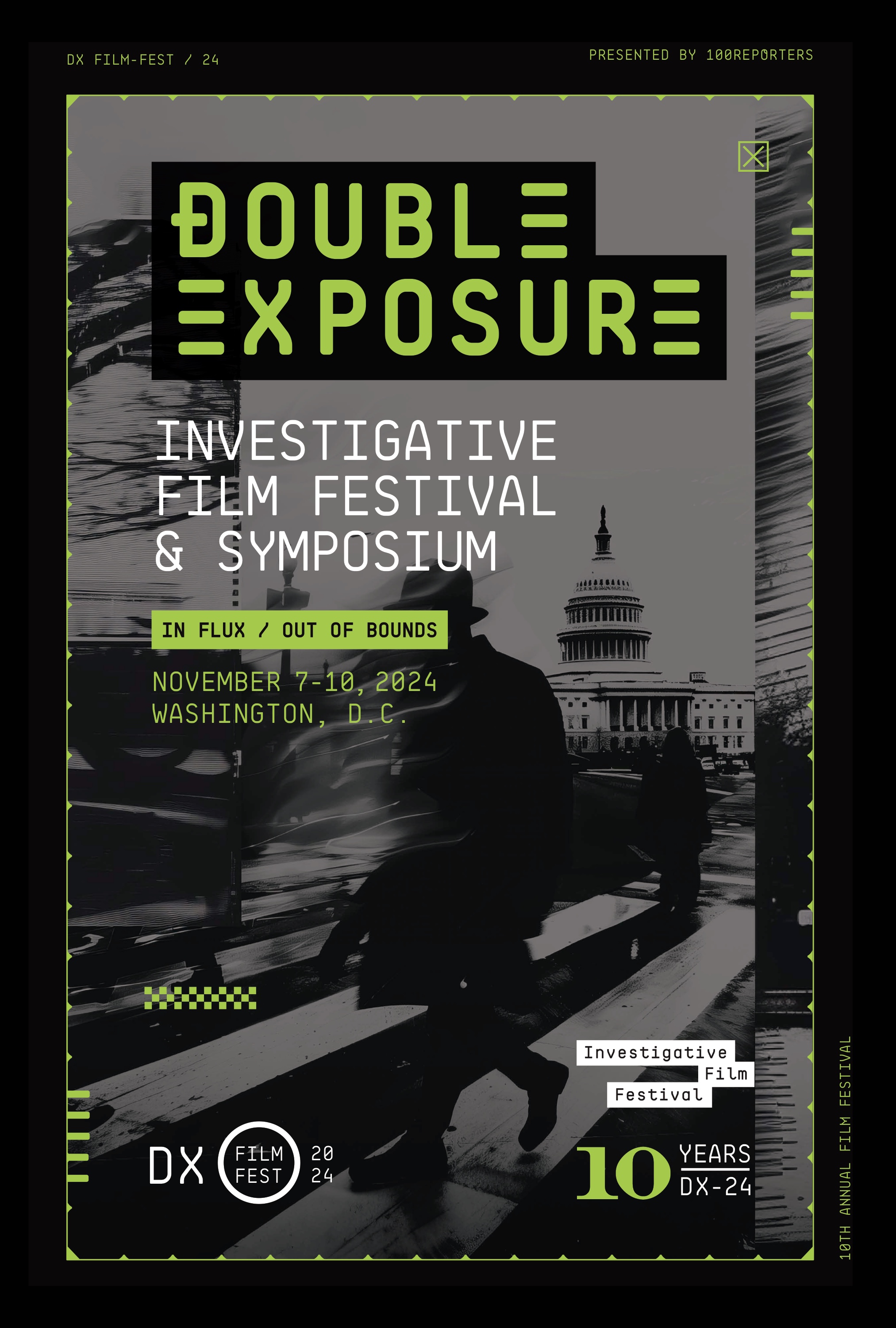
Double Exposure is a project of 100Reporters, the investigative news organization. The festival combines public film screenings with a professional symposium for journalists and visual storytellers.
Workhorse has been the festival’s design partner since its second year, building the brand identity and art directing every piece of collateral that followed.
That relationship has continued for over a decade. Each year brings new posters, new materials, and new ways to push the system forward.
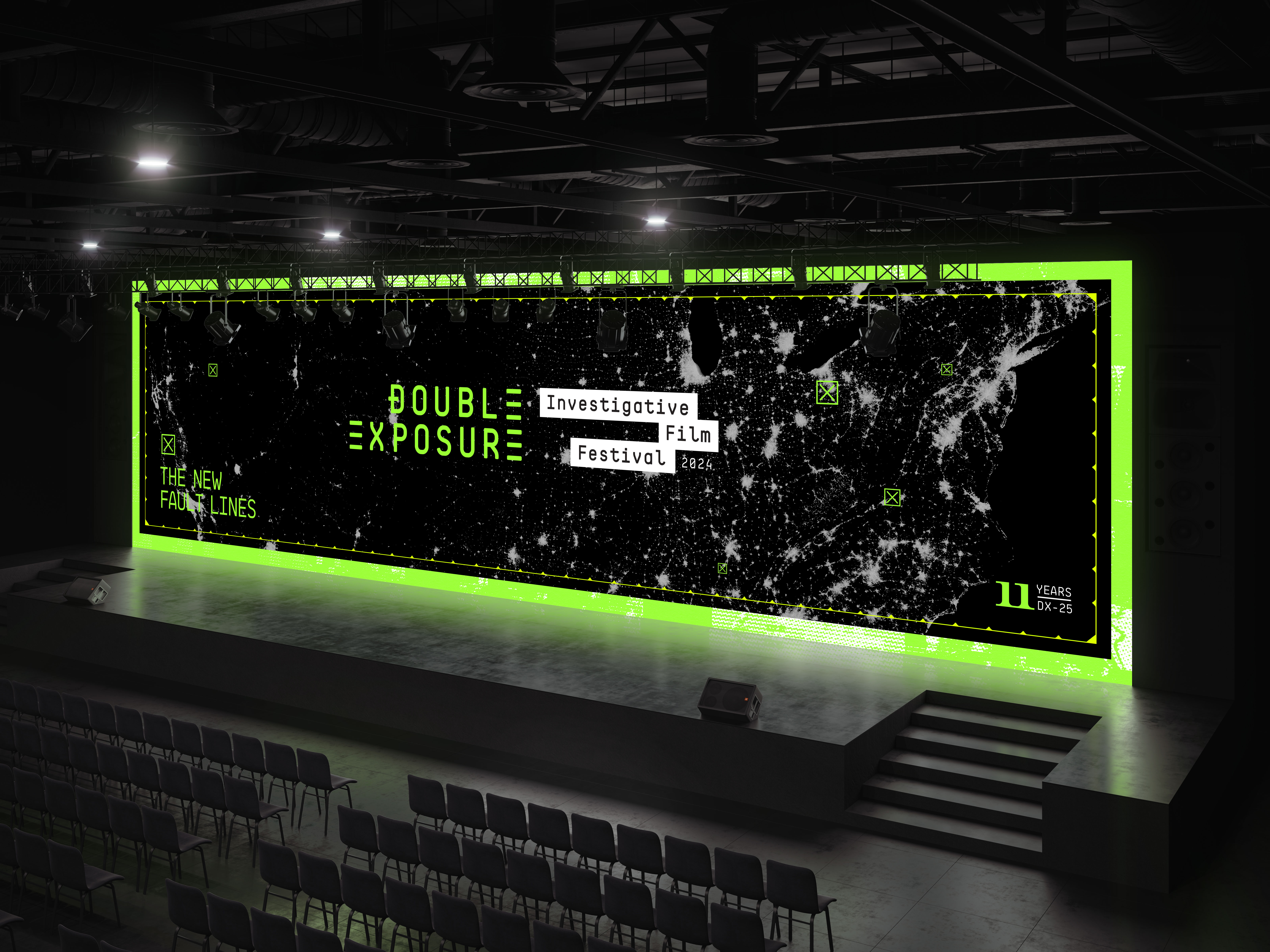
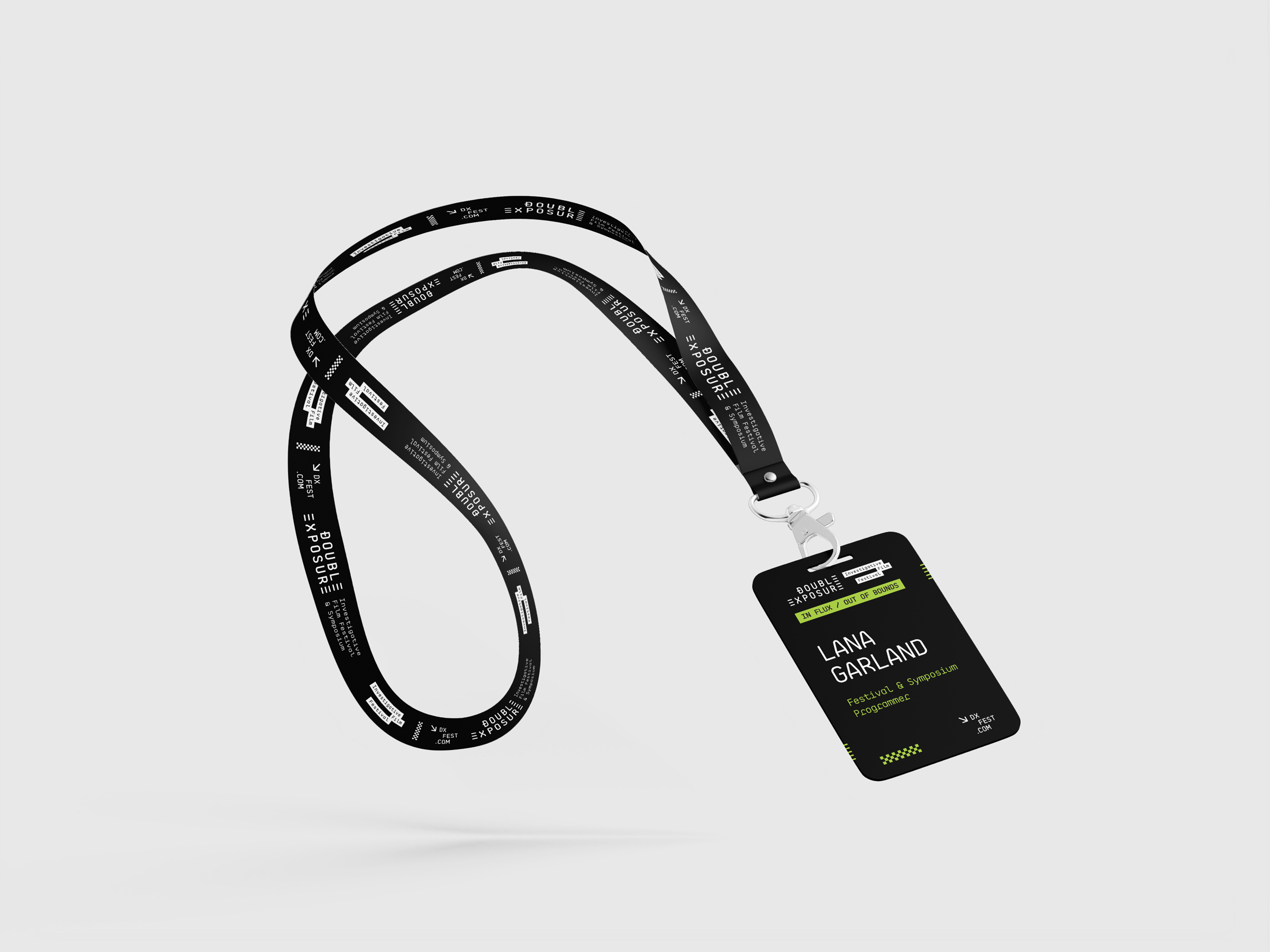
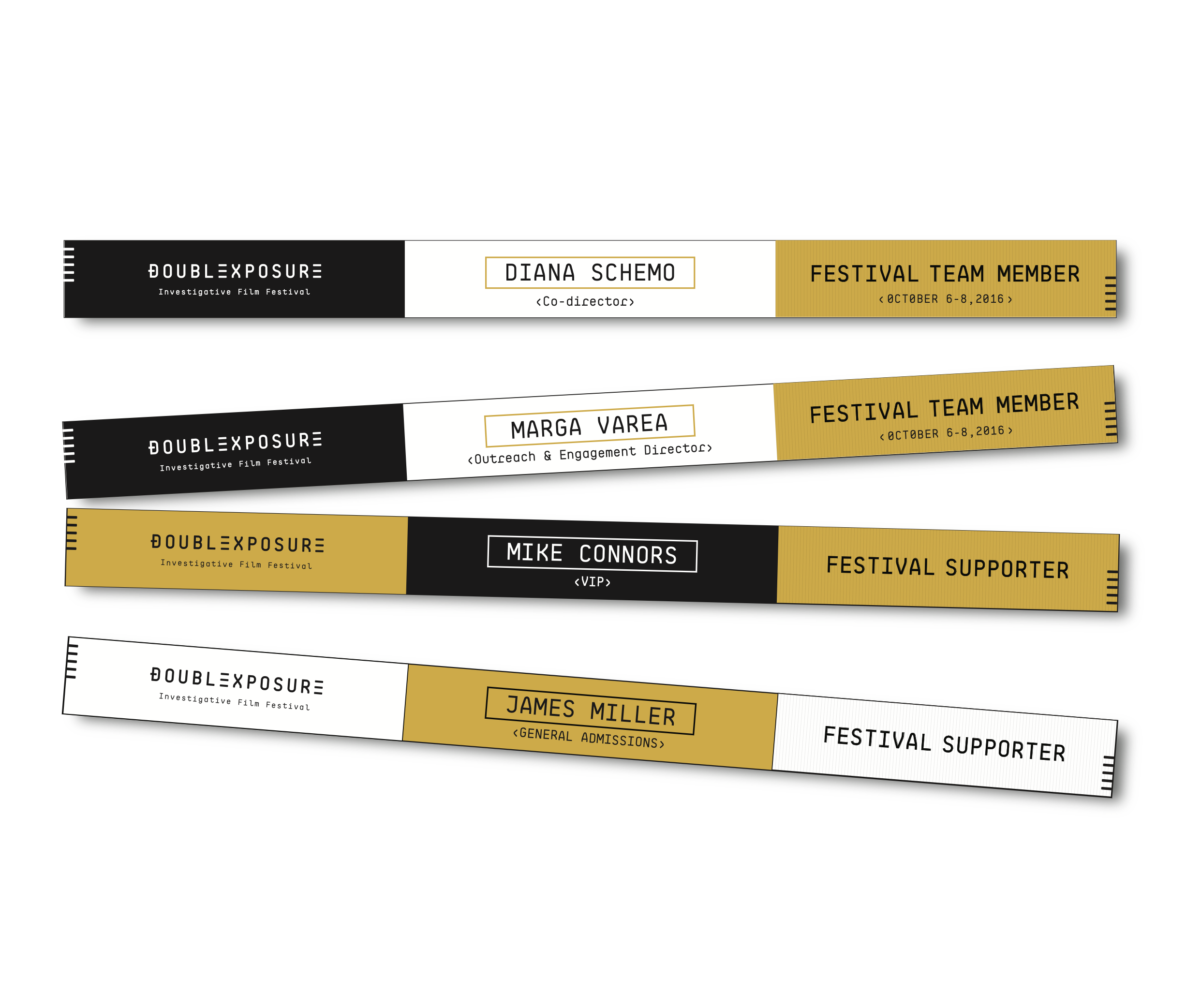
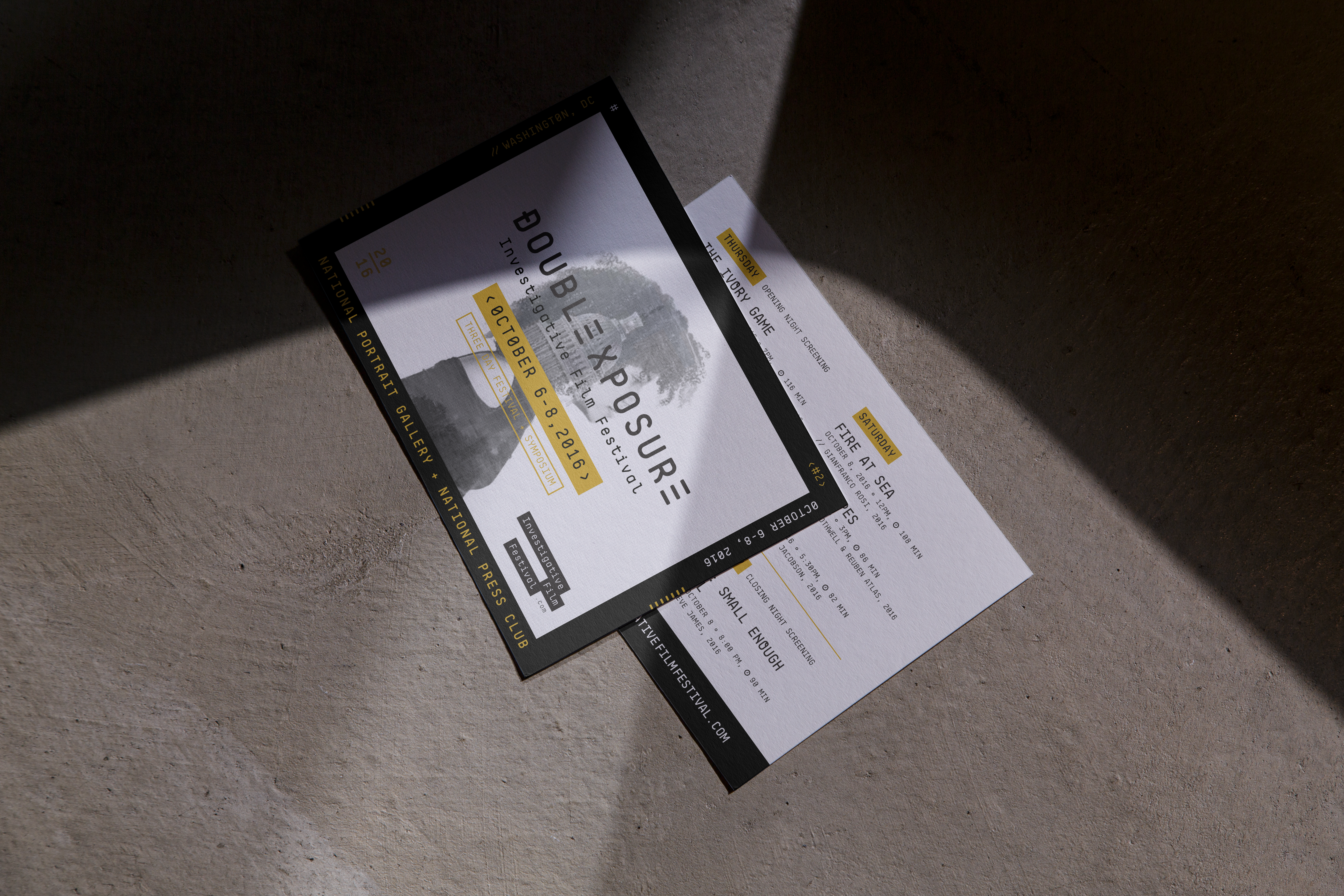
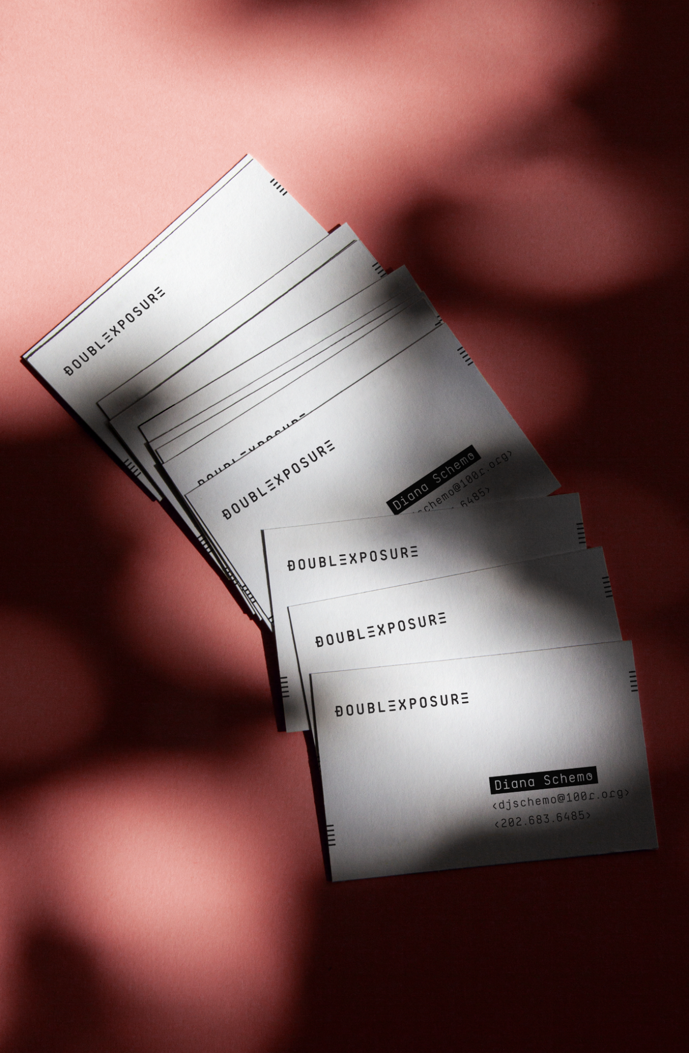
Wristbands. Lanyards. Postcards. Programs. Every piece a festivalgoer touched had to feel like part of the same world.
The print system carries the festival from the mailbox to the theater lobby. Same type, same green, same confidence.

Double Exposure exists because the stories that take the longest to uncover deserve the biggest screen.
Design System
Every element of the Double Exposure system signals the same thing: this festival takes the work as seriously as the filmmakers do.
Color Palette
DX Electric Green
PrimaryBlack
SurfaceWhite
TypographyDX Gold
Original AccentSignal Red
SecondaryGray
MutedContrast Pairings
How the palette colors perform together — text on surface combinations ranked by contrast ratio.
Aa
Black
Aa
White
Aa
DX Electric Green
Aa
Black
Aa
Black
Aa
DX Gold
Aa
Black
Aa
Gray
Aa
Black
Aa
Signal Red
Aa
White
Aa
Signal Red
Type System
Acumin Variable
Schedule / 10:00 AM — Ballroom
Panel 3 — Investigative Methods
Oct 30 — Nov 2, 2025 / Washington, DC
Marks & Lockups
The mark library as delivered — each lockup, badge, and treatment built for a surface the brand ships on.
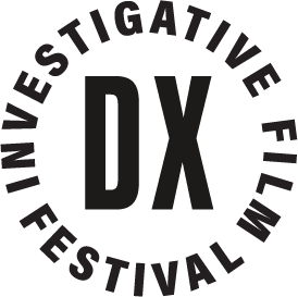
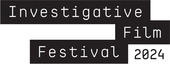
Original Wordmark (2015)
 02
02DX Wordmark (2024)
 03
03Horizontal Lockup
 04
04Stacked Lockup
 05
05DX Monogram (2019)
 06
06DX Circle (2024)
DX Arrow + Year
 08
08IFF Blocks
 09
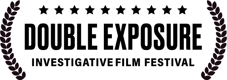
095th Annual Laurels (2019)
 10
10Laurels Horizontal
 11
11Laurels Stacked
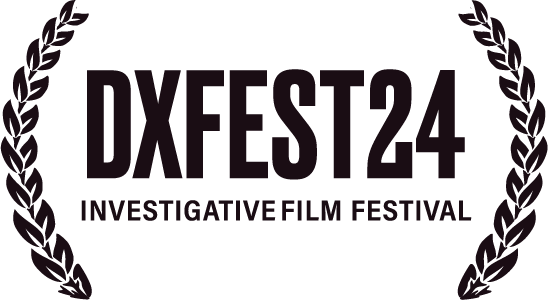 12
12DXFEST24 Laurels
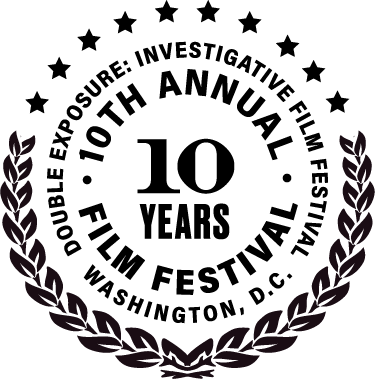 13
1310th Anniversary Seal
 14
1410th Annual Badge
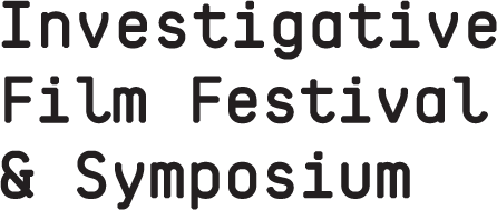 15
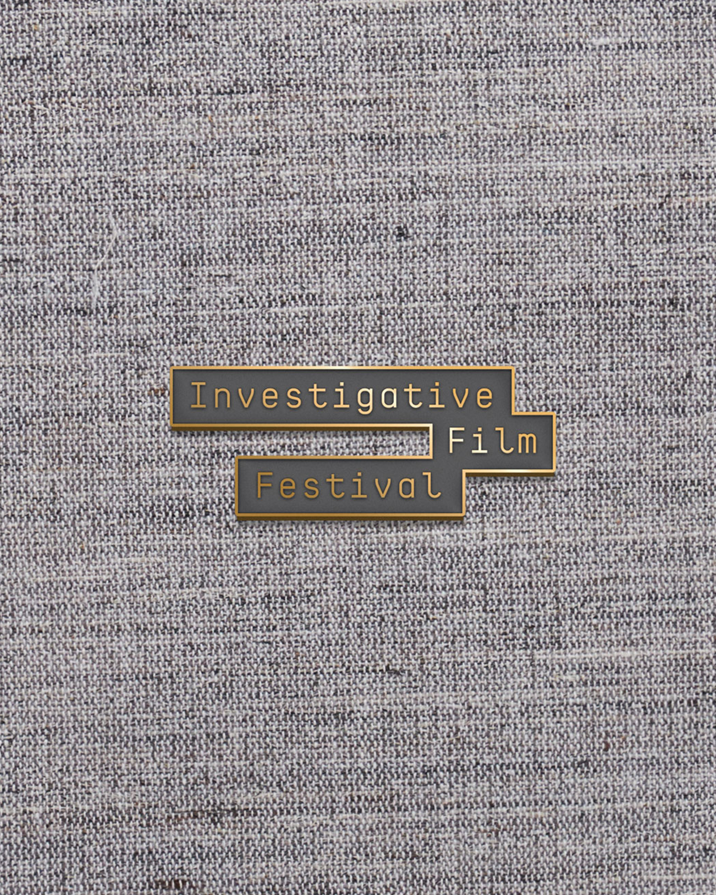
15IFF + Symposium
Social Avatar (DX)
Values
The operating system. What the brand commits to, every time.
The festival is for journalism that earned its facts; standards stay high.
Methods, sources, and intent are visible in the program, not just the films.
Editors, lawyers, archivists, and filmmakers working in the open.
Sources, subjects, and reporters need cover; the festival is part of that cover.
Character (Brand Personality)
Five traits that turn values into behavior.
Intelligent
Programming that assumes the audience reads, thinks, and pays attention. No hand-holding, no dumbing down.
Targeted
Built for journalists and filmmakers first. The specificity sharpens the experience rather than narrowing it.
Distinguished
A decade of consistent programming earned this. The credibility is real, not performed.
Forward-looking
Early on emerging formats, technologies, and voices. Design that feels present without chasing trends.
Brand Pillars (Messaging)
The three things this brand always says — the messages every piece of work ladders back to.
The Investigative Instinct
The festival exists because investigative storytelling matters. Every film selected, every panel convened, every conversation started begins with the same question: what truth needs telling?
Where Stories Land
Washington is not a backdrop. It is the point. Documentary and investigative work hits different in a city where the subjects of these films walk the same streets as the audience.
Beyond the Screen
Screenings are the start, not the finish. Symposiums, panels, and conversations extend the impact of every film past the theater and into the work.
Voice
How the brand sounds out loud — the tone every word inherits.
Lead with the story's stakes, not the festival's credentials.
Talk to filmmakers and journalists as peers. Never as patrons.
Urgency without sensationalism. The work speaks for itself.
From type lockups and photo treatments to press badges and film schedules — here's how the system scales across every touchpoint of the festival.
The 11th Annual
Investigative Film
Festival & Symposium
Oct 30 – Nov 2, 2025
Washington, DC
Druk Bold on neon surface
Black text only on green — white is illegible on this neon surface. The system's strictest rule.
Secondary Accent
Signal Red — links, hover states, urgency against the neon
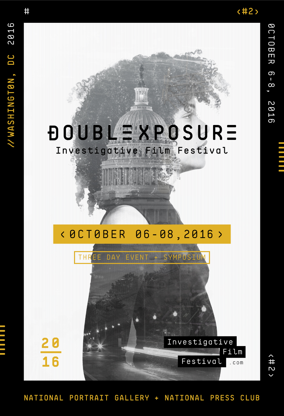
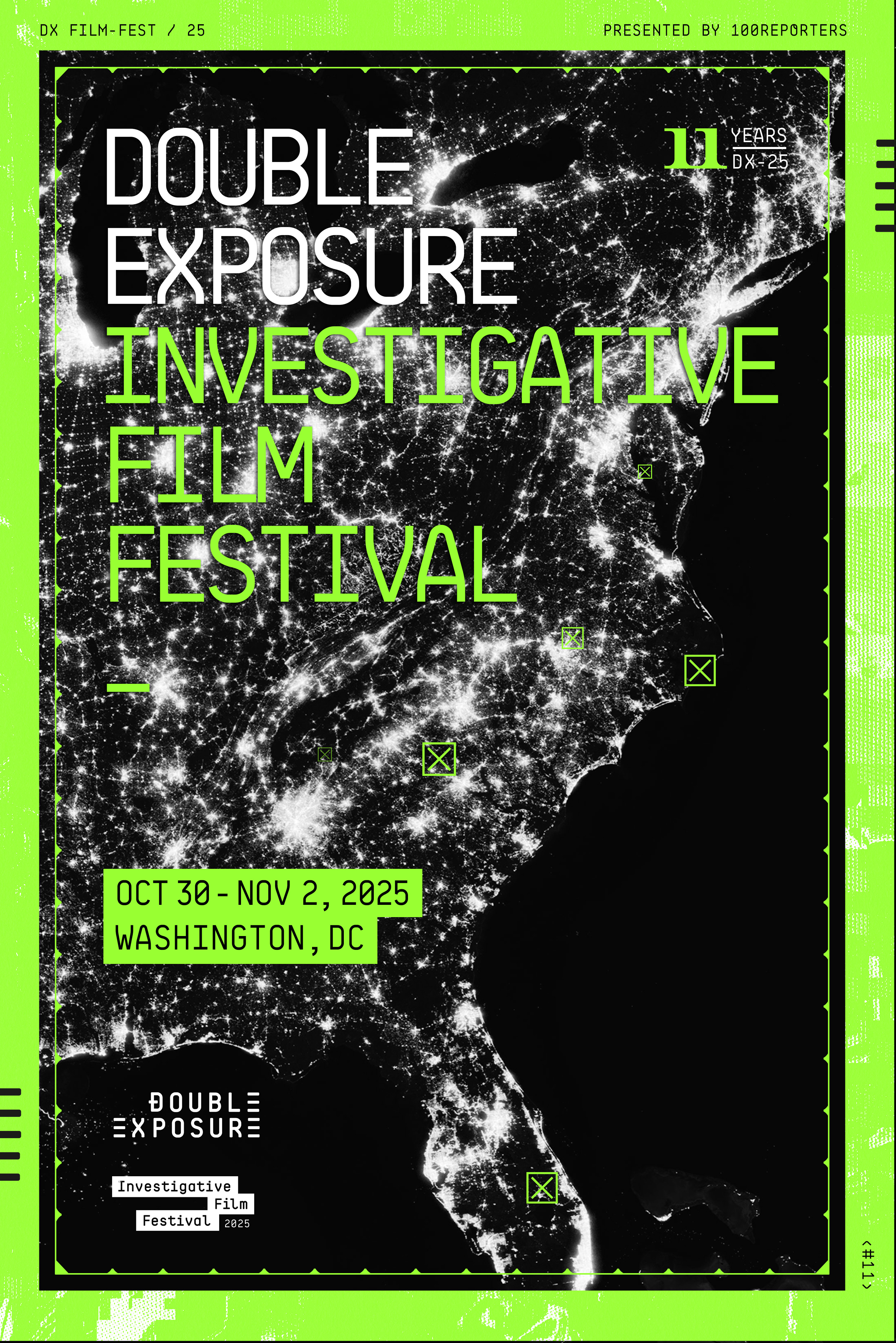
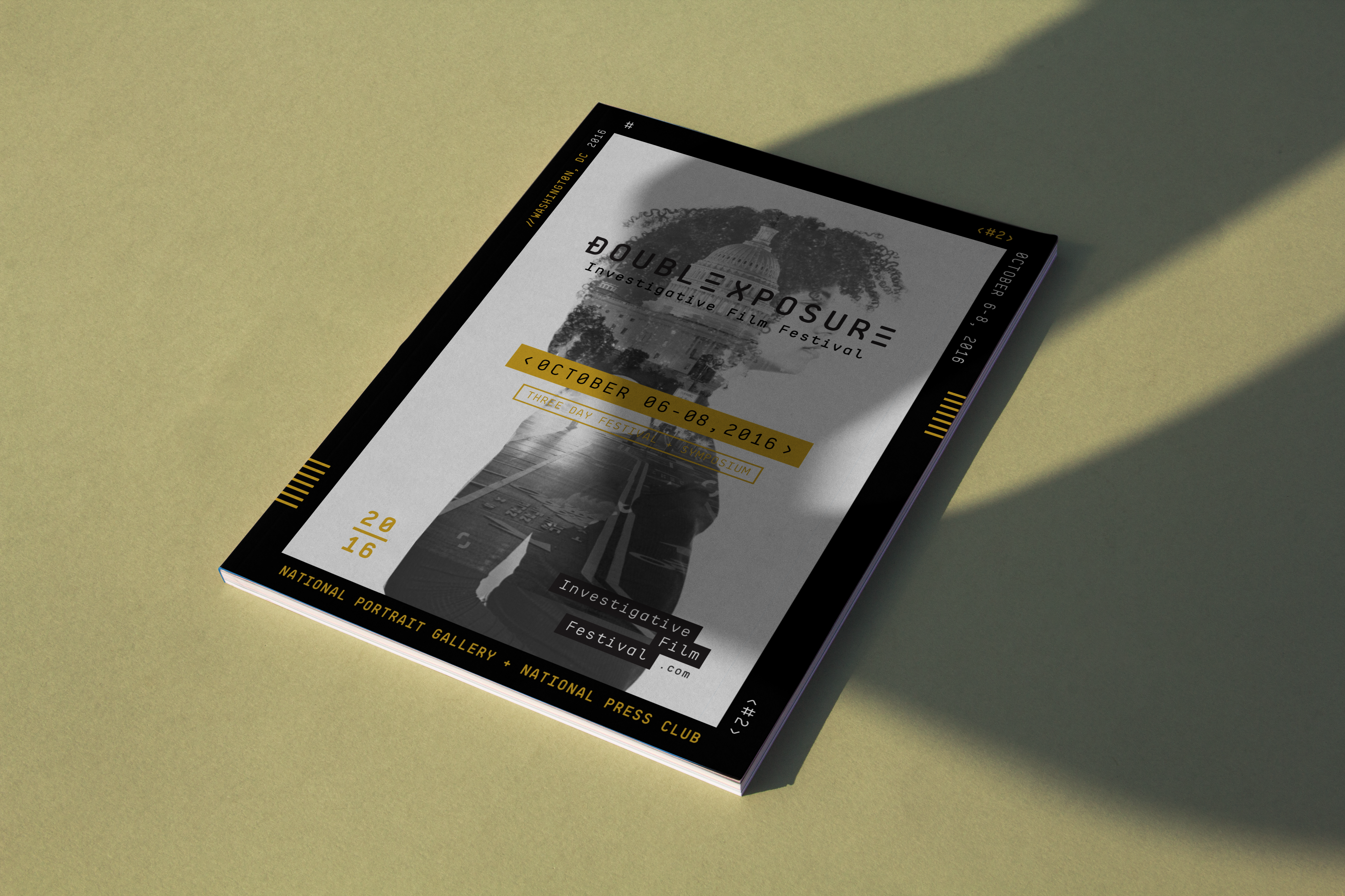
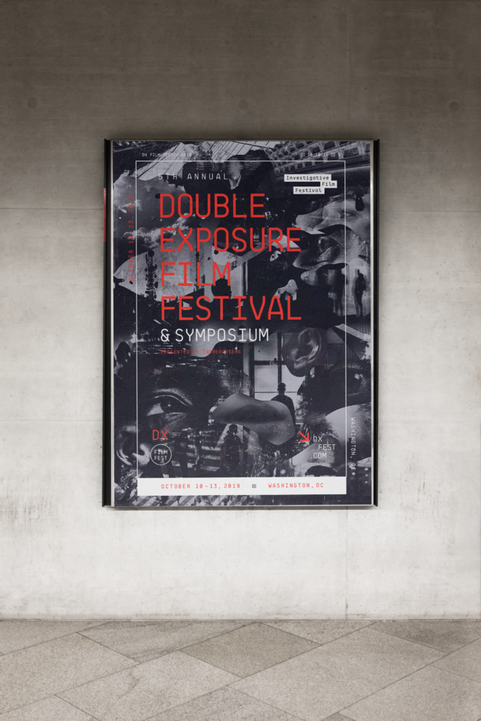
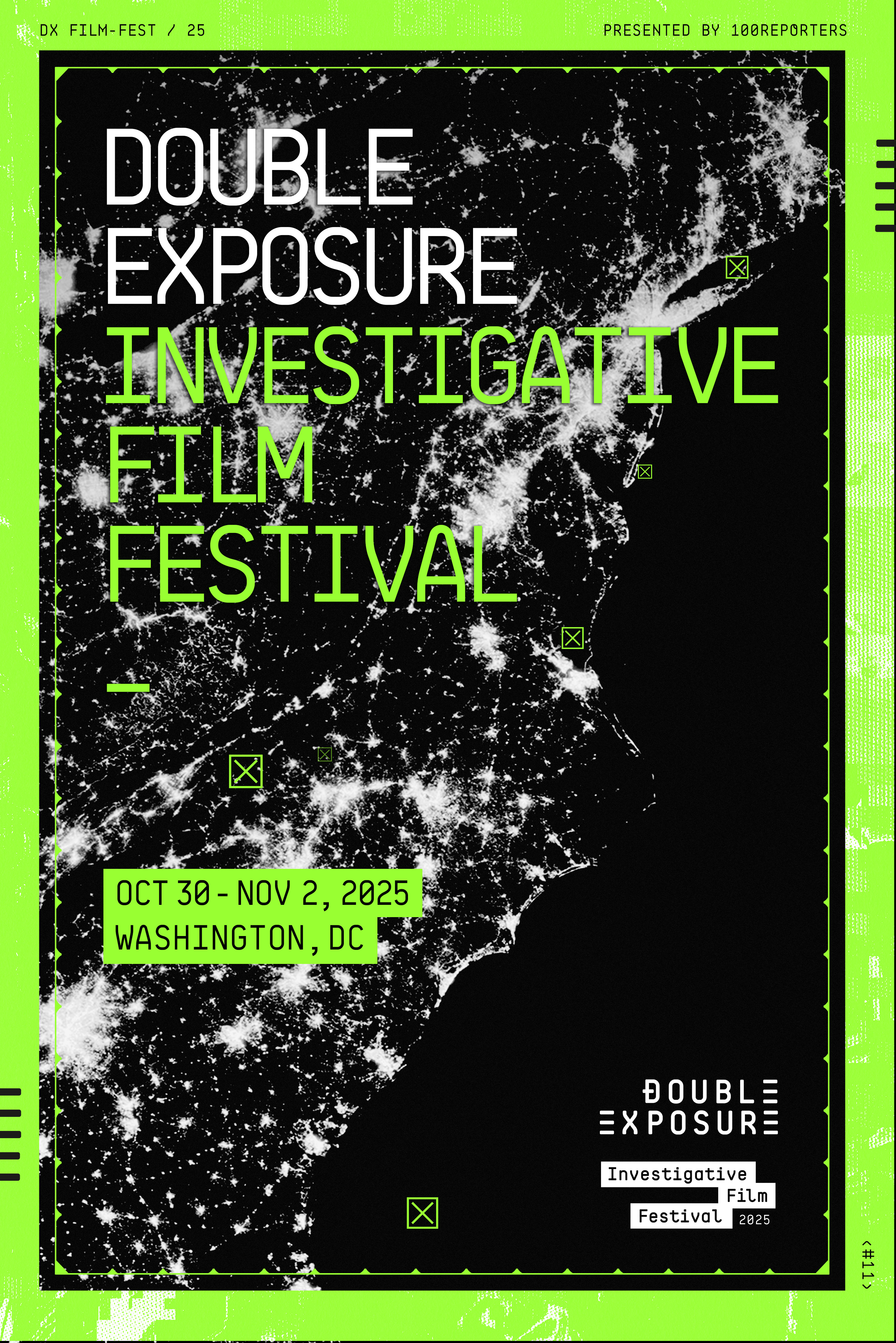
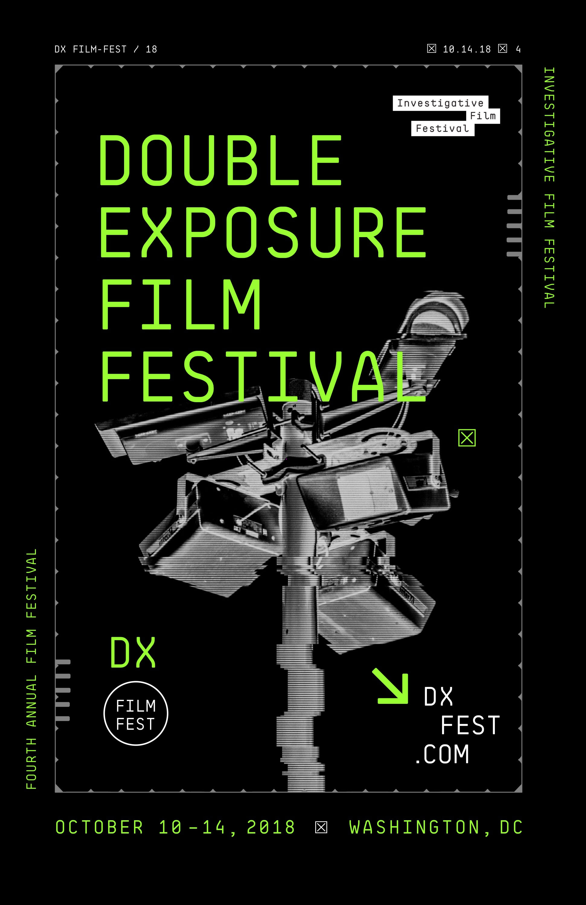
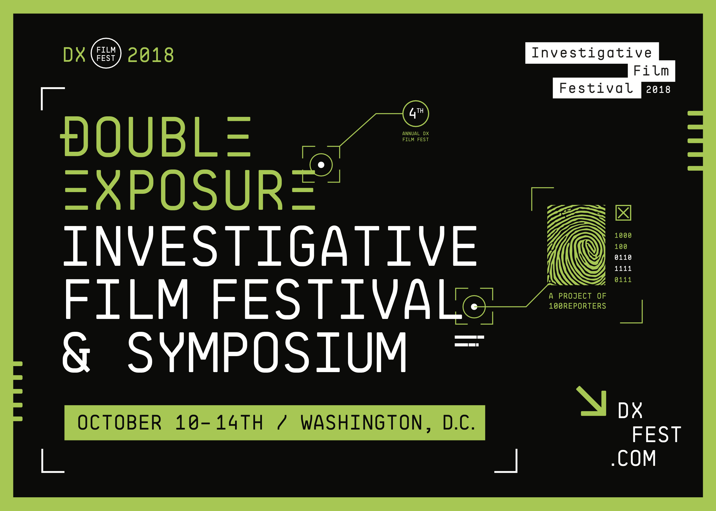
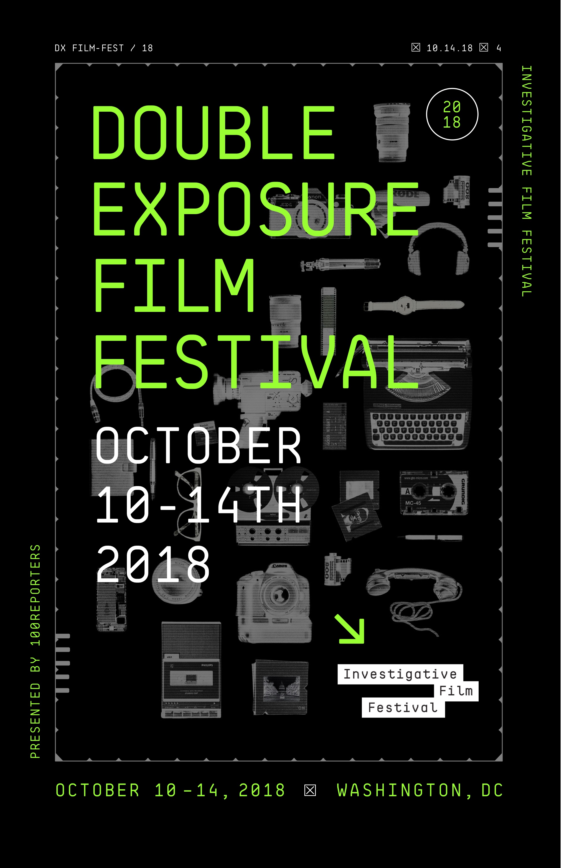
The festival launched in 2016 with a warm gold accent and double-exposure photography. By 2018, the electric green became the signature — but the modular system was always built to accommodate a rotating spot color each year, giving each edition its own energy while the structure stays locked.
High Contrast
B&W, boosted contrast, crushed blacks
Green Duotone
Multiply blend, brand green at 60%
Grain + Scanlines
Heavy noise, CRT scan-line bars

Light Editorial
Desaturated, blown highlights

2025 Official Selection
Documentary98 minInvestigative Documentary · 2025
Feature112 minInvestigative Documentary · 2025
Spotlight90 minInvestigative Documentary · 2025
Collateral Components
Sarah Chen
The Washington Post
Press Credential
DX Film Fest / 25
Screening Pass
Dir. Unknown · 98 min · USA
Fri, Oct 31
7:30 PM · Ballroom
Screening Ticket
Interactive Elements
National Press Club
Washington, DC
Opening Night Reception
National Press Club
Opening Night Film
Ballroom
Closed Doors, Open Wounds
Conference Room
Fog of Falsehood
Ballroom
Race in Real Time
Ballroom
Feature Presentation
Ballroom
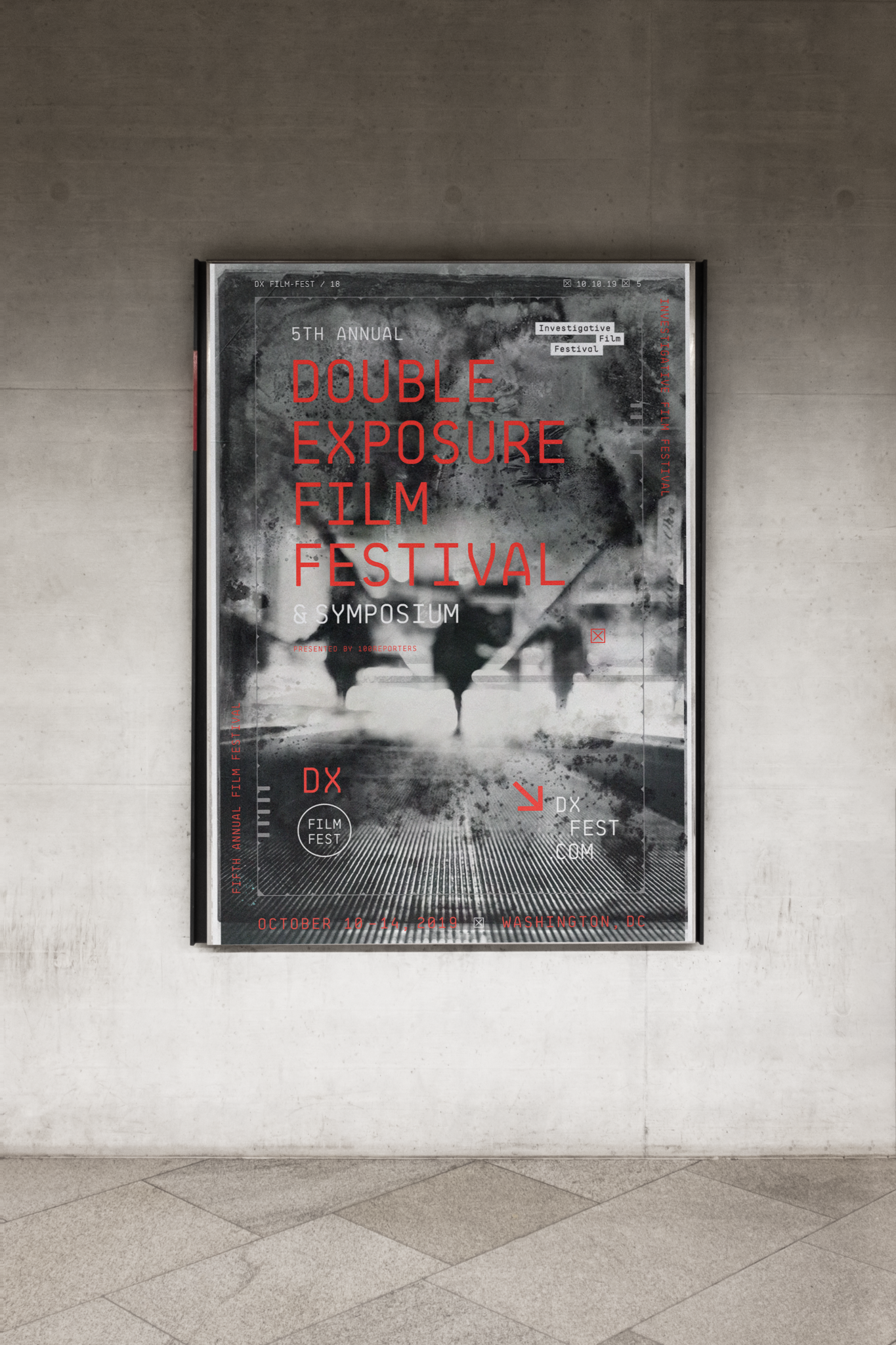
From a scrappy first-year festival to a nationally recognized institution — the brand system grew with every poster, badge, and screen. Each year brought new imagery and energy, but the underlying system never wavered.
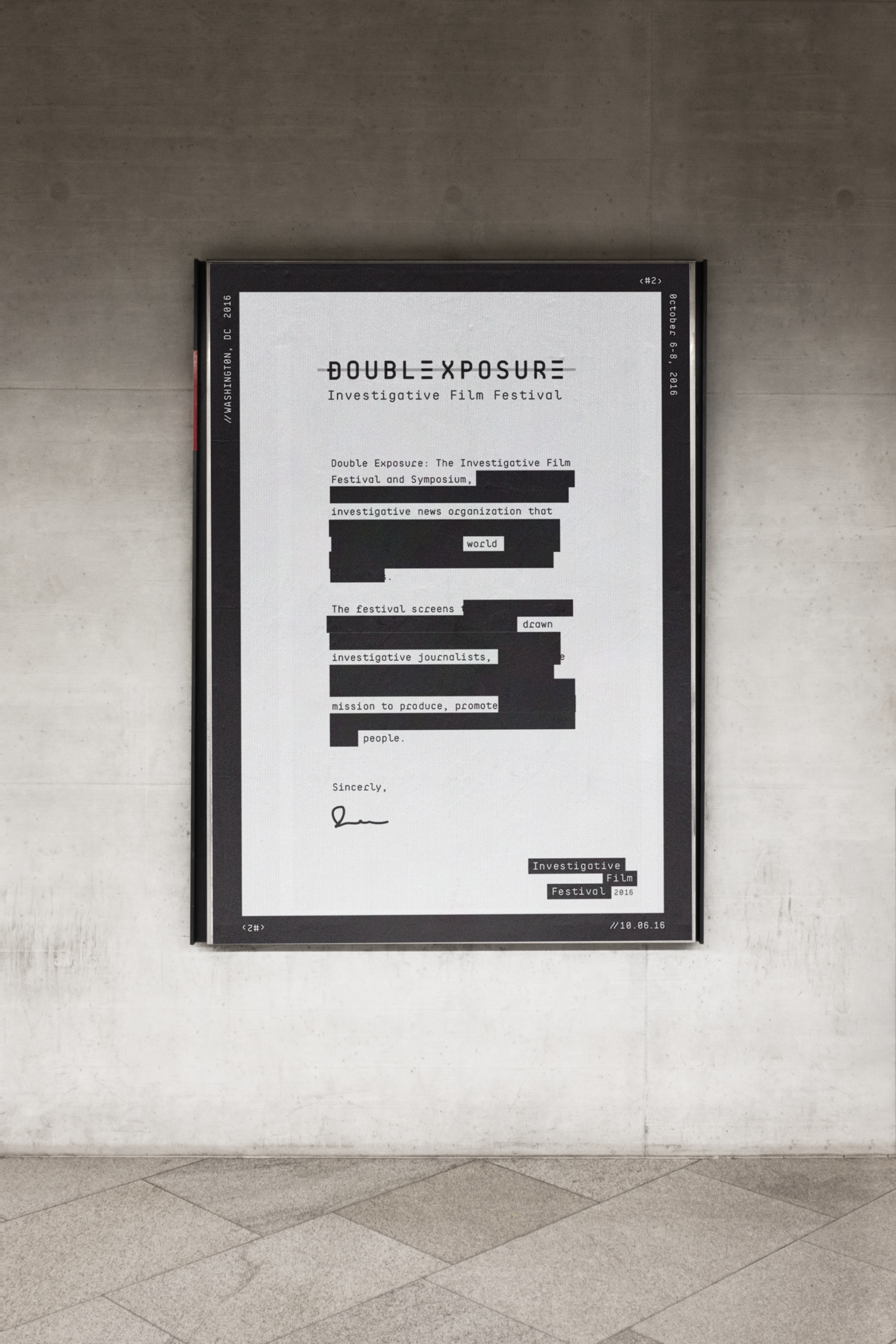
Brand launch. Gold accent, double-exposure photography, the identity takes shape.
Electric green arrives. Three poster variants for a single year — the system matures.
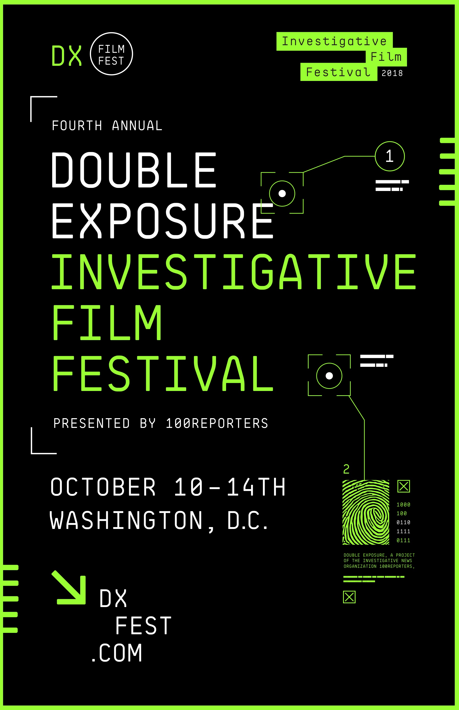
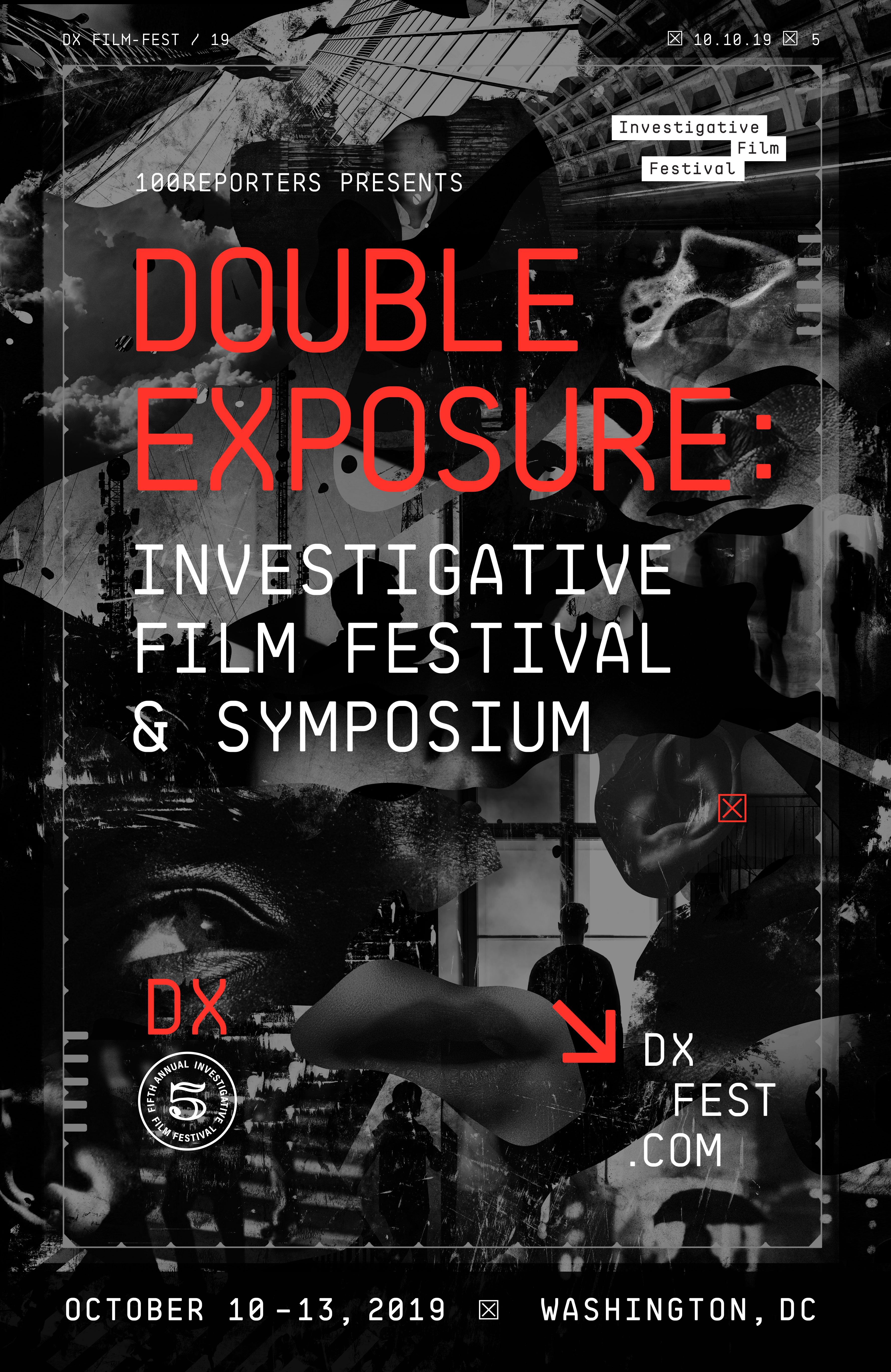
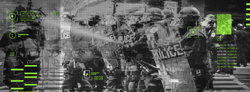
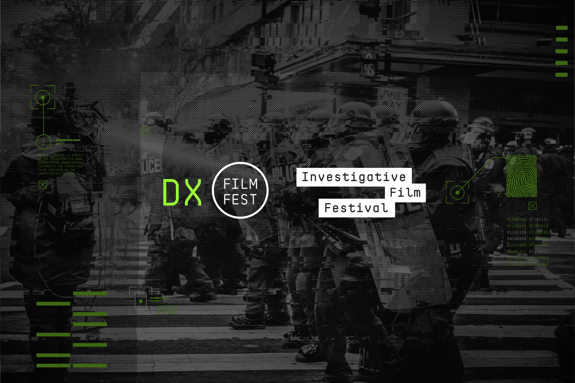
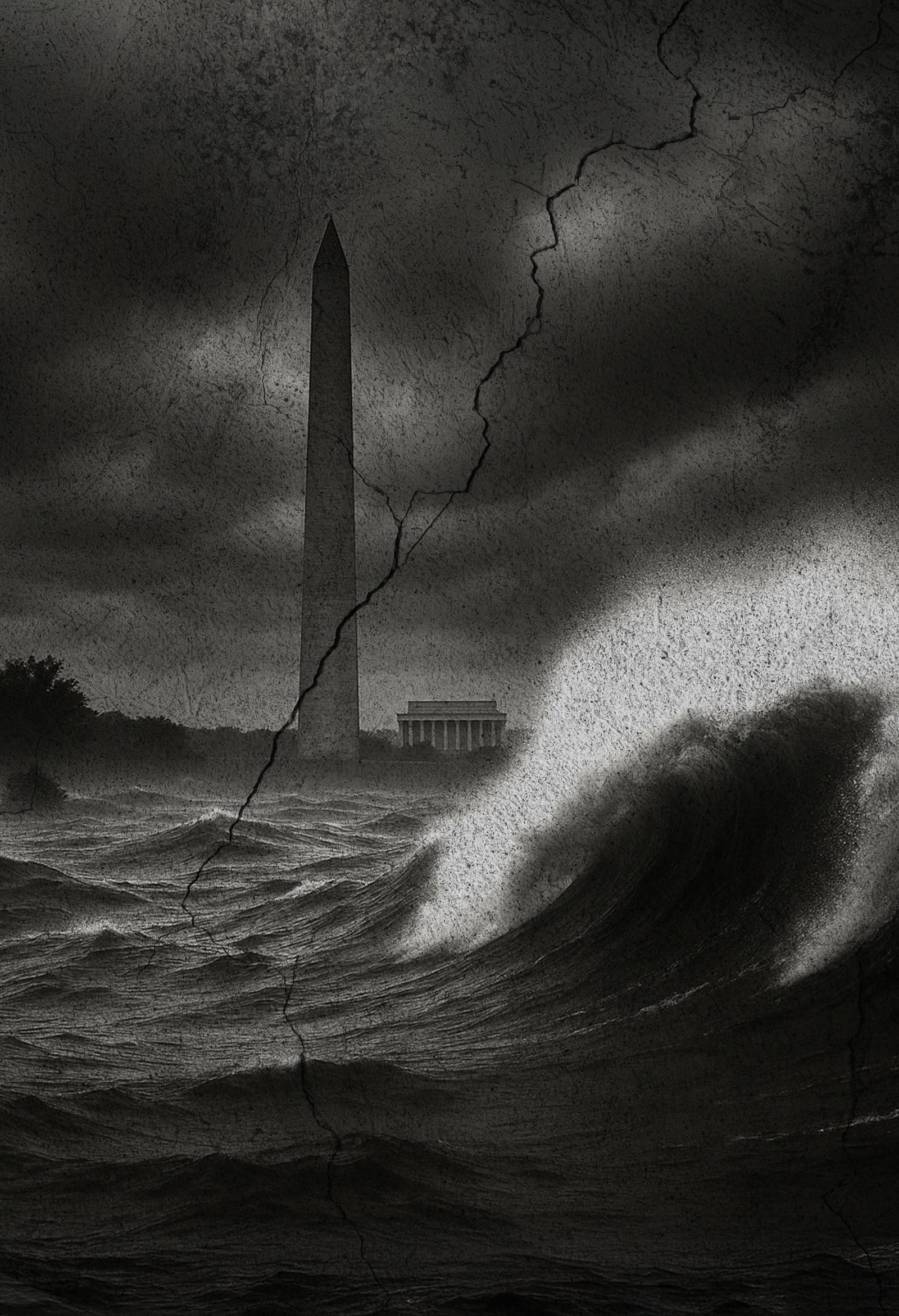
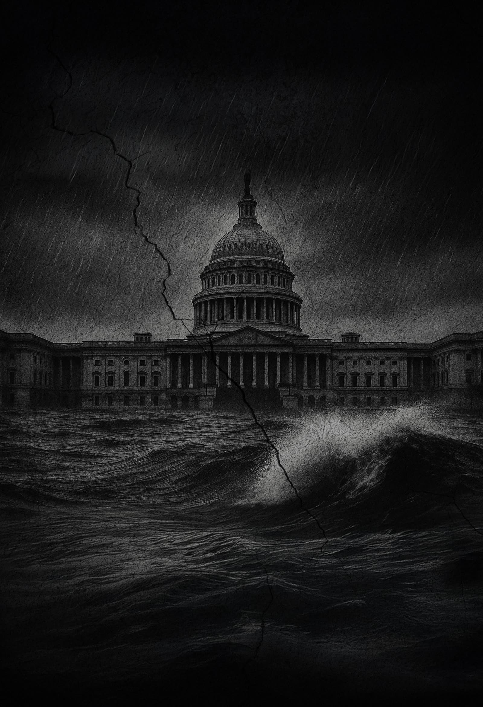
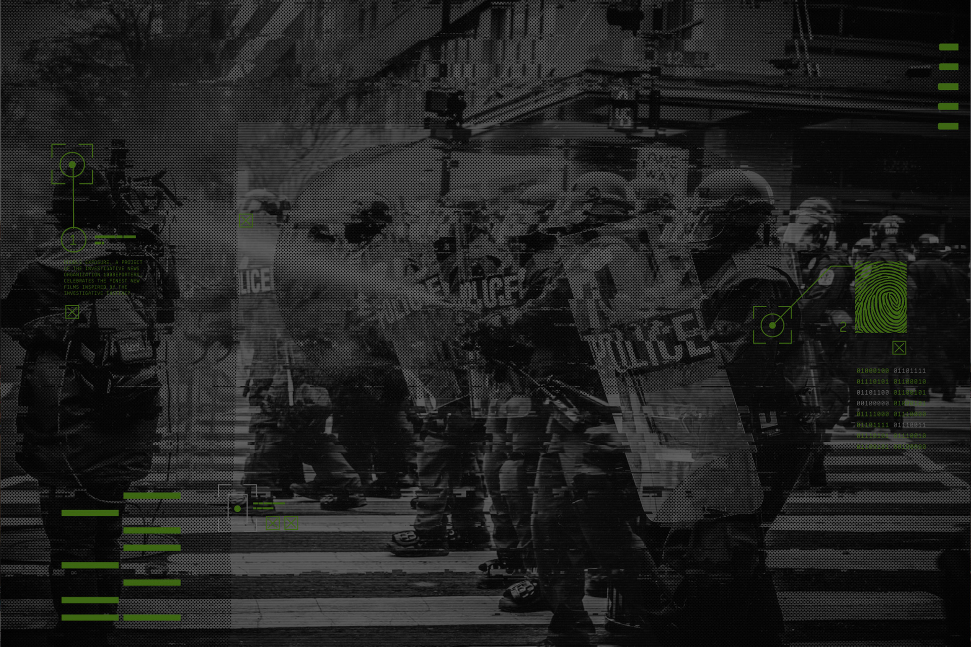
Surveillance camera imagery, fingerprint graphics — the investigative instinct visualized.
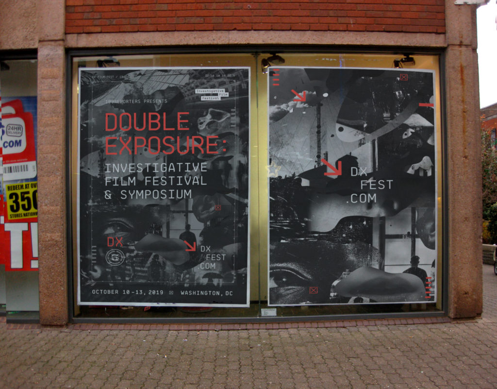
The system holds. Environmental mockups prove scale from screens to signage.
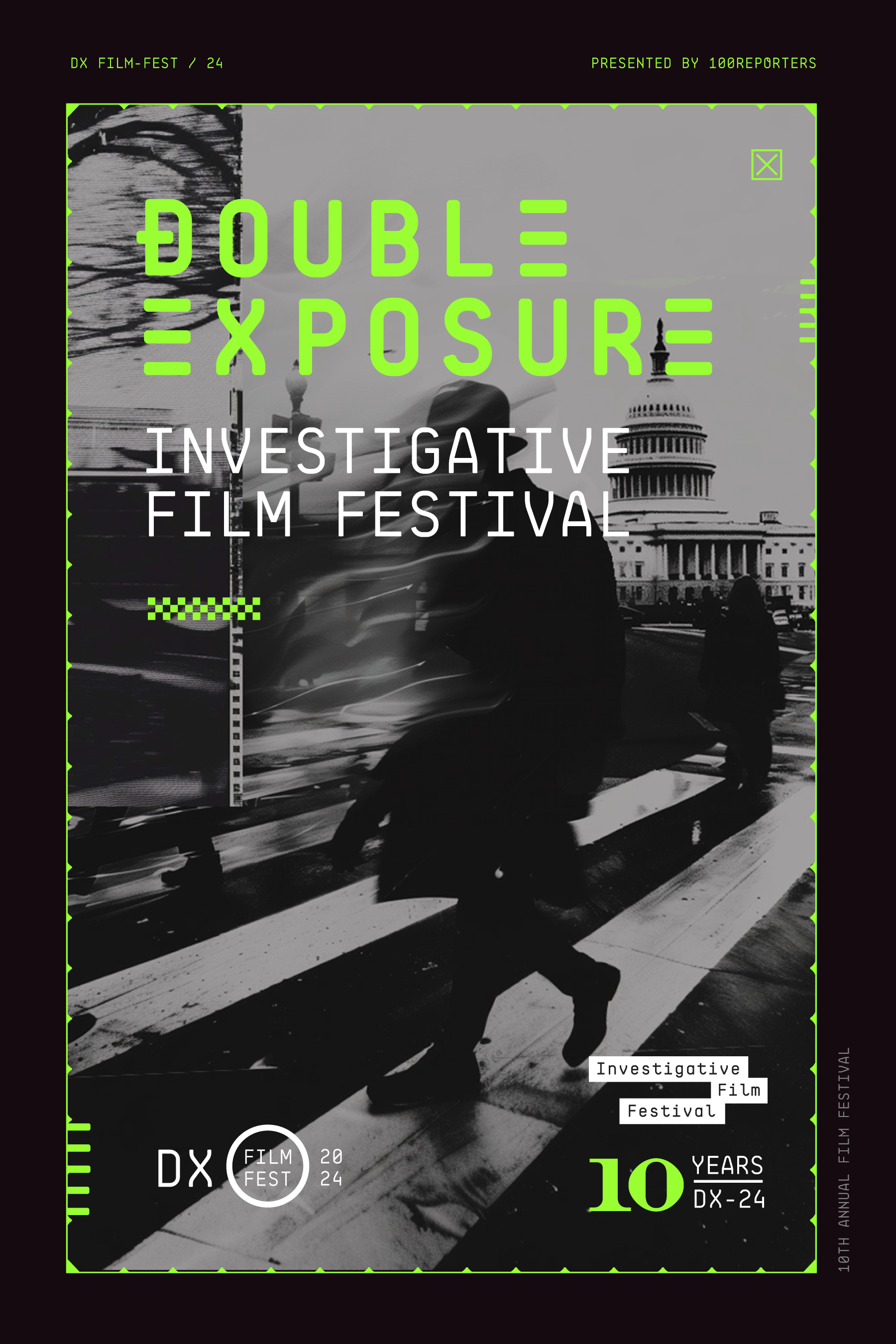
10th anniversary. Double-exposure photography returns, now with the glitch aesthetic.
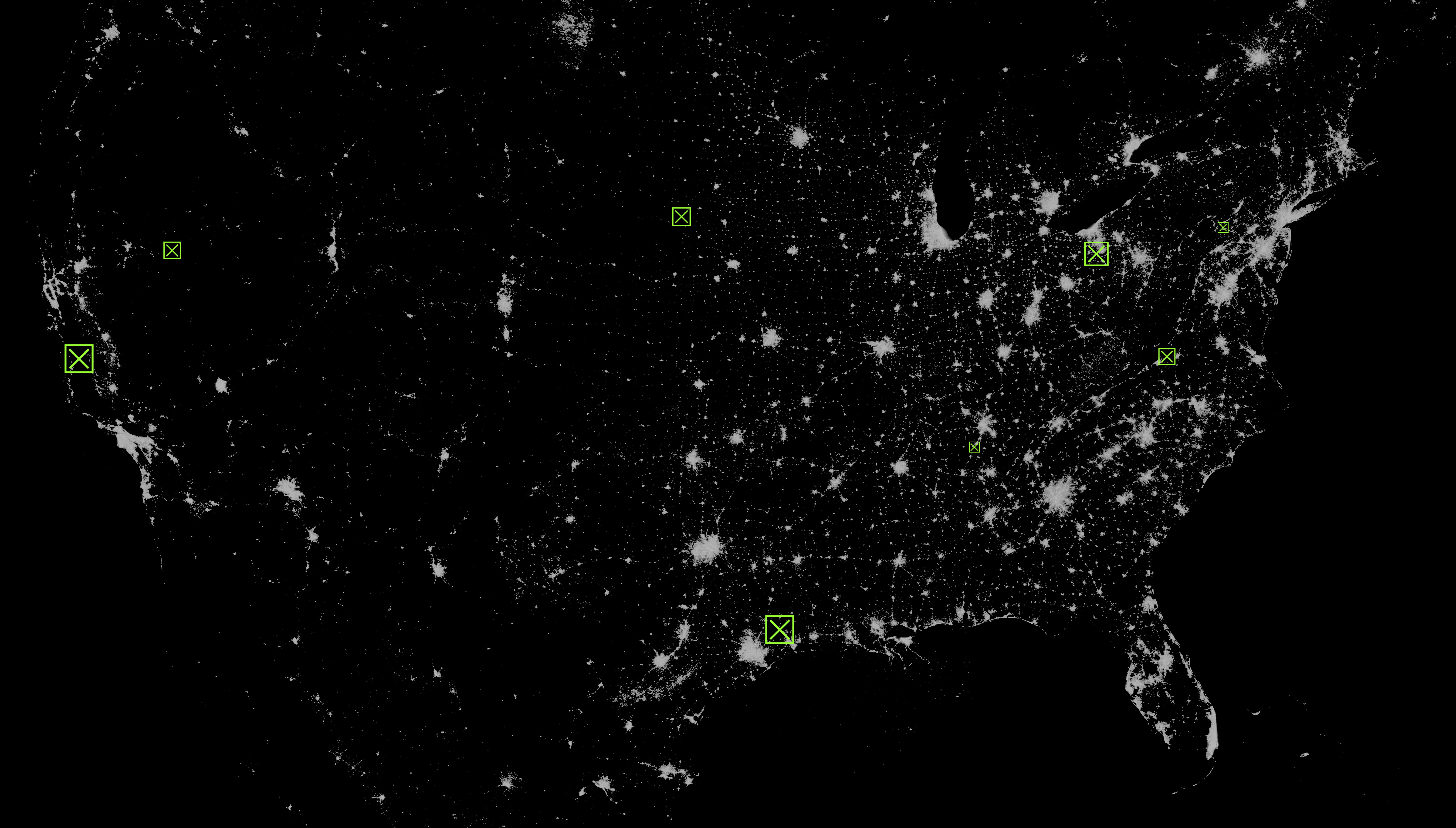
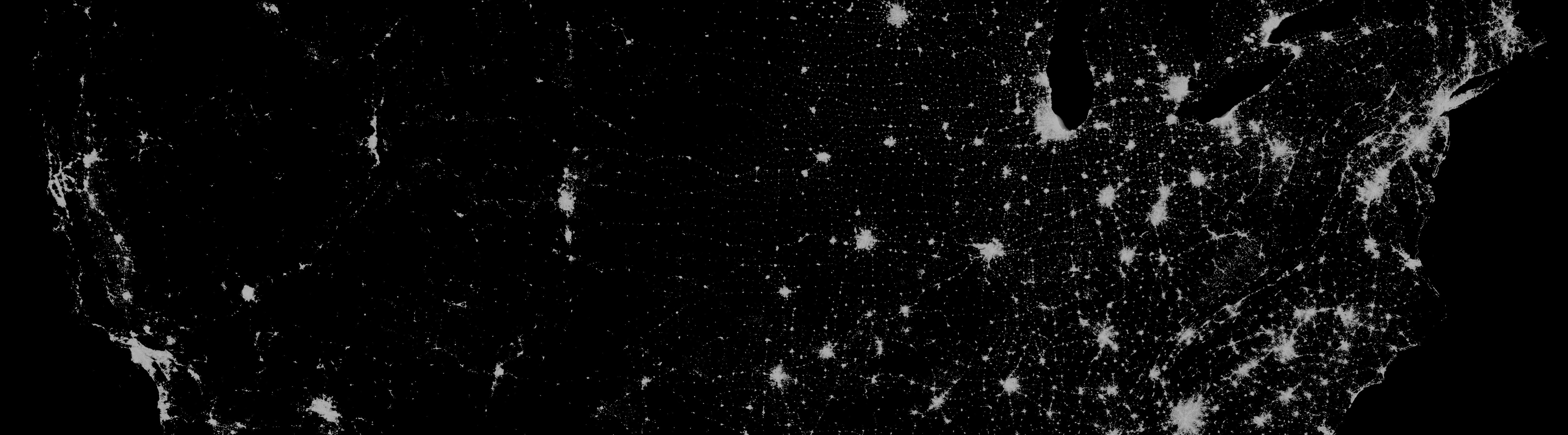
11th year. Satellite surveillance imagery — the system at full scale.
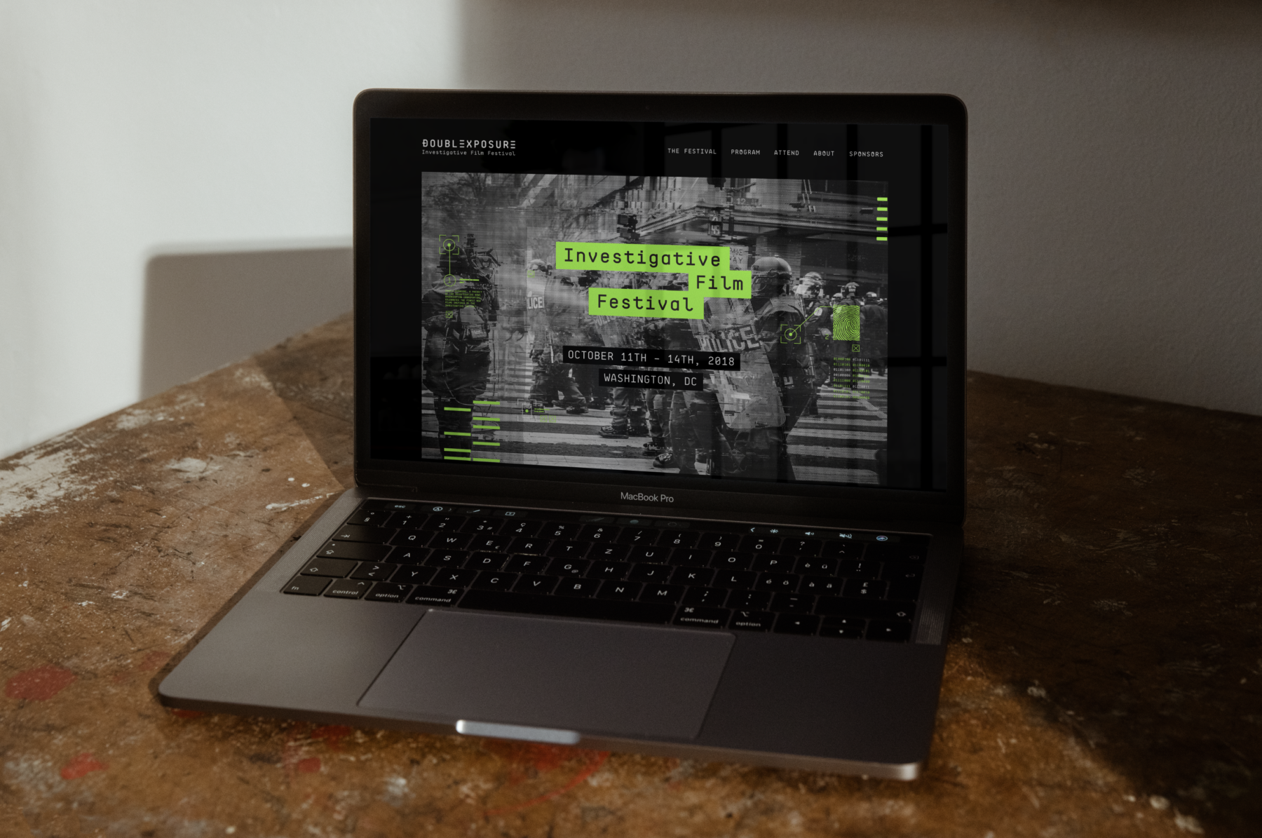
The identity holds together across the website, social, and email. Same monospaced type. Same electric green. Same surveillance-inspired graphic system.
A brand earns its keep when it survives the jump from print to a 1080-pixel square. Double Exposure does.
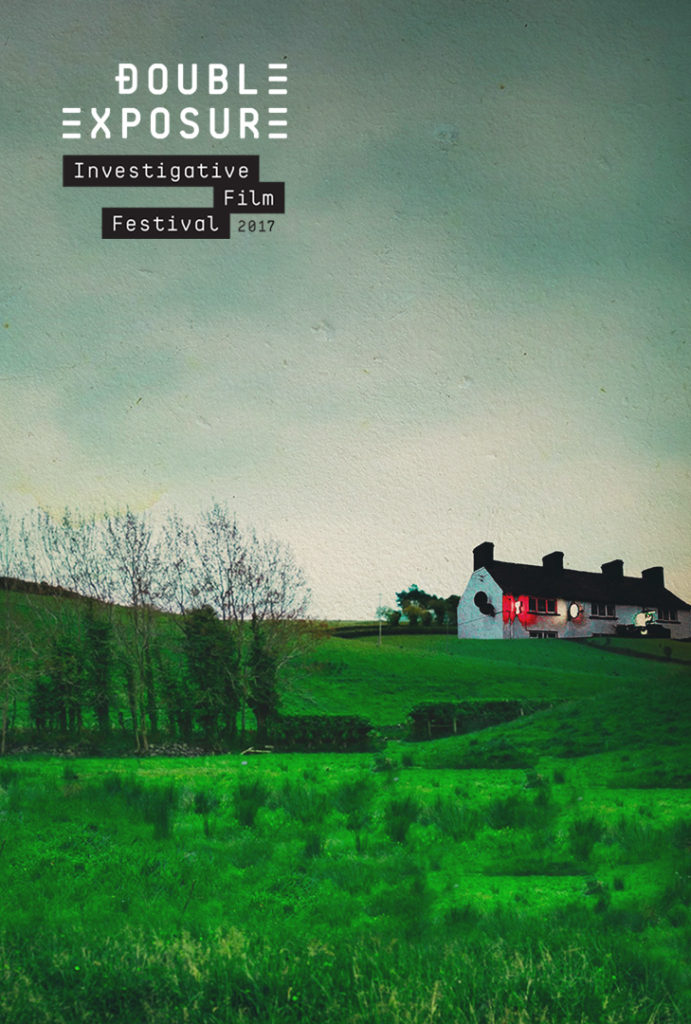
The DX identity extended to co-branded posters for featured films, proving the system could flex across wildly different subject matter while staying unmistakably Double Exposure.
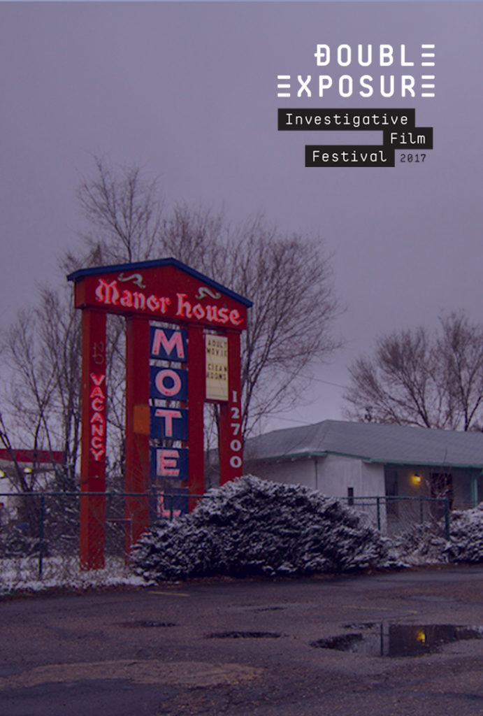
Each year’s official selections received co-branded poster treatments that paired the festival’s typographic system with the film’s own imagery. The result: a consistent curatorial voice across documentaries spanning everything from Northern Ireland to American roadside motels.
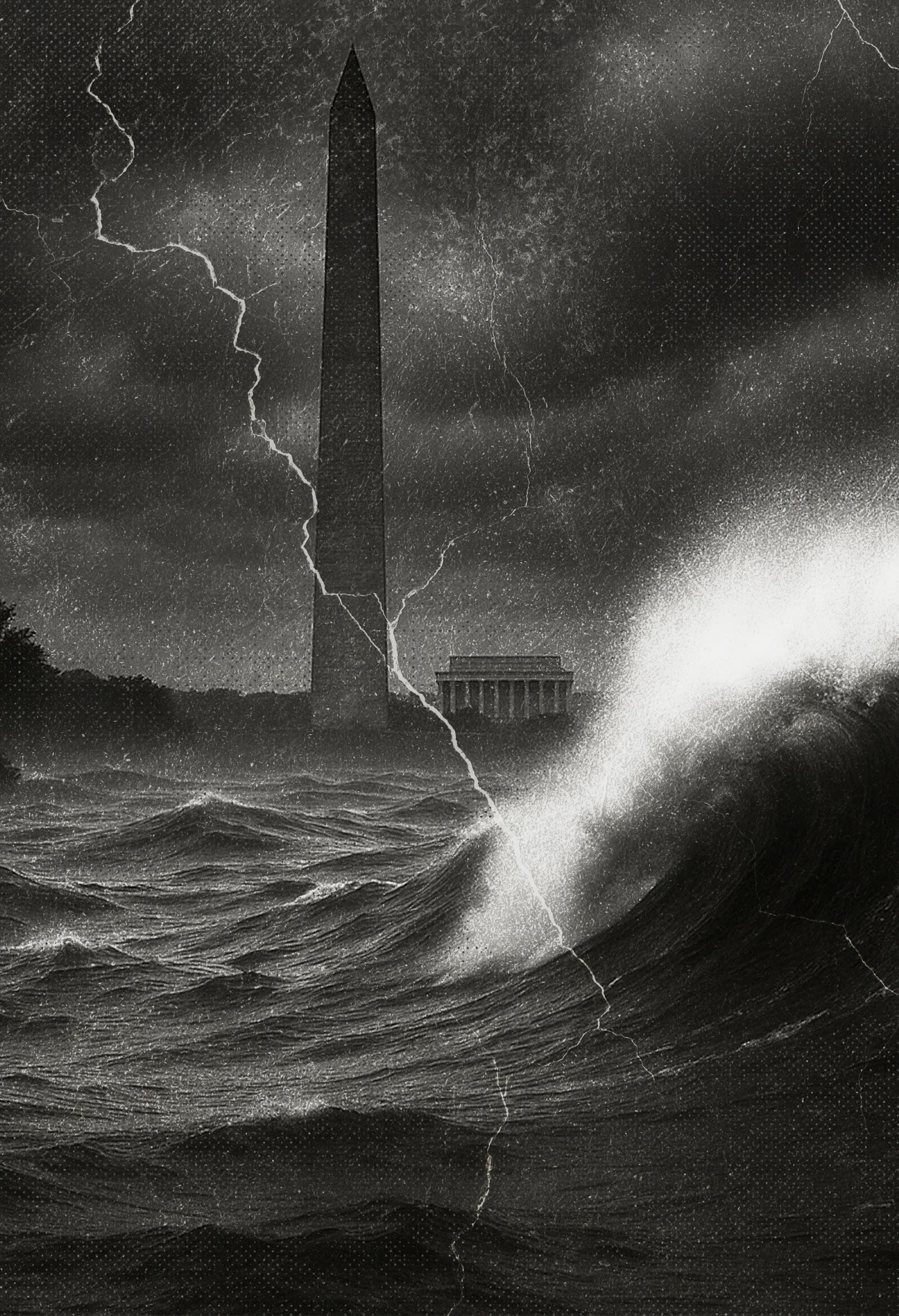
A double exposure layers two images into one frame. So does investigative journalism. The story you see, and the story underneath it.
That tension drives the identity. Monospaced type as evidence. Electric green as the signal cutting through. A system built to hold the work without ever overshadowing it.
A studio practice of composite image-making, run alongside the festival’s ongoing visual archive.
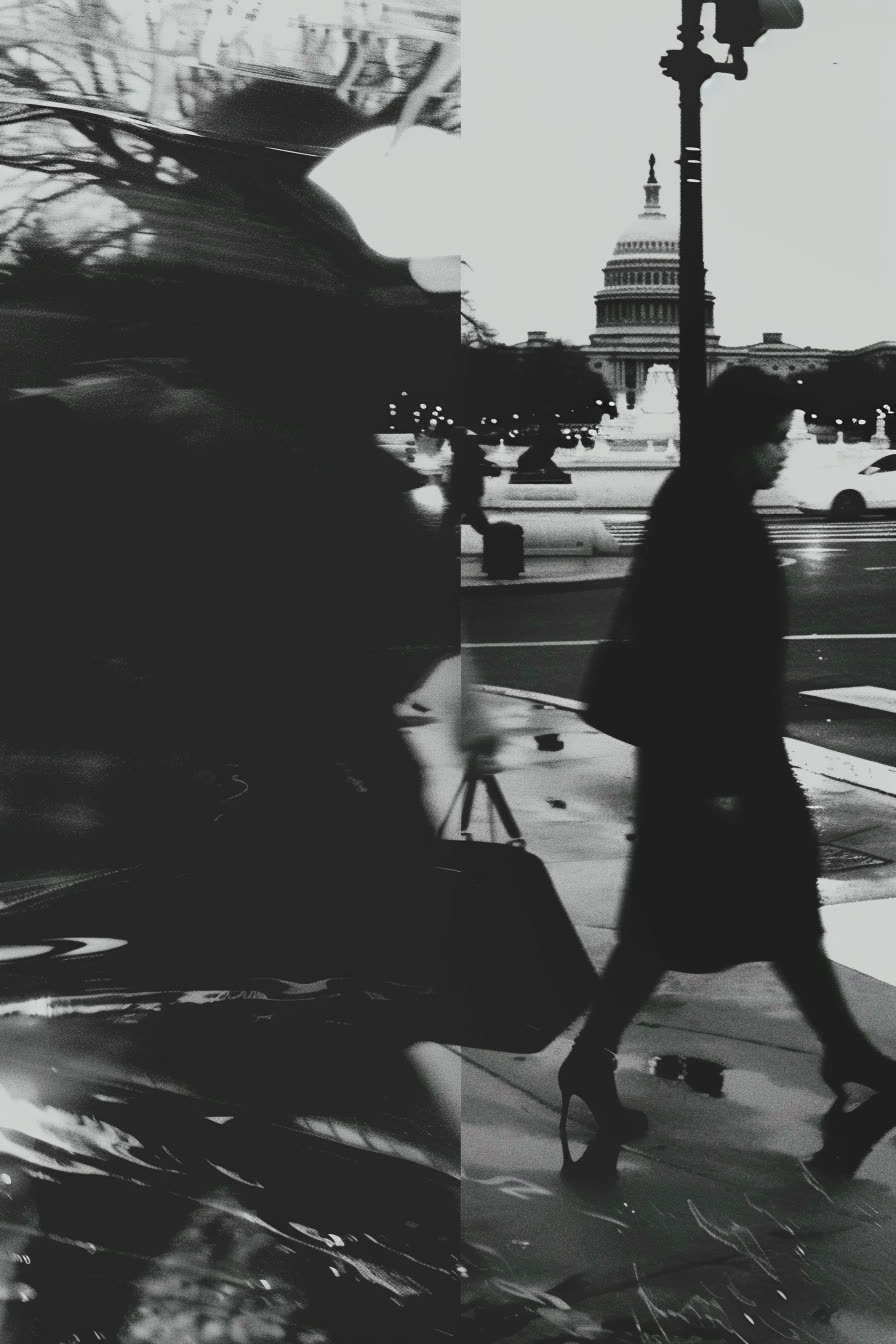
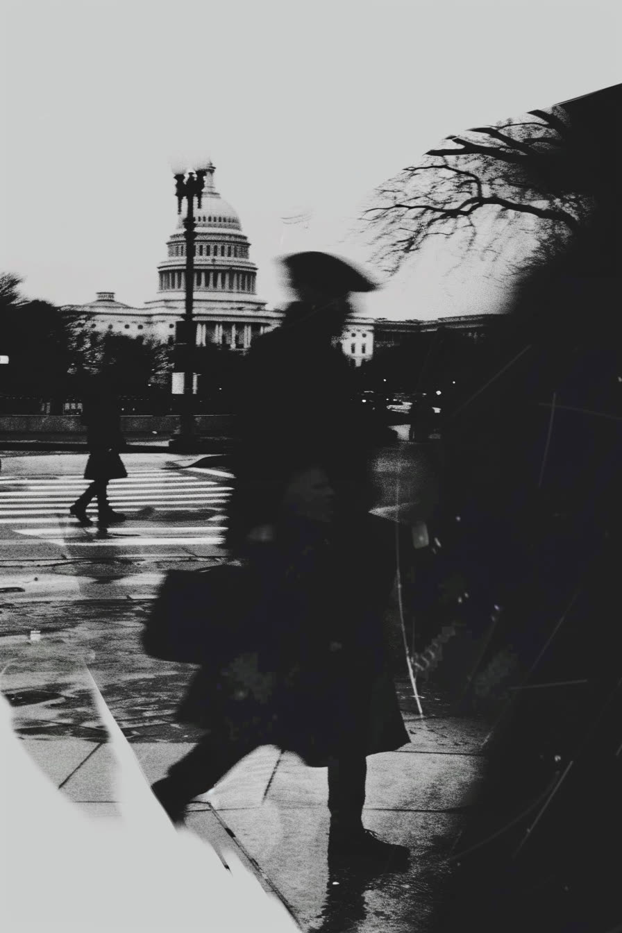
A latent image is the one already on the film, before it’s developed. We borrowed the term for a parallel track of process work: feeding the festival’s source library (surveillance stills, redacted documents, satellite plates, archival photography) back through new image-making tools to see what surfaced.
None of these studies shipped as a finished poster. They worked the way studio sketches always have. Pressure-test the visual language, find the next composition, throw most of it out. The ones that held up fed into poster underlays, motion textures, and editorial backgrounds across DX24 and DX25.
Same brief as every other tool in the studio: serve the system, never overshadow the work.
The marks, the palette, the type, and the designed work that carries them. One source feeds the live brand and this wall. Click any tile to open it.

