Pointer.Digital

Get to the point.

Workhorse was approached over the summer of 2019 to brand a new DC digital marketing agency whose founders' strengths sat in politics, but whose ambition reached past it. The challenge was to make an identity that read as trustworthy enough for a political campaign without locking the firm into one. The name came from the founder's German Shorthaired Pointer; design research said a dog mark would do the opposite of what the brand needed. So Workhorse pivoted to the dot in the name, set the name in Recoleta, and built a system around the point. The dog survives as a secondary mark, used sparingly.

The brief.

Pointer.Digital is a DC digital marketing agency founded in 2019 by operators out of political campaigns, with an ambition that reached past them. They came to us that summer for a name mark and an identity. The brief was to land an identity trustworthy enough for a political campaign without pigeonholing the firm into one party. Five brand themes anchored the work: Community Connection, Collaboration, Protection, Change, Honesty.

The name came from the founder's family dog, a German Shorthaired Pointer. The presumed visual route was a dog mark. Design research said no. A dog mark would have done the opposite of what the brand needed. The pivot was small and decisive. Keep the name. Move the visual centre to the dot.

01Logo
The Pointer.Digital name in white Recoleta black serif with the orange dot replacing the period, over a desaturated photograph of a DC street looking toward the Capitol Dome, with the tagline "Get to the point." in italic serif below

The name mark.

The name sets in Recoleta black, a high-contrast modern serif. The orange dot replaces the period in Pointer.Digital, doing double duty as the period in the URL and as the brand's focal mark. The tagline "Get to the point." sits in italic underneath, speaking to the straightforward attitude the firm brings to projects in an industry that loves to spin.

It holds on cream for everyday use, over the DC street photograph for press, and on a full Pointer Orange field where it needs to be loud.

02Type
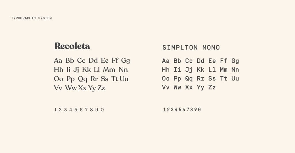
Brand book page showing the typographic system: Recoleta black serif on the left with alphabet and numerals, and SIMPLTON MONO geometric monospace on the right with matching set

Two typefaces.

Recoleta does the display work: black for the name, light italic for the tagline, regular for headlines. SIMPLTON MONO carries the small print, the captions, the footnotes, and the brand book’s own section headers ("TYPOGRAPHIC SYSTEM", "SECONDARY BRAND ELEMENTS"). Together they read as established without landing in either party’s preferred typeface bin.

03System
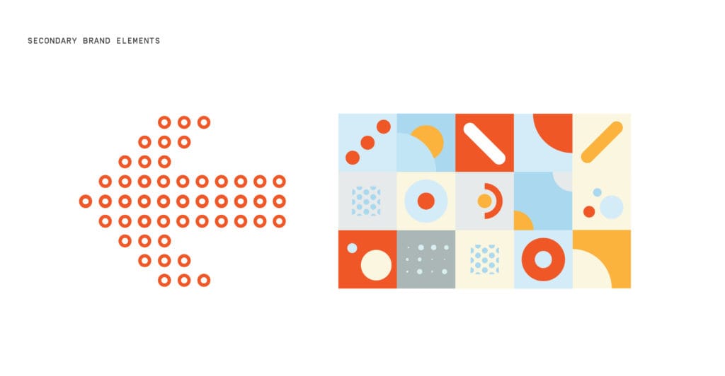
Brand book page showing secondary elements: an arrow made of orange ring-dots in triangular formation, and a 15-tile pattern grid of circles, dots, diagonal slashes, and half-circles in cream, sky blue, sun yellow, and orange

The dot as a system.

Anchoring on the dot bought a whole vocabulary. Secondary elements turn it into an arrow, a triangle of orange ring-dots, and into a 15-tile grid of circles, dots, diagonal slashes, and half-circles in cream, sky, sun yellow, and Pointer Orange. Social posts, presentations, and printed pieces can all be built from those parts without repeating the logo every time.

Pointer.Digital relaunched with the new identity in September 2019.

What are you working on?

Studio for founders, experts, and the institutions they run.

Living, working brands. Built with your team to keep growing.

© 2026 Workhorse Collective, LLCPrivacyTerms