Ideal State

Change is the new status quo.

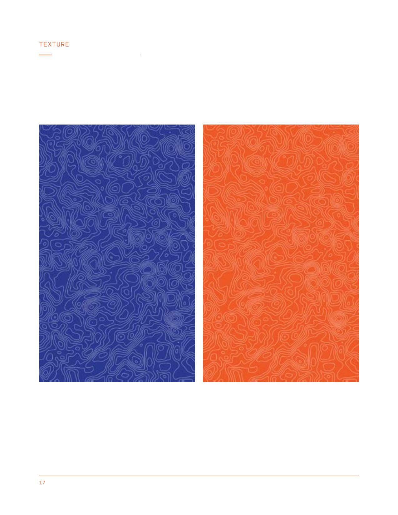
Ideal State was a civic-technology consultancy that built knowledge architectures for nonprofits, foundations, and public-sector groups. Workhorse built the brand out from the founding idea: a logo that reads as a pronunciation key, the Cartograph family in its sans and mono versions, a contour-line texture running underneath, four sub-brands written as filepaths, and a full set of document templates so the practice could produce the work it was hired to do.


The brief.

Ideal State was a civic-technology consultancy that designed knowledge architectures for nonprofits, foundations and public-sector groups: the tools, files and teams an organization runs on, made into one working system. It came to us in 2016 as a new practice with a name, a point of view and no visual identity, and asked for a brand that would say what the work was before anyone read a paragraph, plus the templates to produce that work in.

We delivered the identity in 2017: the mark, the Cartograph family, the color and texture, four sub-brands written as filepaths, and a document set covering the white paper, the deck, the one-sheet, the stationery and the process map. The practice is archived now, and this page and the brand book at /brand/ideal-state are the record of it.

01Practice
The practice.

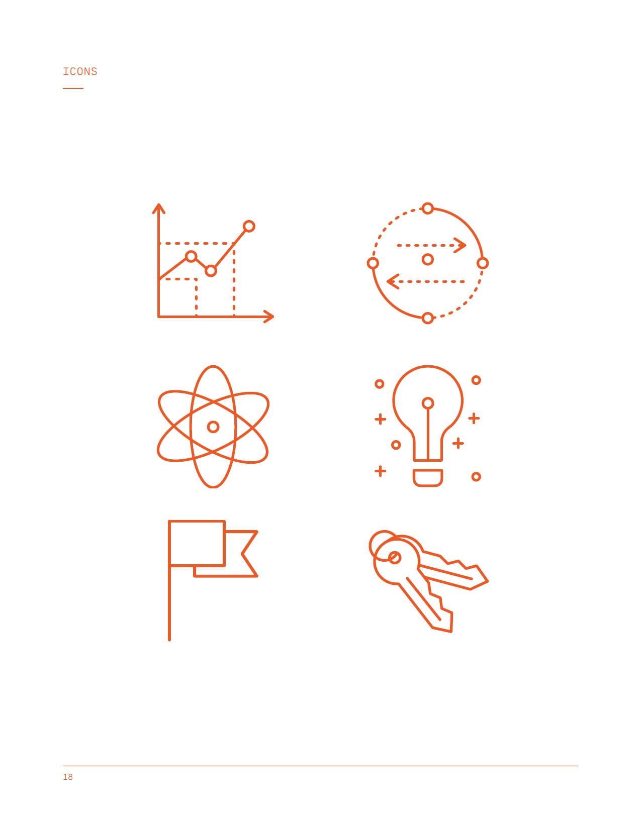
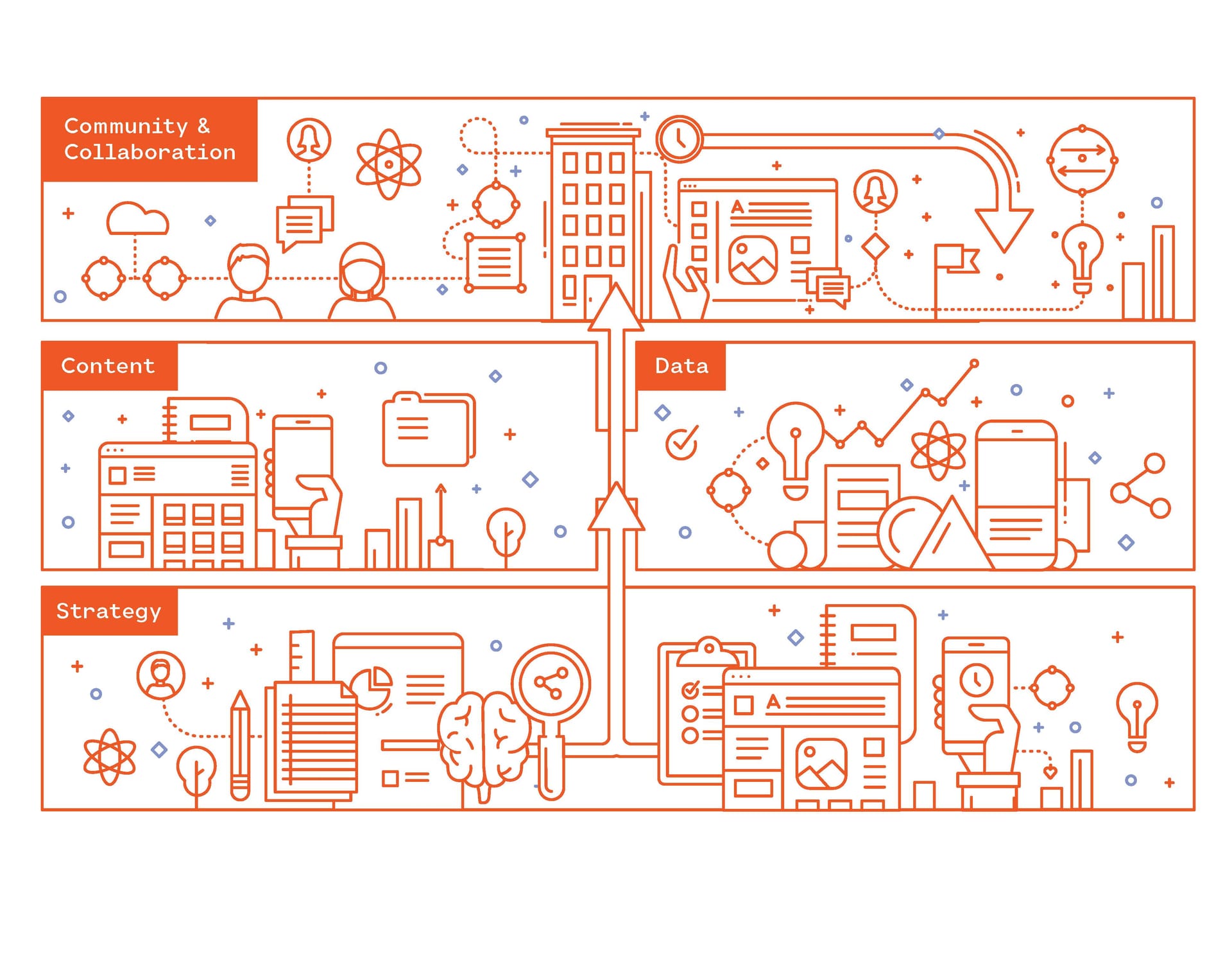
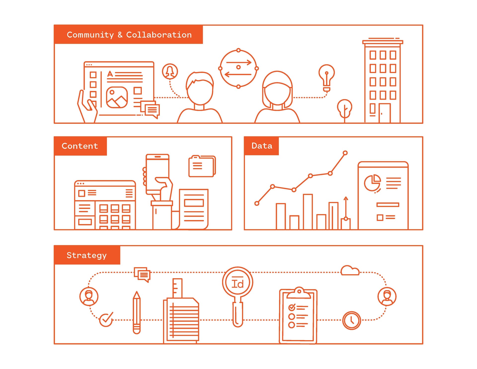
Primary illustration set: even-weight outline in tangerine on white, a landscape of knowledge built from small icons.

The practice.

Ideal State opened in 2016 to handle the part of a technology overhaul that new software never fixes on its own: what an organization knows, where it keeps it, and who can find it. The founding idea was that a working knowledge ecosystem combines people, process, and technology, and that fixing all three changes how a team works and what it can put into the world.

Nonprofits, foundations, and public-sector groups signed the contracts. The people who used the work day to day were communications leads, knowledge managers, IT directors, and program officers, the ones who run the intranet, file the documents, and live with whatever the brand produces. Boards and funders read the white papers and judged the practice by them. The brand had to sound like one company to all three.

Design is so simple, that is why it is so complicated.

Paul Rand. Quoted on the brand cover.

02Mark

The mark.

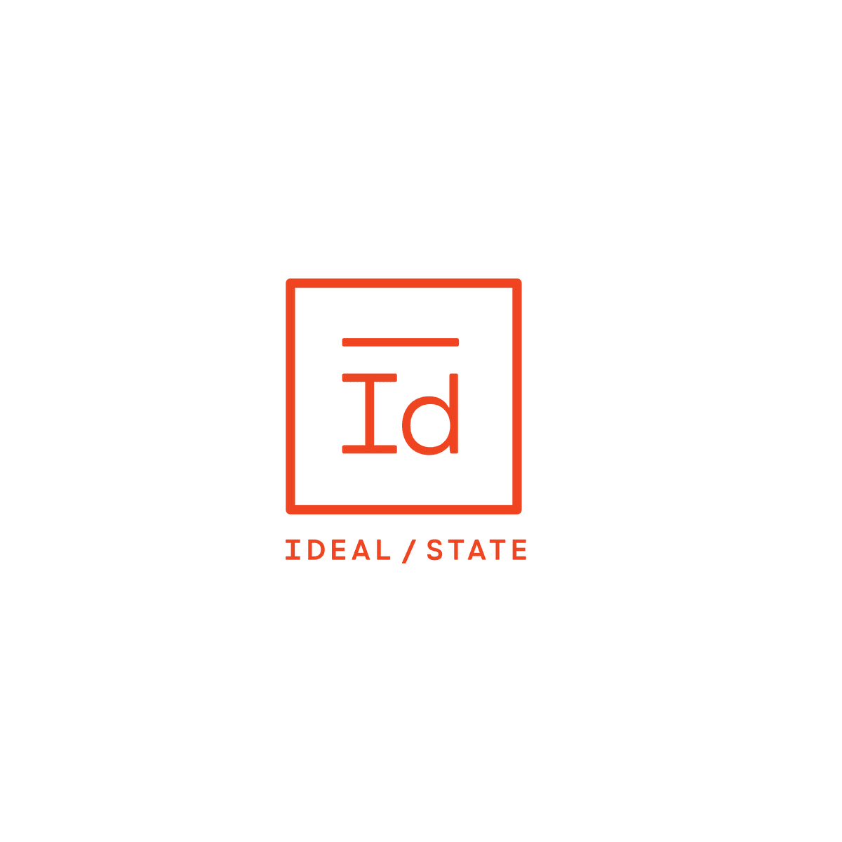
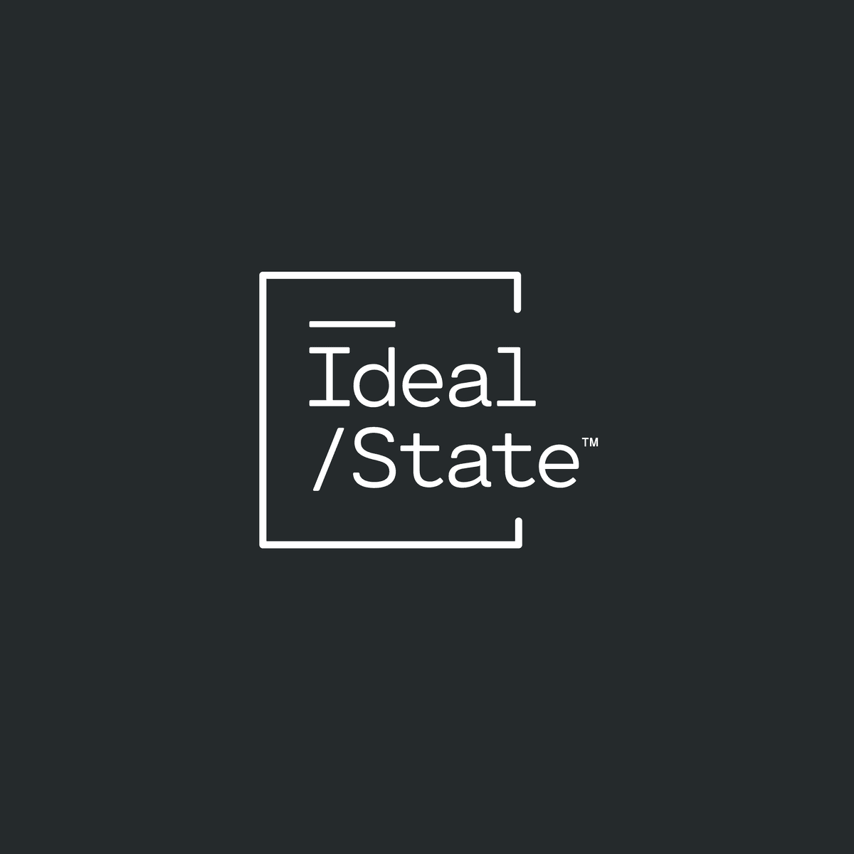
A practice hired to build knowledge architectures should say so before it says anything else, so the name Ideal State got set inside phonetic brackets, with a macron over the I and a slash in front of /State.

Read as International Phonetic Alphabet notation it spells the practice's name out loud, and read as a file path it is a directory tree running from the current state to the ideal one. Four marks came off the same idea: the stacked logo as the main one, a horizontal version for narrow headers, the ID monogram for small sizes, and the bracketed mark for darker printed pieces and merchandise.

Stacked, tangerine on white
Stacked, reverse on tangerine
Stacked, reverse on slate
Horizontal, tangerine on white
Monogram, tangerine on white
Bracketed, reverse on slate

Tangerine on slate.

Tangerine carries the energy and royal blue carries the institutional weight, and the two talk to each other everywhere they appear, which is how a knowledge architecture is supposed to behave. Brick, Salmon, and Periwinkle fill in behind them, with Slate, Graphite, and Fog as the greys.

Cartograph Sans CF and Cartograph Mono CF (Connary Fagen Type Foundry) ran as one family, the sans doing the heavy lifting while the mono handled captions, small headings, and the logo itself. Two voices out of the same set of letters, which kept everything sounding like one company without going flat.

Cartograph Sans CF, sample setting
Cartograph Mono CF, sample setting
03Sub-brands

Four directories.

The sub-brands change only what follows the slash, and the bracket box holds the family together. The four service areas covered everything the practice sold: Ideal/Knowledge for the architecture work itself, Ideal/Community for the work with the people affected, Ideal/Events for convening, and Ideal/Systems for technology builds.

Alongside them ran three numbered courses: Ideal/Process (ID_COURSE.01) on how the practice is run, Ideal/Research (ID_COURSE.02) on how it listens before designing, and Ideal/Mindset (ID_COURSE.03) on the outlook that makes the other two work. The naming reads as a portfolio and as a file system at the same time.

Ideal/Knowledge
Ideal/Community
Ideal/Events
Ideal/Systems
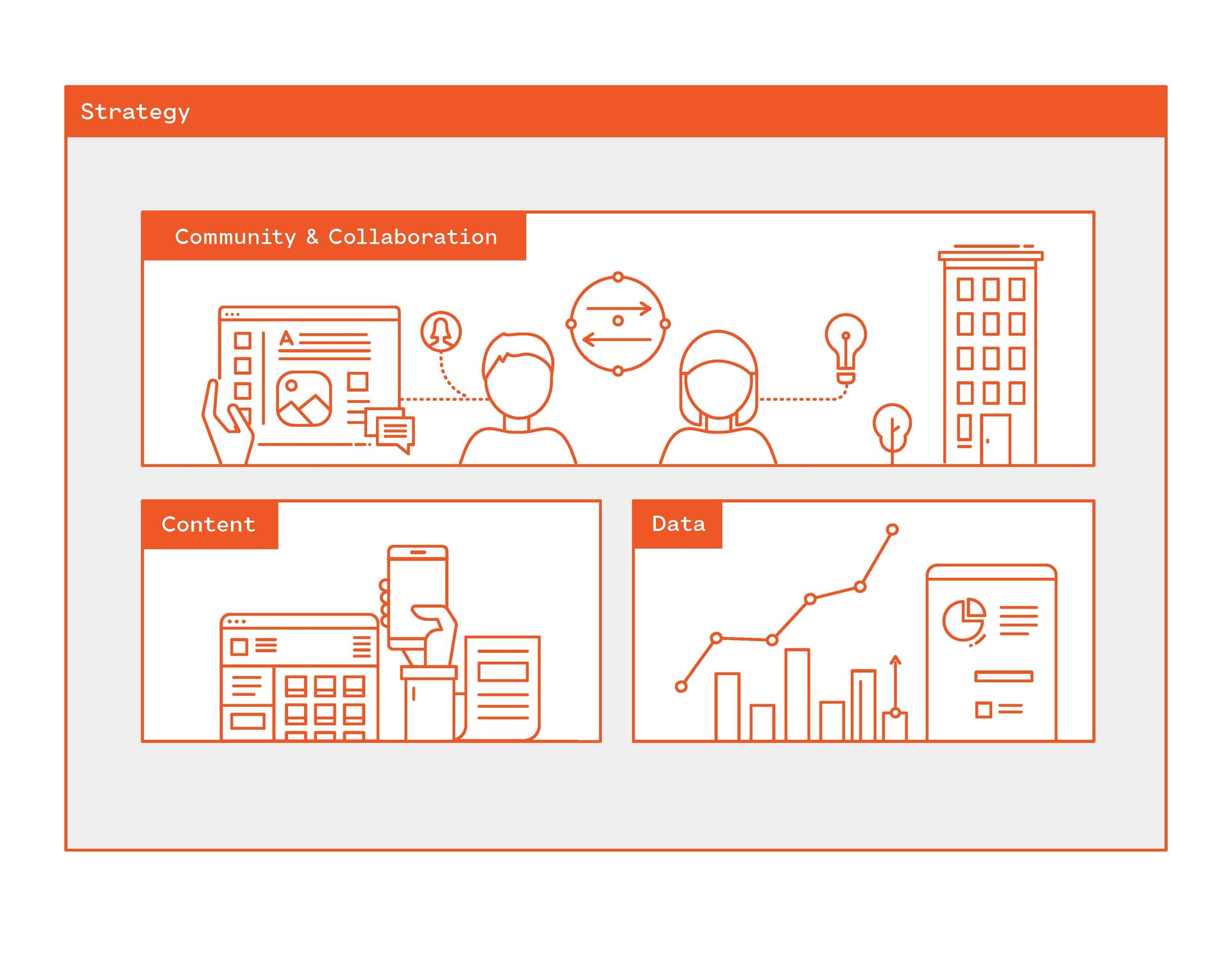
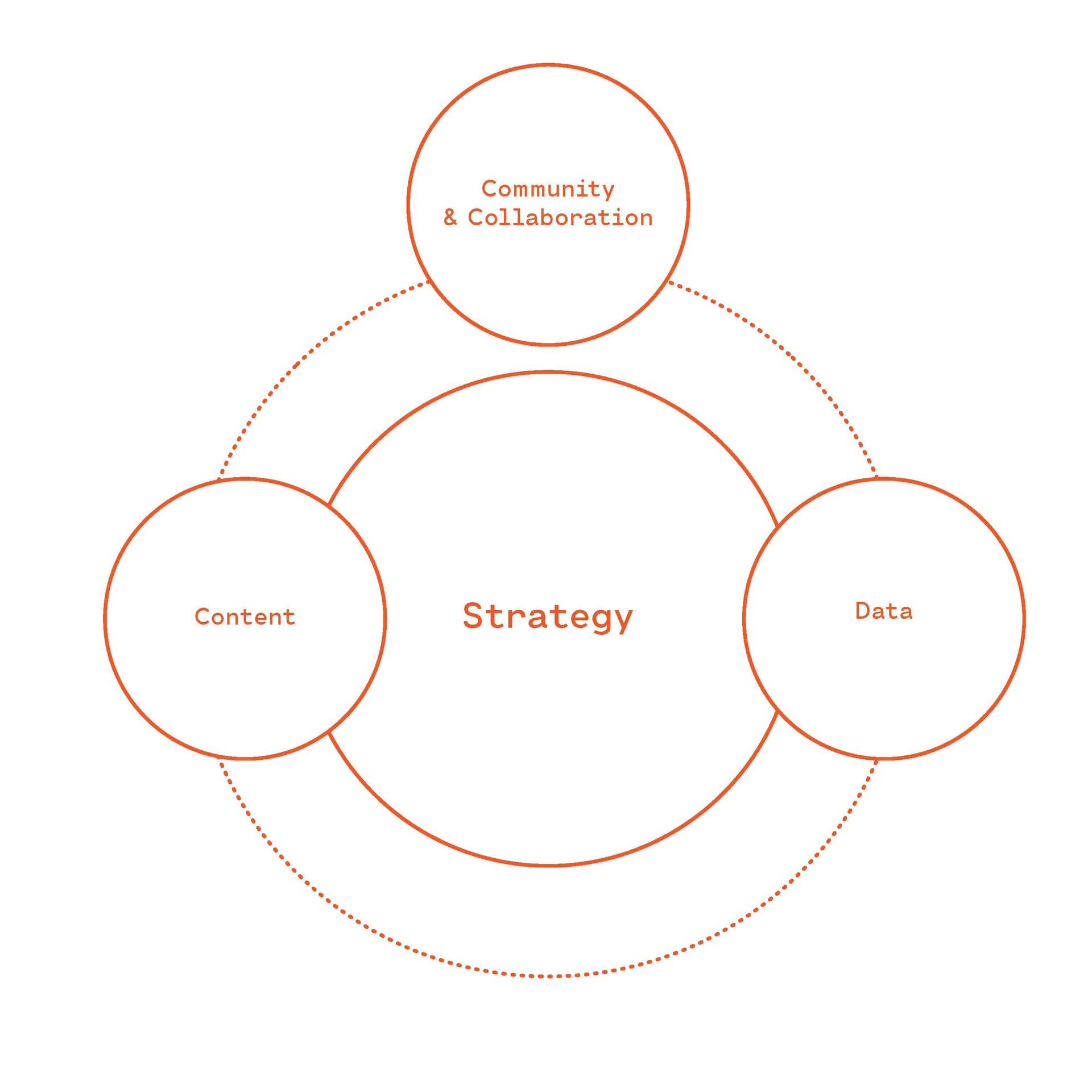
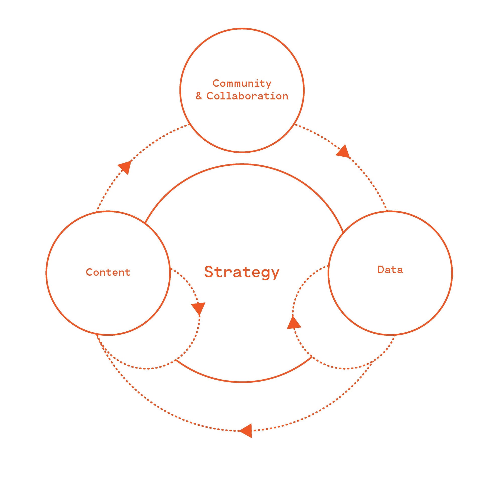
Four-pillar ecosystem
Sub-brand application
04Templates

The templates.

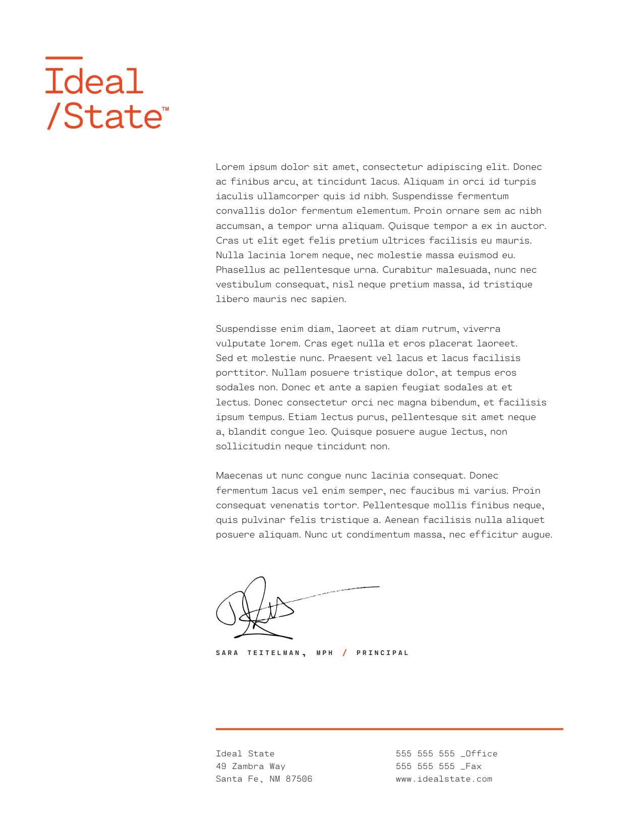
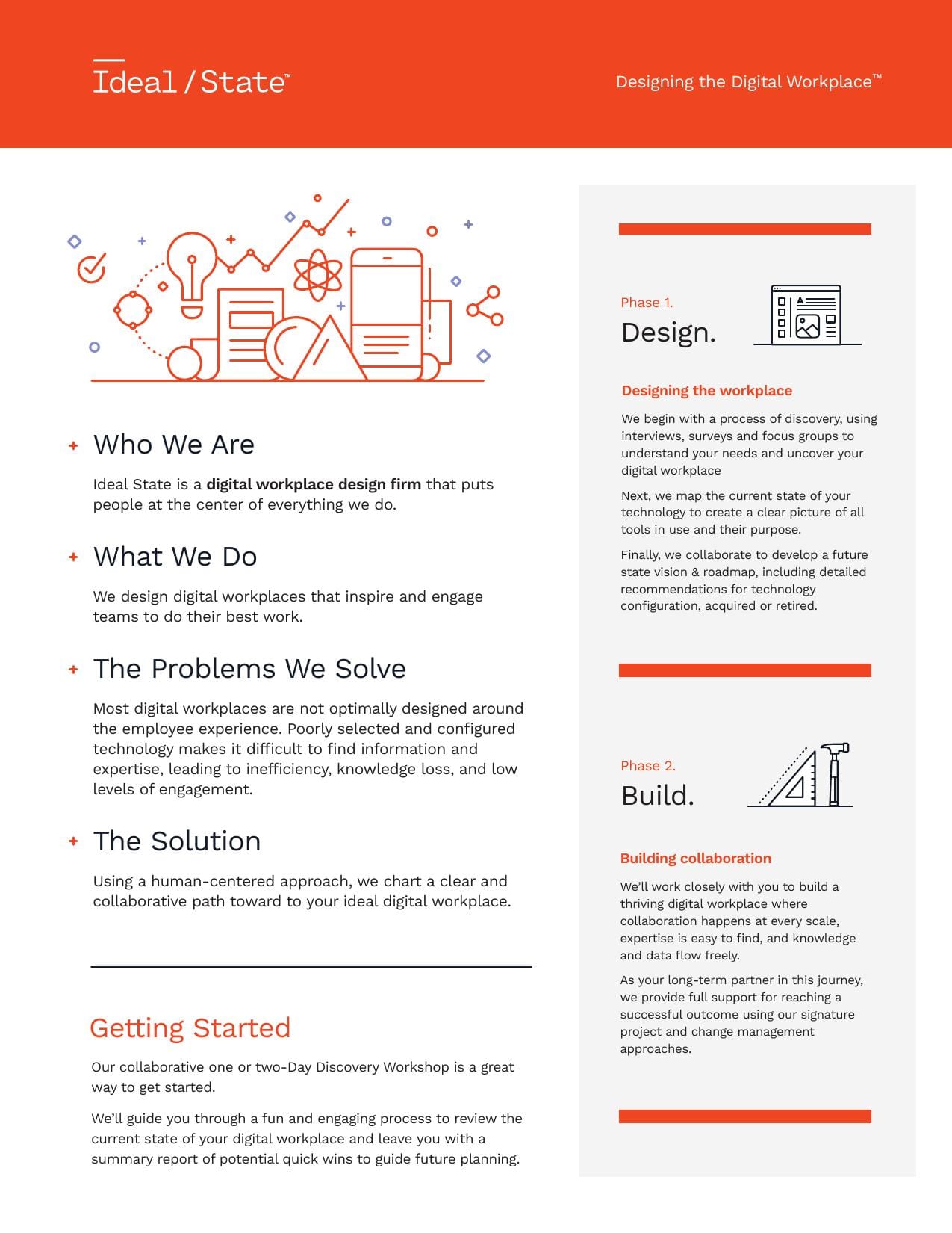
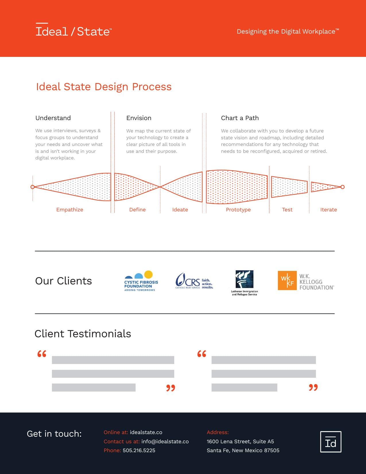
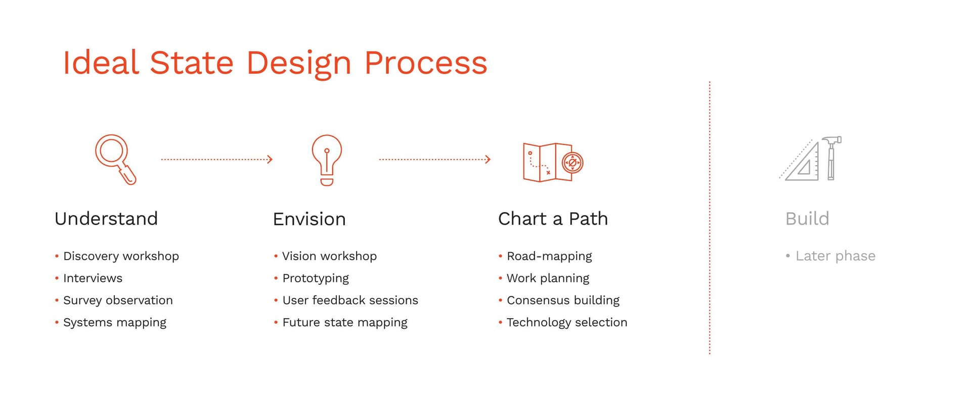
A brand system lives or dies on whether the people inside the building can produce with it, so the 2017 delivery came as working files: business cards, letterhead, a white-paper series template, a PowerPoint master, a one-sheet handout, and a Design Process Map.

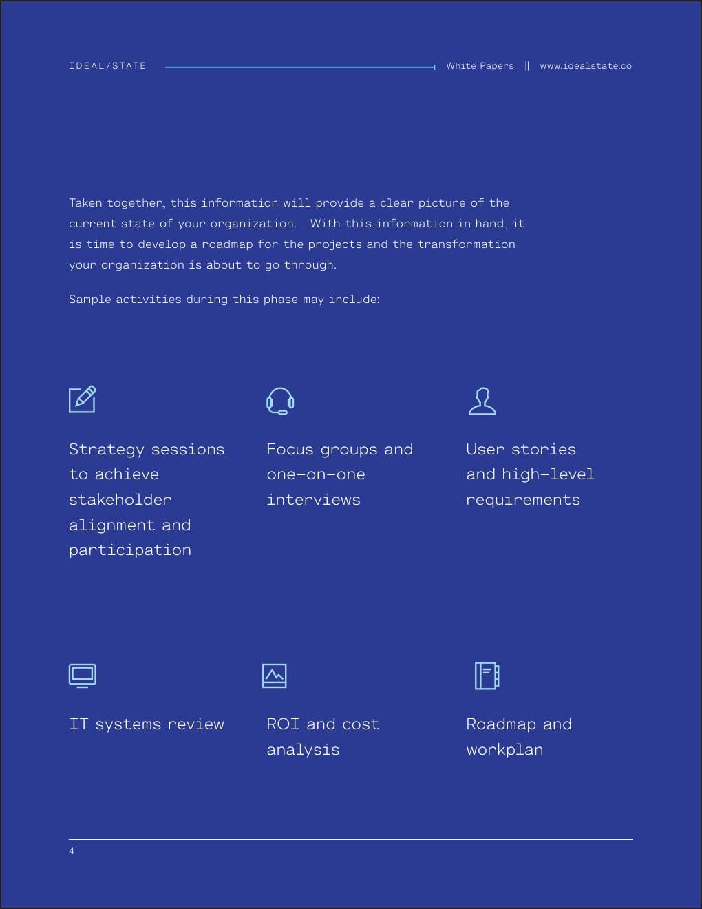
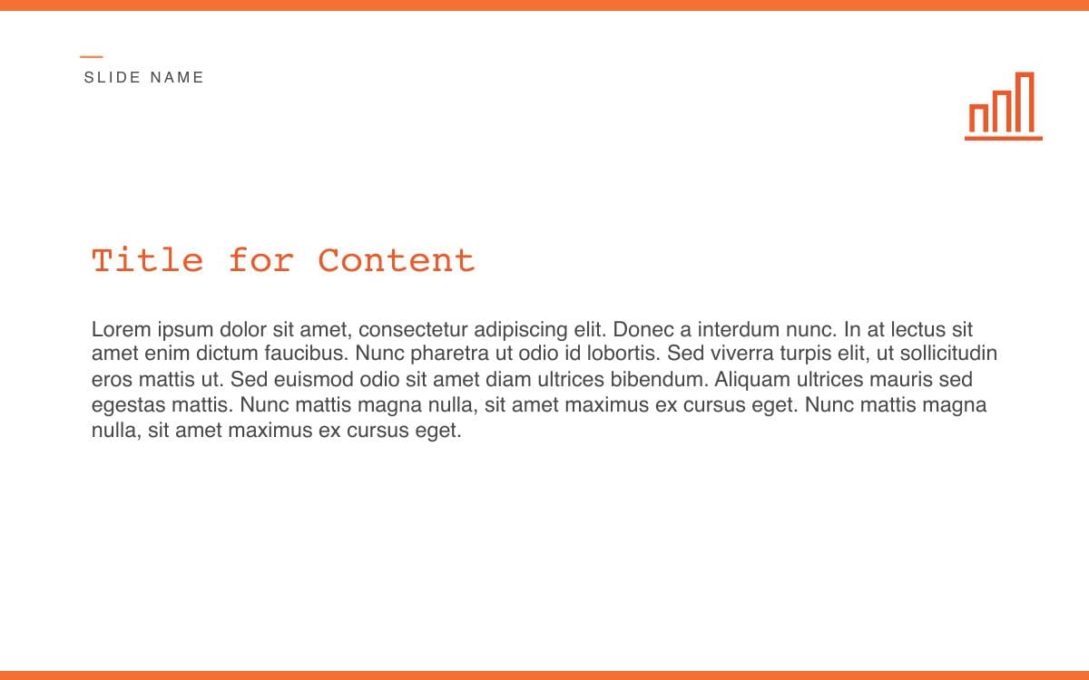
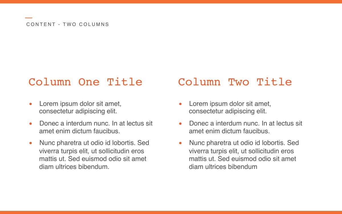
The white paper carried the long-form research: a royal-blue contour-line cover with the sub-brand mark on it, tangerine on the numbered process steps and the pull-quotes, and an interior grid that takes a story or a sidebar without anything being redrawn. The PowerPoint template took the same contour lines into its chapter dividers and put the secondary illustrations on section openers.

White paper cover
White paper interior
White paper sidebar
Presentation cover
Presentation chapter divider
Presentation content slide
Business identity
Letterhead
One-sheet handout
One-sheet interior
Design Process Map
Process Map, detail
05Numbers

Project window: 2016 to 2018

A practice with a system underneath it.

Brand strategy started in spring 2016, the full style guide landed in September 2017, and the production templates stayed in service for the rest of the practice's active years. The parts held together because they share one logo idea, one type family, and one contour-line texture.

01 · Brand system delivered

2017

30-page web styleguide, September 21, 2017. Source of the spec mirrored at /brand/ideal-state.

02 · Brand pillars, same set inside and out

4

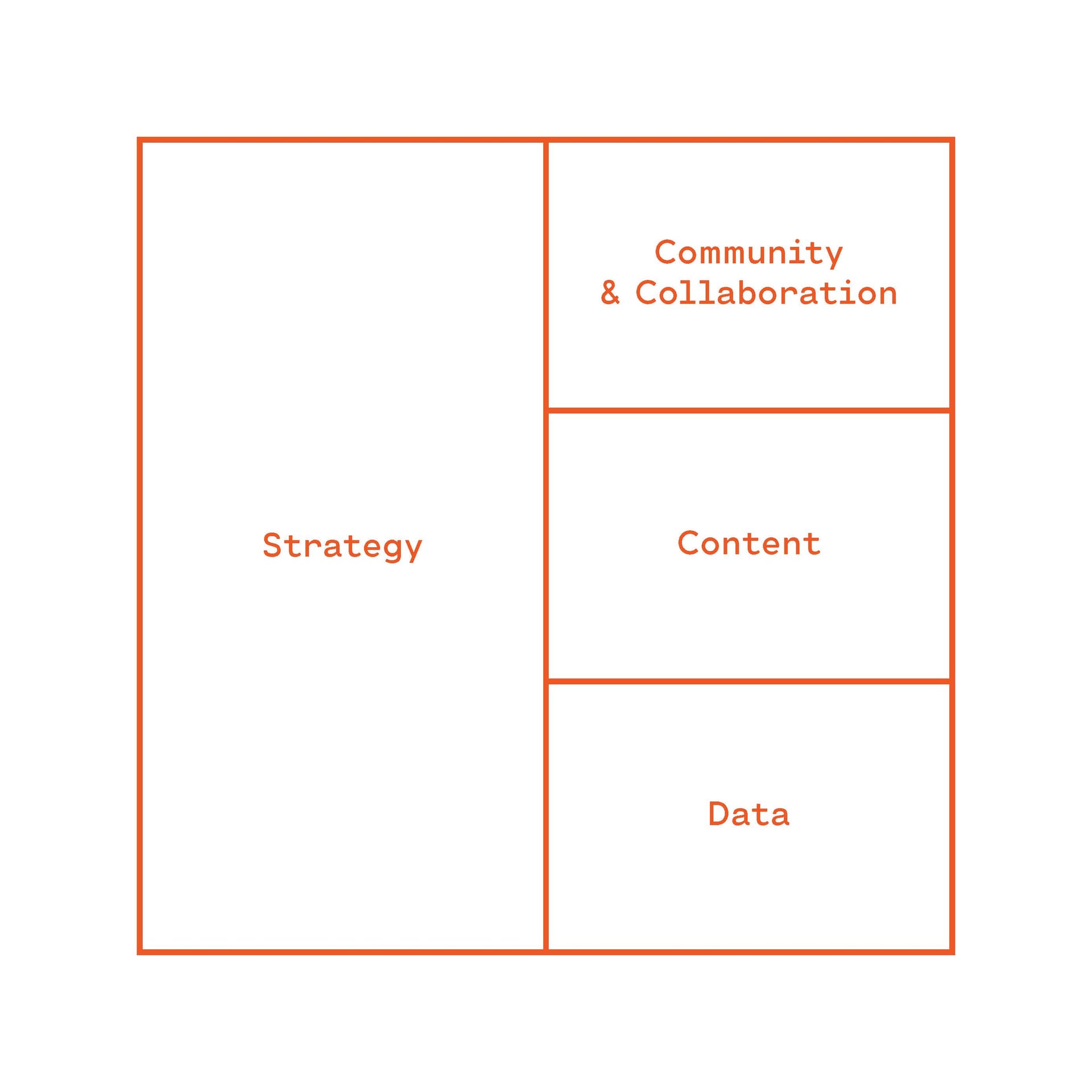
Strategy. Community and Collaboration. Content. Data. The ecosystem the practice diagnosed for clients was the one the brand ran on.

03 · Brand values codified

6

Experience matters. Build a better world. Work with you, not for you. Work hard with heart. Think holistically. People first.

04 · Approved logo versions

17

Four mark families (stacked, horizontal, ID monogram, bracketed) across four color treatments.

Production ledger

2016 – 2019

10

Named brand colors

Tangerine leads and Royal Blue carries the institutional weight, with Brick, Salmon, Navy, and Periwinkle filling out the palette and Slate, Graphite, Fog, and White as the neutrals.

2

Versions of the Cartograph family

Cartograph Sans CF does the heavy lifting; Cartograph Mono CF takes captions, small headings, and the logo itself.

7

Sub-brand directories

Four service areas (Ideal/Knowledge, Ideal/Community, Ideal/Events, Ideal/Systems) and three numbered programs (Ideal/Process, Ideal/Research, Ideal/Mindset).

5

Production-ready collateral systems

Business identity set. White paper template. PowerPoint template. One-sheet handout. Design Process Map.

2

Illustration styles, one signature texture

Primary illustrations in even-weight outline, secondary illustrations as figurative posters, and the contour-line texture in two colorways underneath both.

/īdē[ə]l/stāt/

The mark, written out

A pronunciation key and a file path at the same time, which is the whole practice described in one line.

Brand system delivered September 21, 2017. Practice archived. Live brand book preserved at /brand/ideal-state, with /brand/ideal-state/spec.json and /brand/ideal-state/spec.md serving the spec to AI tools.

06Archive

The archive.

This page is the full record of a system built for a practice that sat halfway between strategy and documentation. The logo did double duty as a word and as a path, the sub-brands worked as a directory tree, and the white-paper template carried the research the practice traded on.

The live brand book lives at /brand/ideal-state, with the specification at /brand/ideal-state/spec.json and its written version at /brand/ideal-state/spec.md. The practice is closed; the system is kept here because the idea behind the mark still works.

What are you working on?

Studio for founders, experts, and the institutions they run.

Living, working brands. Built with your team to keep growing.

© 2026 Workhorse Collective, LLCPrivacyTerms