Grubb's Pharmacy
Brand Identity/2021

Grubb's Pharmacy

Brand IdentityBrand GuidelinesSignagePrint & Collateral
Revitalizing the Grubb's Pharmacy brand.

Grubb's Pharmacy

Revitalizing the Grubb's Pharmacy brand.

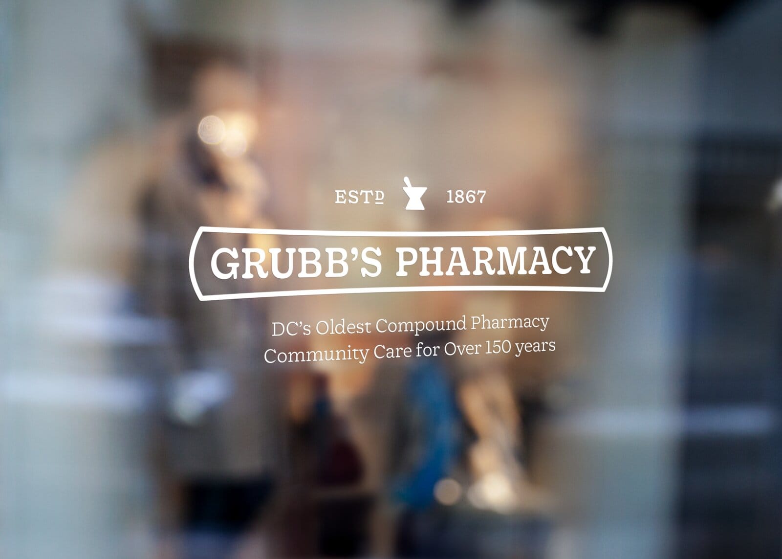
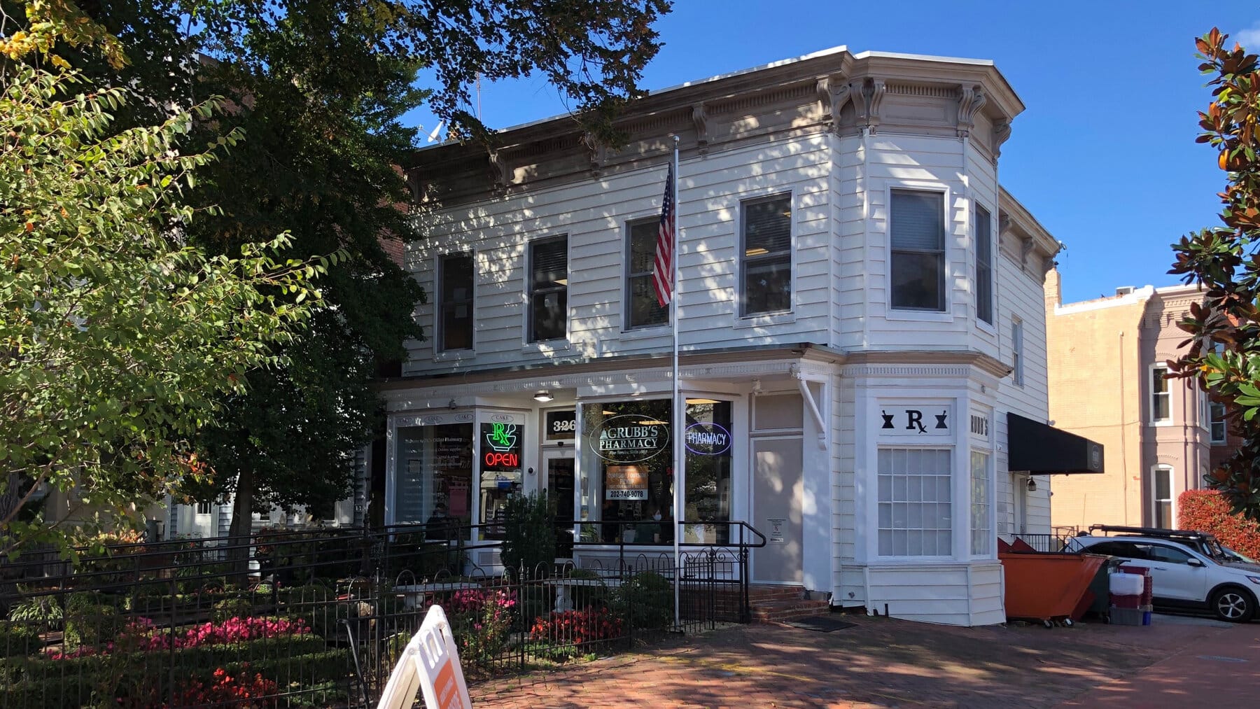
Grubb's has compounded prescriptions on Capitol Hill since 1867. When it comes to a neighborhood-focused family-owned pharmacy, there weren't a lot of comparisons left. Because faceless big-box chains have replaced most independents, we had to carve a unique path.

Brand IdentityBrand GuidelinesSignagePrint & Collateral
Grubb's Pharmacy

A century-old independent, not a museum.

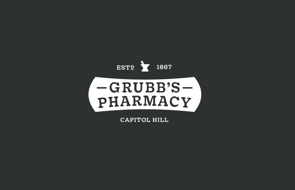
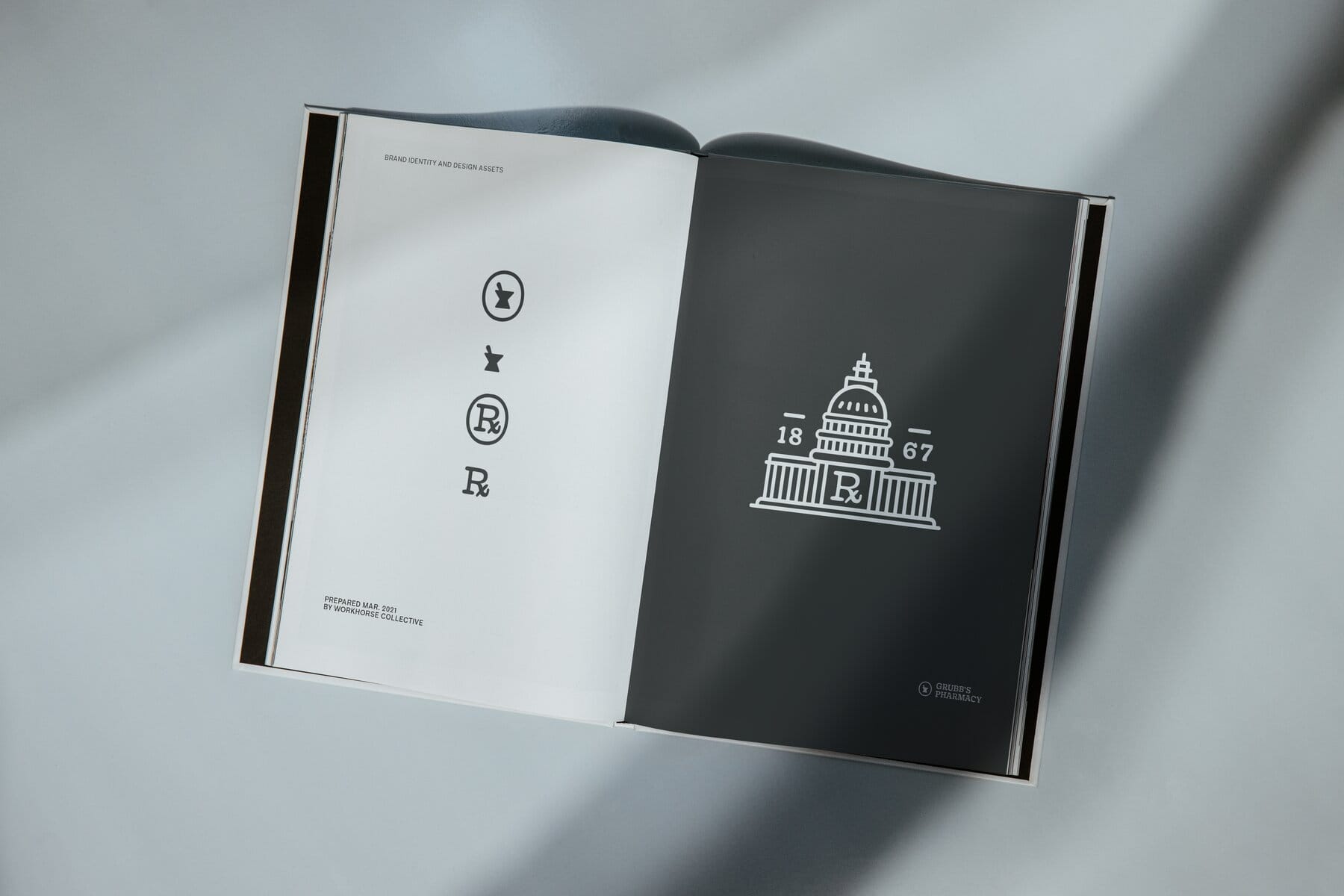
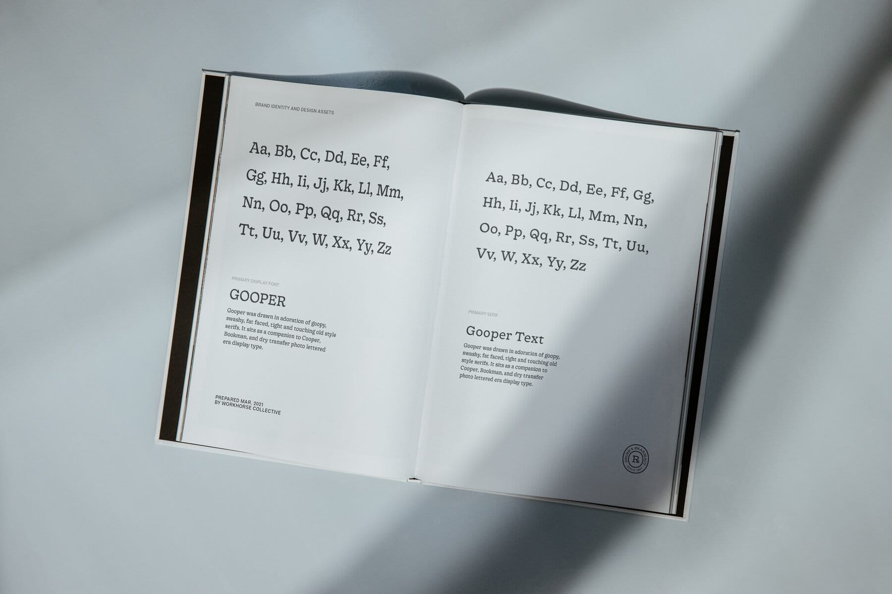
The risk in rebranding a business this old runs in both directions: sand off the history and it reads like every chain that replaced the independents, or lean on it too hard and it reads like a museum gift shop. The system splits the difference by acting its age. Black and white, almost no decoration. A mortar-and-pestle mark, a keystone-framed wordmark, an Rx roundel stamped SINCE 1867, and Gooper, a fat-faced serif drawn in adoration of Cooper and Bookman, doing the talking.

Design System

A pharmacy brand at home in its own century.

Black and white, a mortar-and-pestle mark, an Rx roundel stamped SINCE 1867, and Gooper's fat-faced serif. The system reads like a place that knows your name and has known it for a while.

01Color System

Color Palette

Ink Black

Marks, type, brand book panels
Hex#1a1a1a
RGB26 · 26 · 26
HSL0° · 0% · 10%
CMYK0 · 0 · 0 · 90
1.2:117.4:1

Mortar Cream

Warm ground, brand cover
Hex#f4eed5
RGB244 · 238 · 213
HSL48° · 58% · 90%
CMYK0 · 2 · 13 · 4
18.0:11.2:1

Paper White

Stationery, window vinyl reverse
Hex#ffffff
RGB255 · 255 · 255
HSL0° · 0% · 100%
CMYK0 · 0 · 0 · 0
21.0:11.0:1

Contrast Pairings

How the palette colors perform together: text on surface combinations ranked by contrast ratio.

Aa

Ink Black

on Paper White17.4:1

Aa

Paper White

on Ink Black17.4:1

Aa

Ink Black

on Mortar Cream14.9:1

Aa

Mortar Cream

on Ink Black14.9:1
02Typography

Type System

The quick brown fox jumps over the lazy dog

The quick brown fox jumps over the lazy dog.

Gooper

Display (Bold)
Display

Headlines, signage, and brand lockups

Gooper Text

Text (Regular)
Text

Guidelines copy, labels, and print

03Logo System

Marks & Lockups

Stamped, stitched, and stuck on.

The mark family behaves like pharmacy equipment: the mortar-and-pestle icon, the keystone-framed wordmark, and the Rx roundel each built to be embossed, embroidered, and printed on a sticker roll without losing their manners.

Rx roundel01

Rx roundel

Roundel on cloth02

Roundel on cloth

Secondary mark03

Secondary mark

Grubb's Pharmacy — 1
Grubb's Pharmacy — 2
Capitol Hill's pharmacy since 1867.

Shipped to the shelf, the sidewalk, and the sleeve.

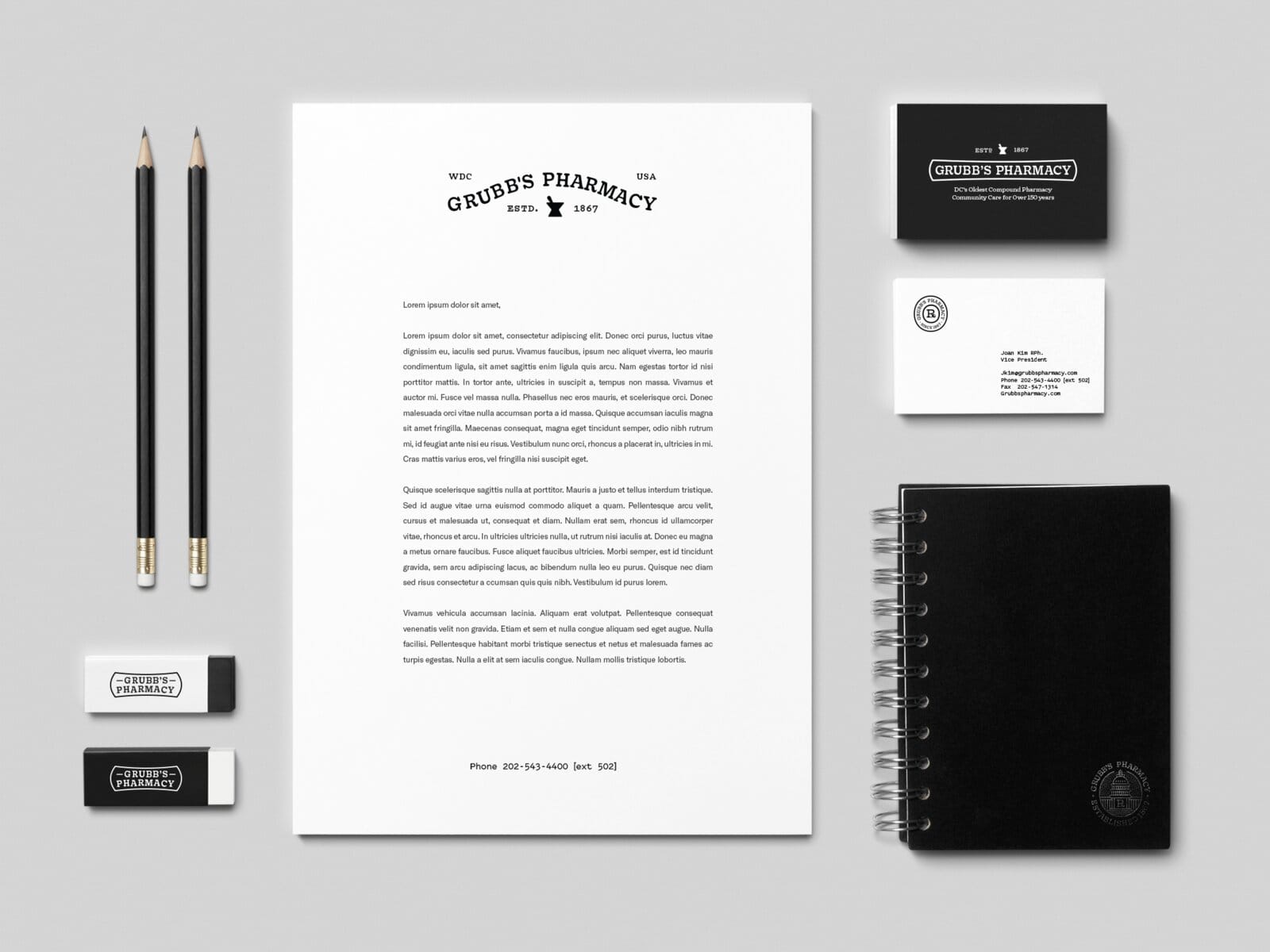
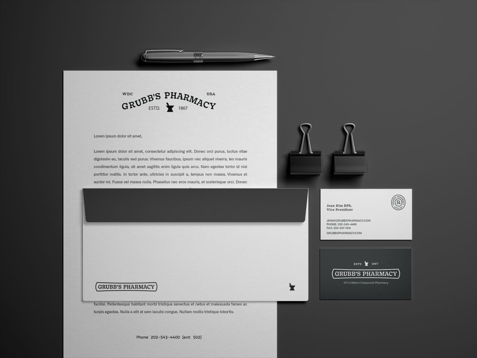
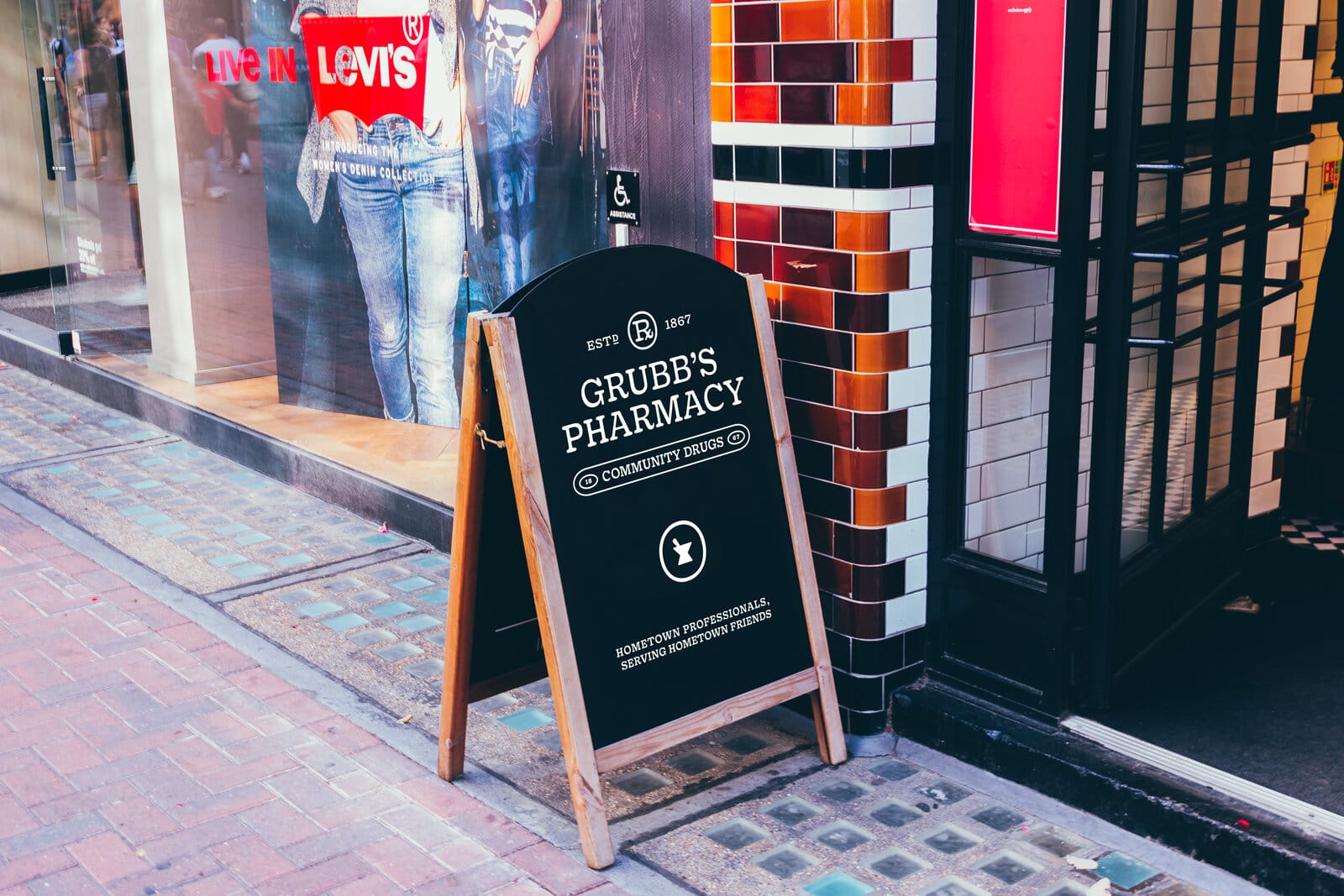
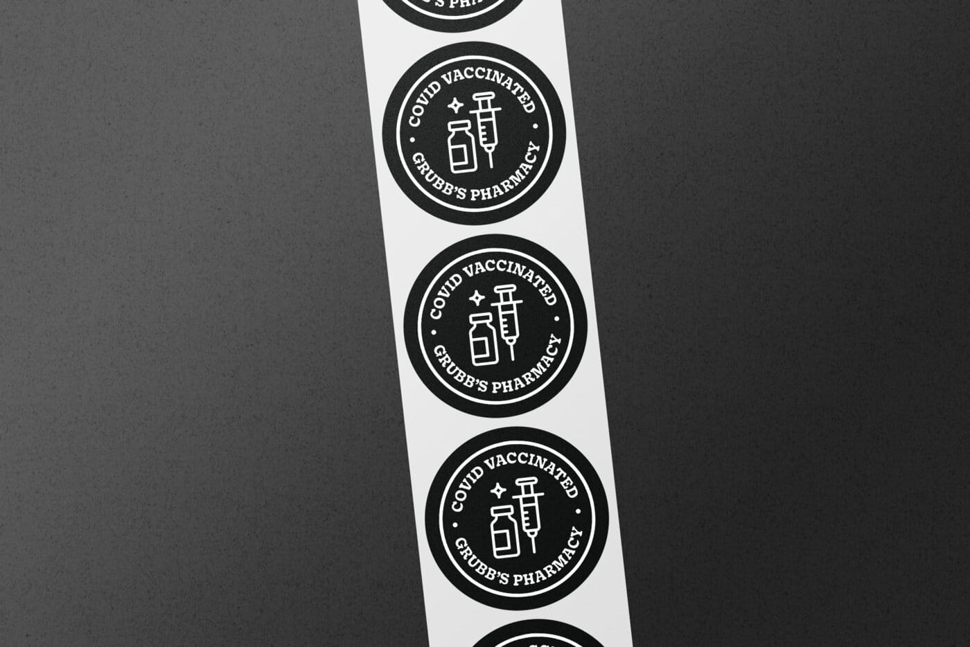
The identity shipped as objects: a printed brand book, a stationery kit, embroidered marks, window vinyl, a sandwich board for the sidewalk, and sticker rolls. The COVID-vaccinated roundel on the sticker roll dates the engagement precisely; the rest of the system is built not to date at all.

Grubb's Pharmacy — 1
Grubb's Pharmacy — 2
Grubb's Pharmacy — 1
Grubb's Pharmacy — 2
Grubb's Pharmacy

A second act: Grubb's Tea Lab.

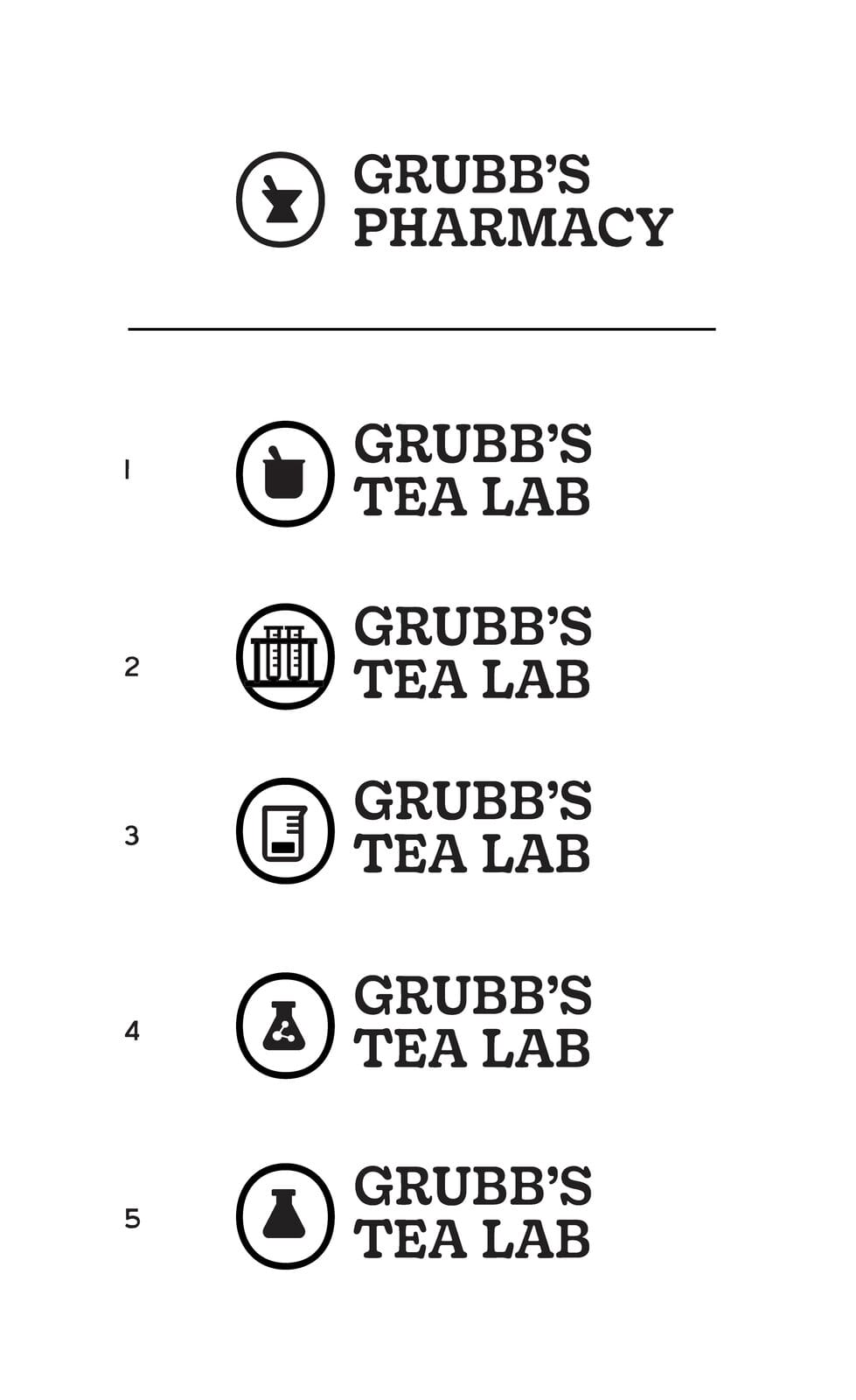
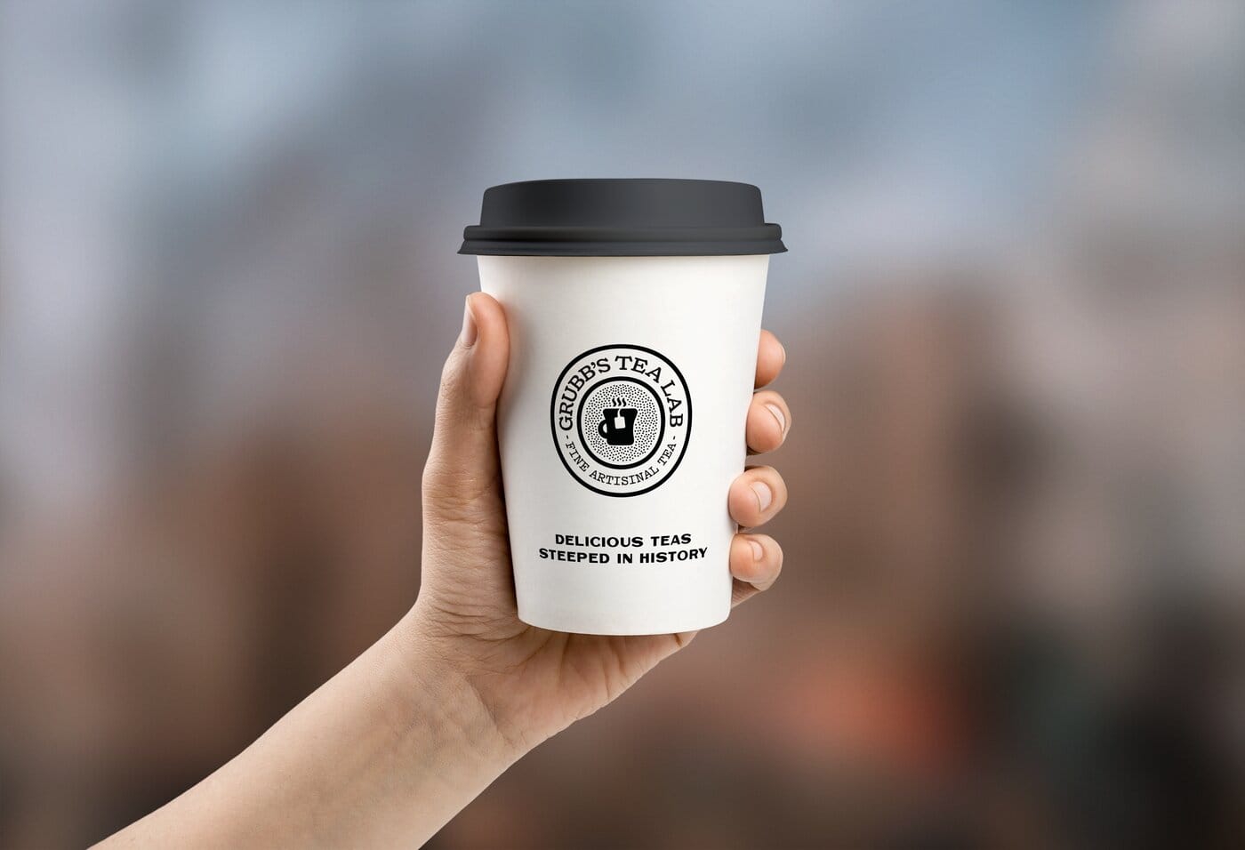
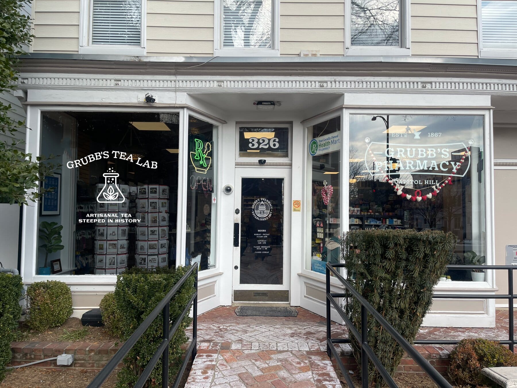
The pharmacy opened a tea bar, and the system stretched to meet it. A set of logomark variations swaps the mortar for tea vessels (a cup, a pot, a tin) under the same keystone manners. Storefront vinyl and cups carry the line: delicious teas, steeped in history. Same brand, new counter.

Grubb's Pharmacy — 1
Grubb's Pharmacy — 2
Same brand, new counter

What are you working on?

Studio for founders, experts, and the institutions they run.

Living, working brands. Built with your team to keep growing.

© 2026 Workhorse Collective, LLCPrivacyTerms