
Epic Curing
Epic Curing
Modern meats made the old school way.
Epic Curing is a meat curing company in Washington, DC. In the early stages of their business, they needed a brand that could introduce small-batch cured meats to the DC market: identity, packaging, social, events, and the photography to carry all of it.

Between the butcher shop and the apothecary.
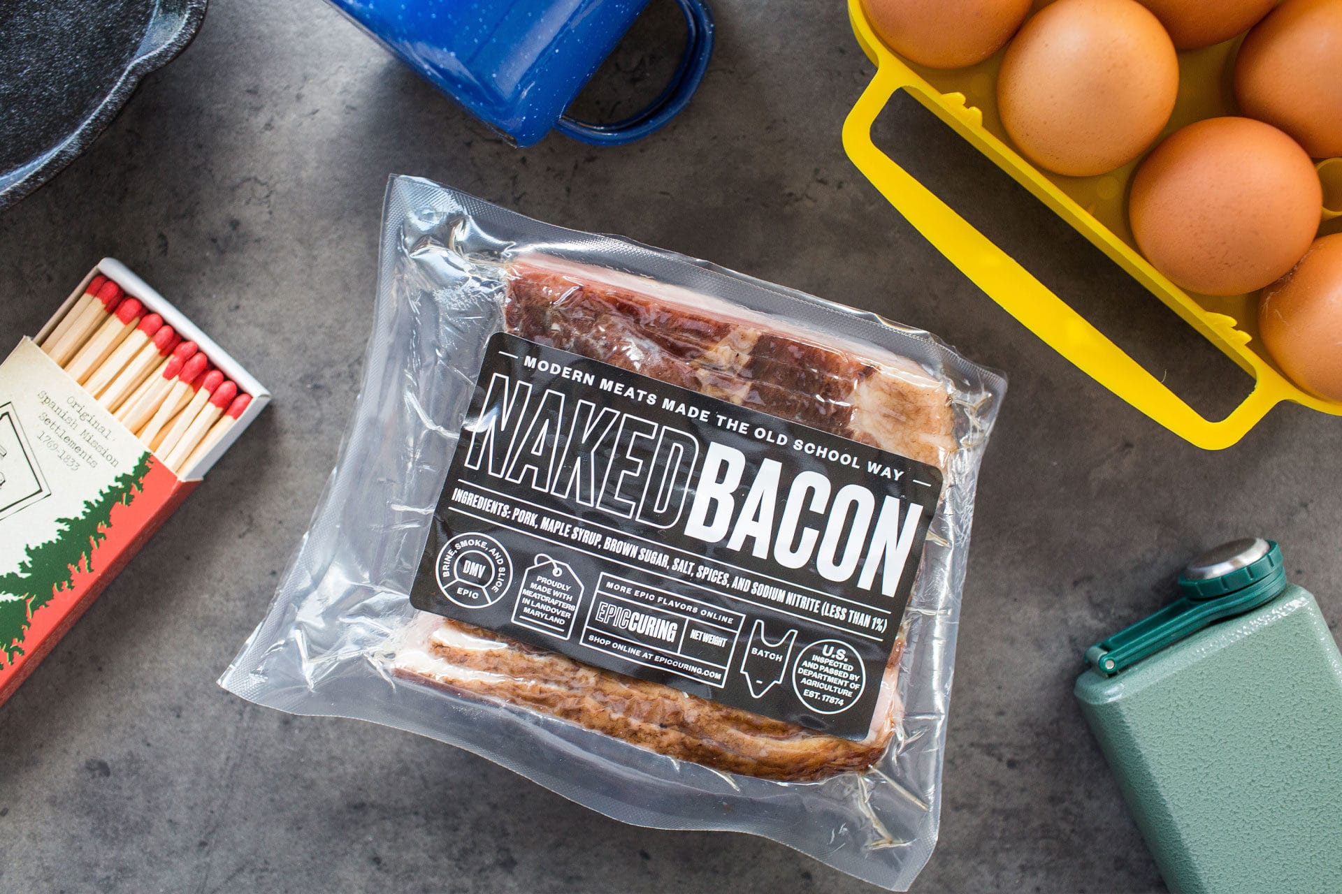
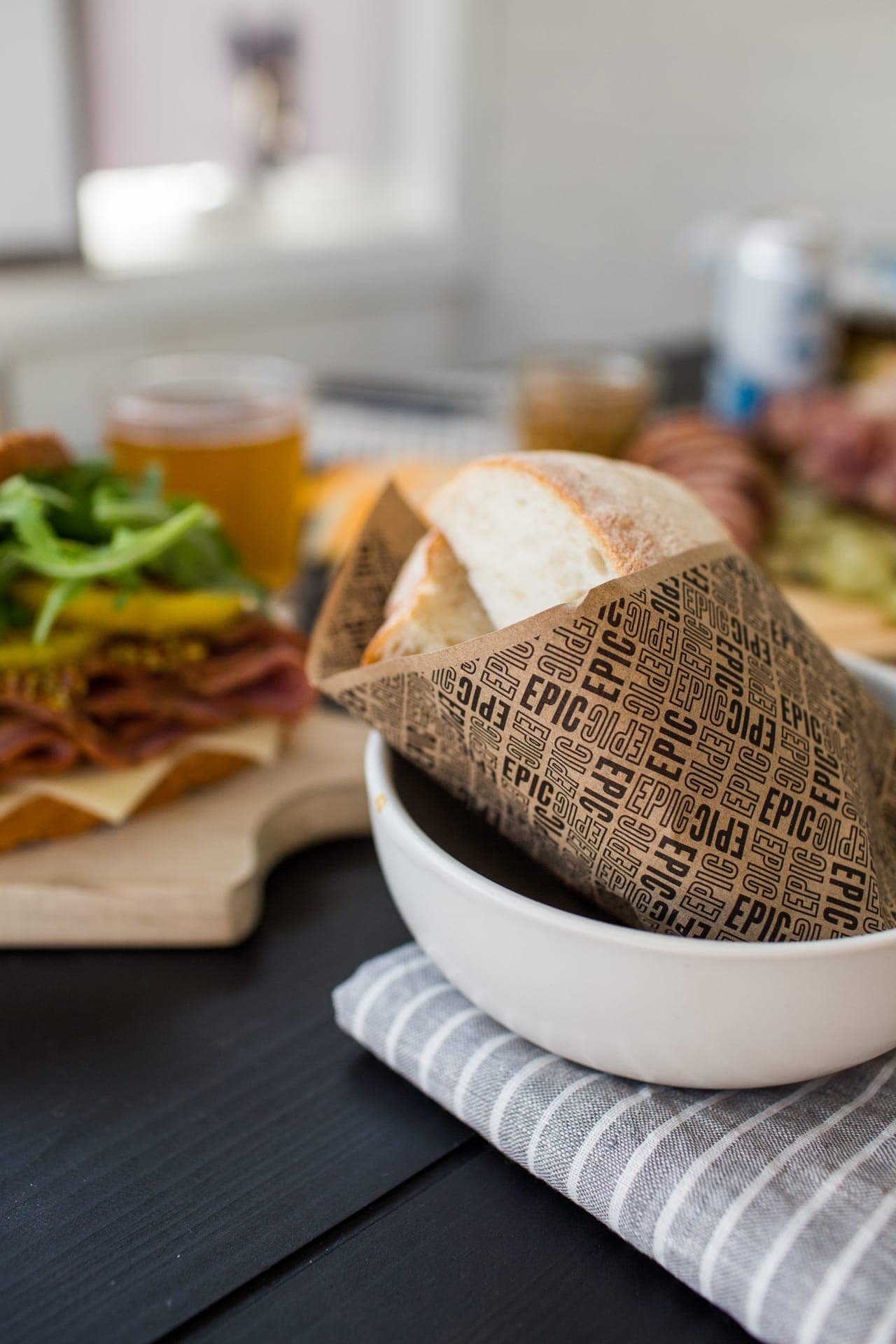
Most cured-meat brands on the shelf in 2018 leaned hard into either heritage (engraved butcher illustrations, Old World framing) or modernist apothecary (clinical minimalism, big numbers). Epic Curing sat between. The black label with the heavy outline wordmark reads modern utility. The honest ingredient list on the front (PORK, MAPLE SYRUP, BROWN SUGAR, SALT, SPICES) reads old-school transparency.
The product itself, photographed in camp light against scout-grade accessories, completes the frame: this is meat for people who cook outside, made by people who cure it by hand a few miles away.
Design System
Heritage transparency, modern utility.
Black label, outline wordmark, an ingredient list printed at the same scale as the product name. A badge family carries the system beyond the label: the Epic Flavor meat-tag, the Brine-Smoke-and-Slice DMV roundel, and the stacked product-name lockup that extends across the line.
Color Palette
Label Black
Primary label surface, wordmark groundBone White
Type on label, poster groundBacon Brown
Product tone, photography warmthCamp Pine
Accessory accent, outdoor contextMatch Red
Accent badge, ticket + event collateralContrast Pairings
How the palette colors perform together — text on surface combinations ranked by contrast ratio.
Aa
Label Black
Aa
Bone White
Aa
Bone White
Aa
Camp Pine
Aa
Bone White
Aa
Bacon Brown
Aa
Bone White
Aa
Match Red
Aa
Label Black
Aa
Match Red
Aa
Label Black
Aa
Bacon Brown
Marks & Lockups
A badge for every surface.
The wordmark carries the label. The badges carry everything else: the Epic Flavor meat-tag on product and social, the Brine-Smoke-and-Slice roundel as the process seal, the brand line set on its own frame.
 01
01Epic Flavor tag
 02
02Brand line
 03
03DMV roundel
Smoke Meat Everyday.
A launch that ran on appetite.
The launch was a program, not a poster. A monthly Instagram grid alternated photography with badge and tagline frames. The Meet-the-Products series set each SKU name (NAKED BACON, EPIC PASTRAMI, TURKISH-D BACON) in the stacked outline wordmark over its own product photography. And the End of Summer Meat Up took the brand on the road: a month of tastings across DC breweries and restaurants, announced by posters designed as ticket stubs and backed by giveaway tickets and totes.


Photographed where the meat gets eaten.
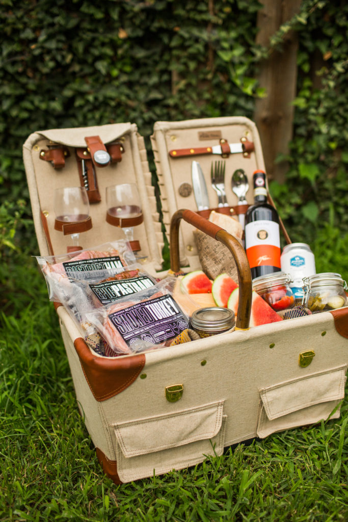
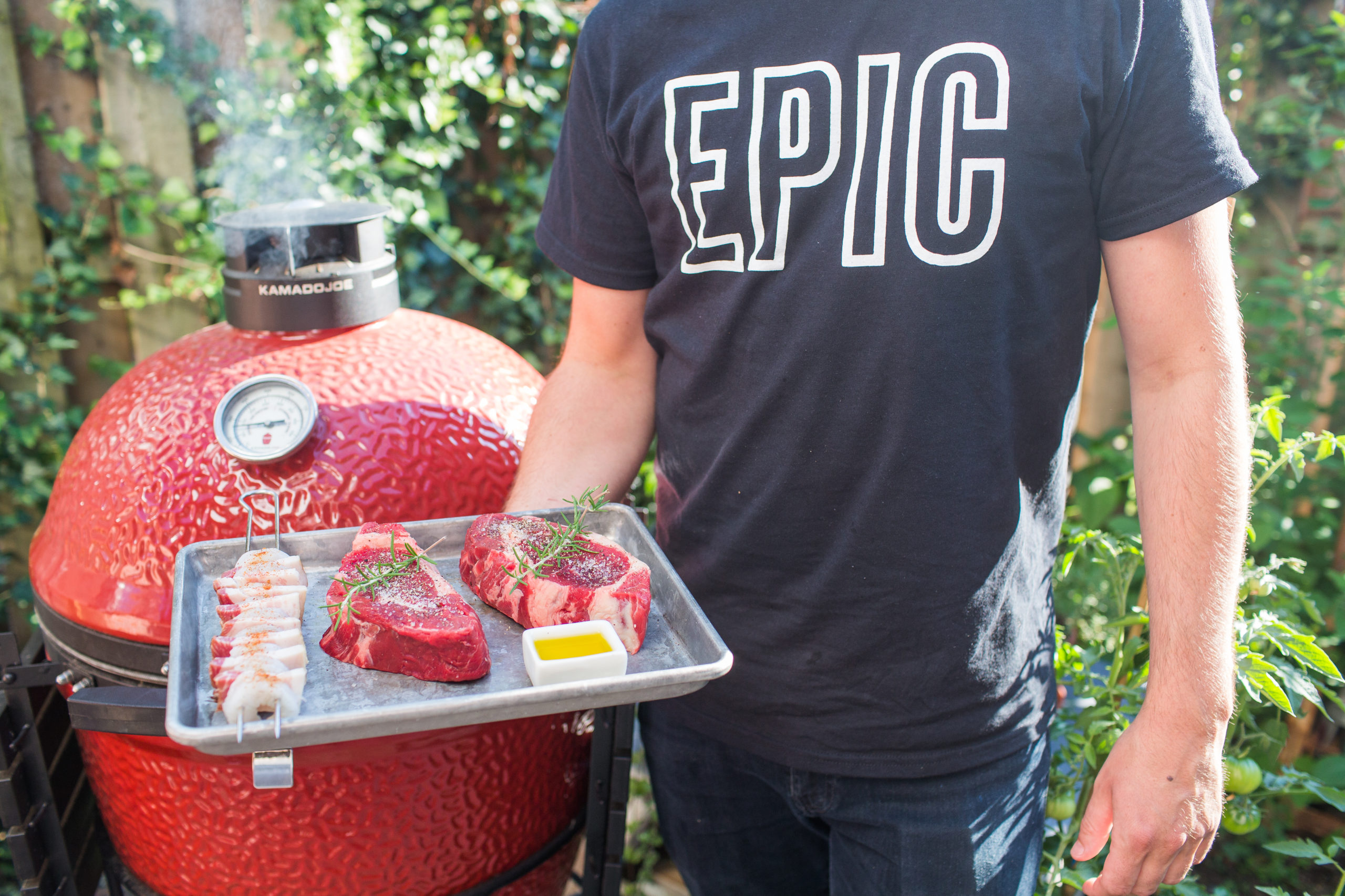
The photography direction ran in two registers. The launch shoot placed the products against camp-grade accessories: enamel mugs, brown eggs, scout-print matches, slate counters. The in-market series followed the brand out of the studio and into the city: the kamado in the garden, charcuterie boards at the table, the sandwiches at the restaurants that stock the line. The brand never sits on white seamless.


Everything this brand is made of.
The marks, the palette, the type, and the designed work that carries them. One source feeds the live brand and this wall. Click any tile to open it.
Badge · Epic Flavor tagLogo & MarksBadge · DMV roundelLogo & Marks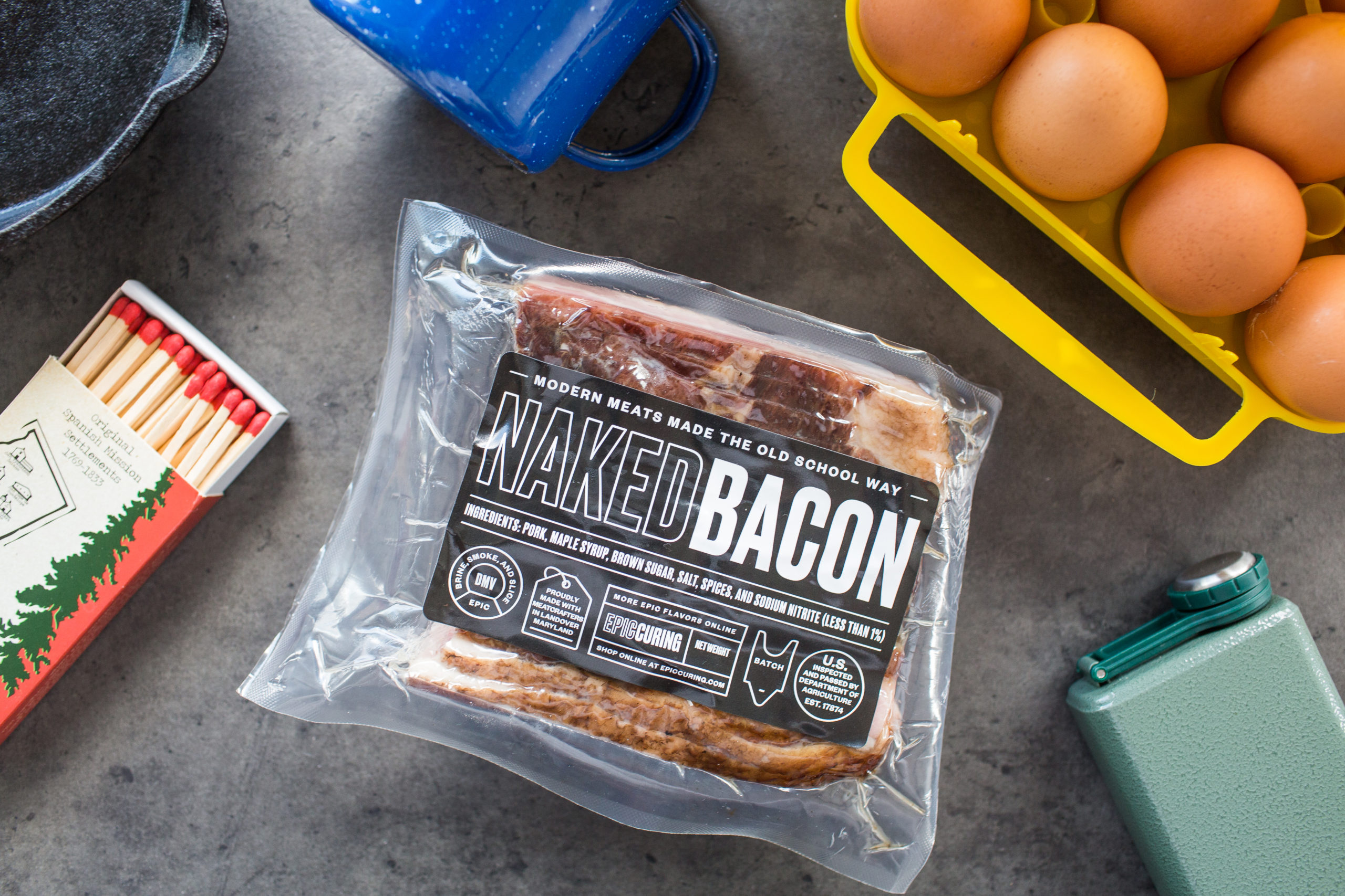 Naked Bacon · packagedLogo & MarksProduct line · flatlayPackaging
 Packaging · shelf contextPackaging
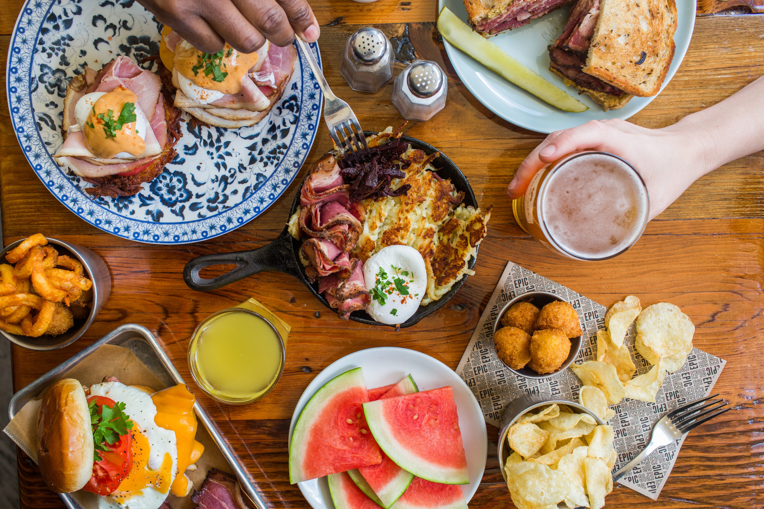 Packaging · in-handPackagingMeet the products · Naked BaconSocial Media DesignMeet the products · Epic PastramiSocial Media DesignMeet the products · Turkish-DSocial Media DesignIn the garden · kamadoEditorial PhotographySandwich study · white brickEditorial PhotographyBrisket · EPIC boardEditorial PhotographyBrand portrait · meat trayEditorial PhotographyMeat Up · ticket posterCollateralTote · Smoke Meat Every DayCollateral
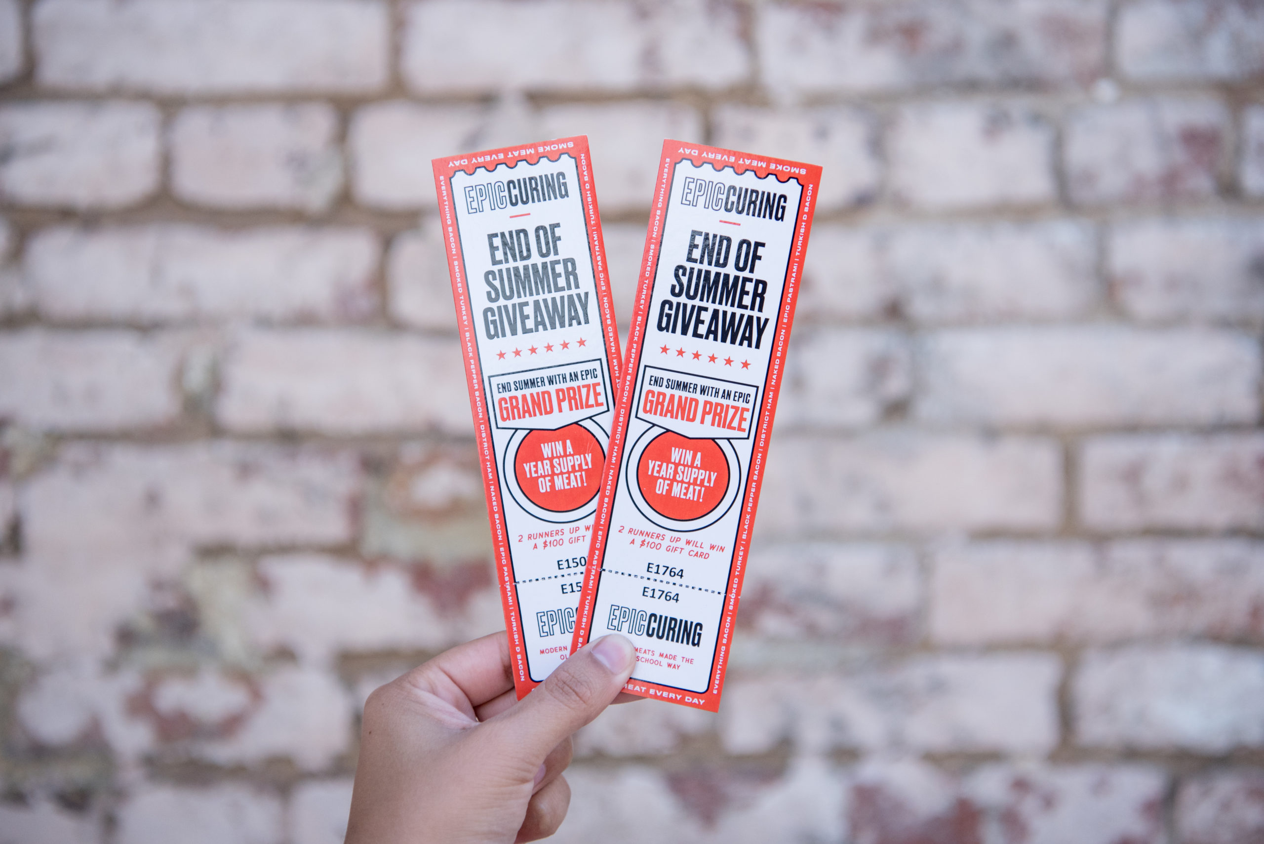 Event tickets · launch seriesCollateral
Related Work