Brand & Identity
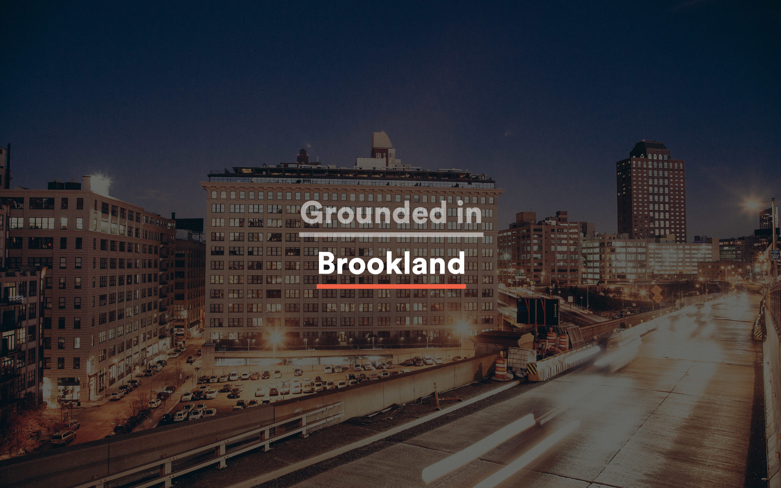
2 shown / 2 totalBrand Identity
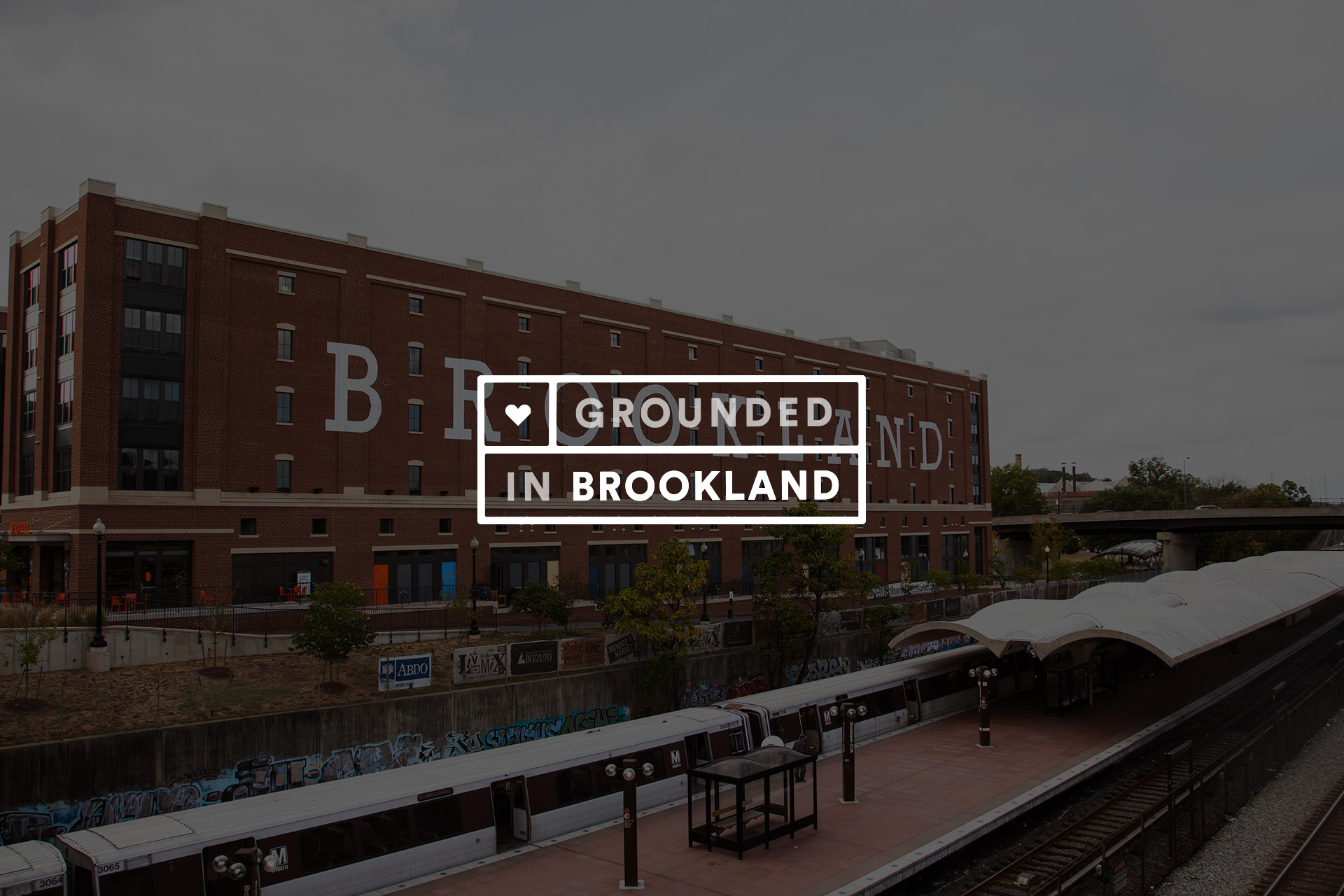
#brand-identityWhite stamp-badge mark anchored on a heart icon and a compressed-sans wordmark stacked across two lines (GROUNDED / IN BROOKLAND). Built to hold against full-bleed photography and to sit on flat collateral surfaces at the same visual weight. Coral and cinnabar accent rules carry through every pairing.
Content & Editorial
2 shown / 2 totalPrint Design
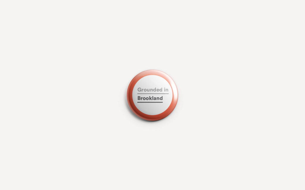
#print-designPin-board takeaway cards designed to live on a sales-office wall, on a fridge, in a buyer's mailer envelope. Same badge, same accent rules, scaled down to letter-sized portrait. Two pin variants shipped, both running the umbrella line as the headline.
Marketing & Social
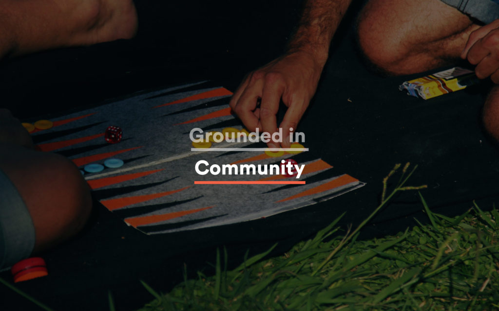
3 shown / 3 totalThree-pillar editorial campaign mechanism. One line, three substitutions: "Grounded in Community." "Grounded in Culture." "Grounded in History." Each pillar gets its own neighborhood-sourced photograph, treated with the same overlay, badge, and accent-rule system. The line was designed to be lifted into any future Brookland conversation without the rest of the visual system being present.


Environmental & IRL
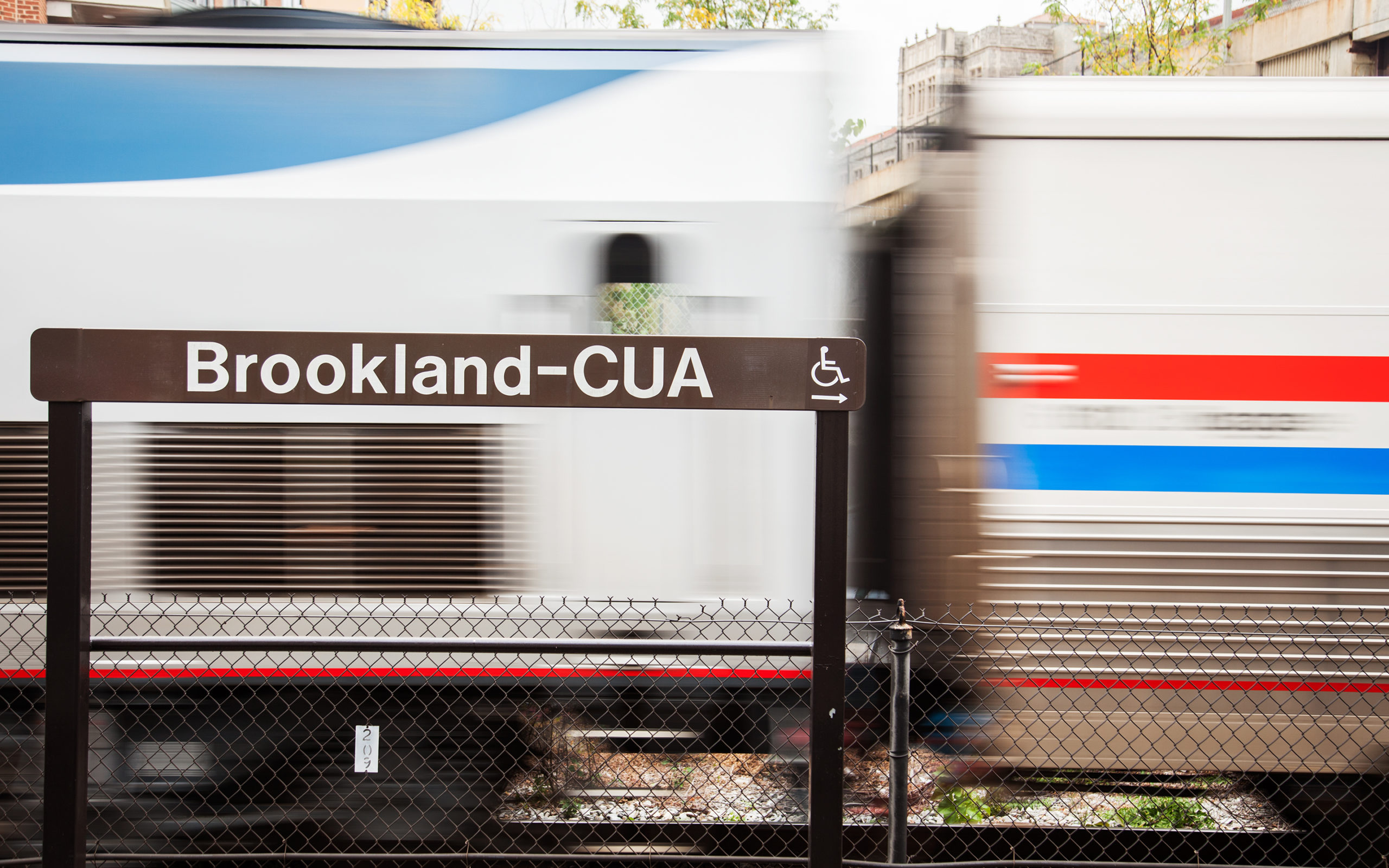
2 shown / 2 totalEnvironmental Graphics
#environmental-graphicsBuilt into the neighborhood. The campaign's sense of place came from real Brookland surfaces: a "BROOKLAND" mural on the brick building above the Metro station, the Arts Walk pedestrian way, the existing street furniture and signage system. The badge was designed to coexist with these without competing.
Becoming grounded means putting down roots.