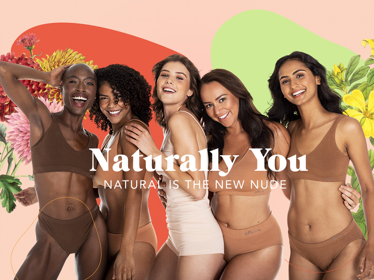
This summer, our long-time client Boody came to us to support a new product launch—based on customer feedback, they decided to expand their range of “nude” shades to accommodate more skin tones. In their words, Boody is about being ‘something for everybody,’ and they wanted us to design a campaign that supported that brand ideal.
For us, this presented some creative and strategic challenges that we enjoyed tackling. First, Boody isn’t the first company to release a wider array of nude shades. Brands have already been heeding the call to provide a more inclusive representation of what nude shades should look like. With that in mind, we knew we needed to design a campaign that could stand on its own, and not be perceived as jumping on a marketing bandwagon. Second, Boody’s hue expansion isn’t entirely all-inclusive, so it was important that this campaign be approachable, but not disingenuous, about the expansion and who it accommodates.
Ultimately, one of the core components of Boody’s brand is how (insanely) soft their product is. It’s true comfort. So we decided to tap into that concept, not only as a sensation, but as a state of mind—and the idea that comfort is an aspect of inclusion.
Our concept:
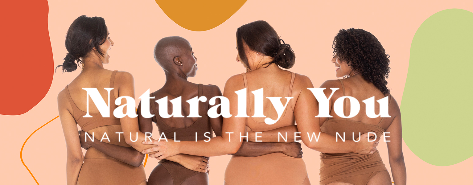
Our idea was simple: keep it simple, keep it natural. Rather than walk in the footsteps of nudes campaigns past and build a campaign with more overtly diversity-focused messaging, we made the choice to shift the focus toward how the expansion makes the customer feel. This campaign makes a concrete step to move away from the term “nude” and focus instead on the concept of “natural”—the overall sentiment of how the customer feels when they are at their most natural.
Our visual approach:
Instead of the soft earth tones and minimalist vibes we saw in other brand campaigns, we opted for a maximalist style that drew inspiration from the boldness and beauty of the natural world. Using a color palette that complemented the different new hues, we created a visual system that is playful, dynamic, and fun, while keeping the messaging approachable and down-to-earth.
The result:
We worked with the client’s existing photography to create a series of campaign assets for a landing page for their launch. We also concepted and produced a photoshoot to build on our creative concept with flatlays to be used for product pages. All of these assets were repurposed to support the campaign launch for both email and social.


