
Workhorse
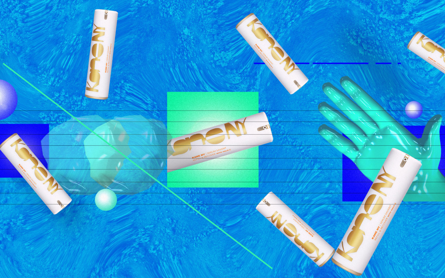
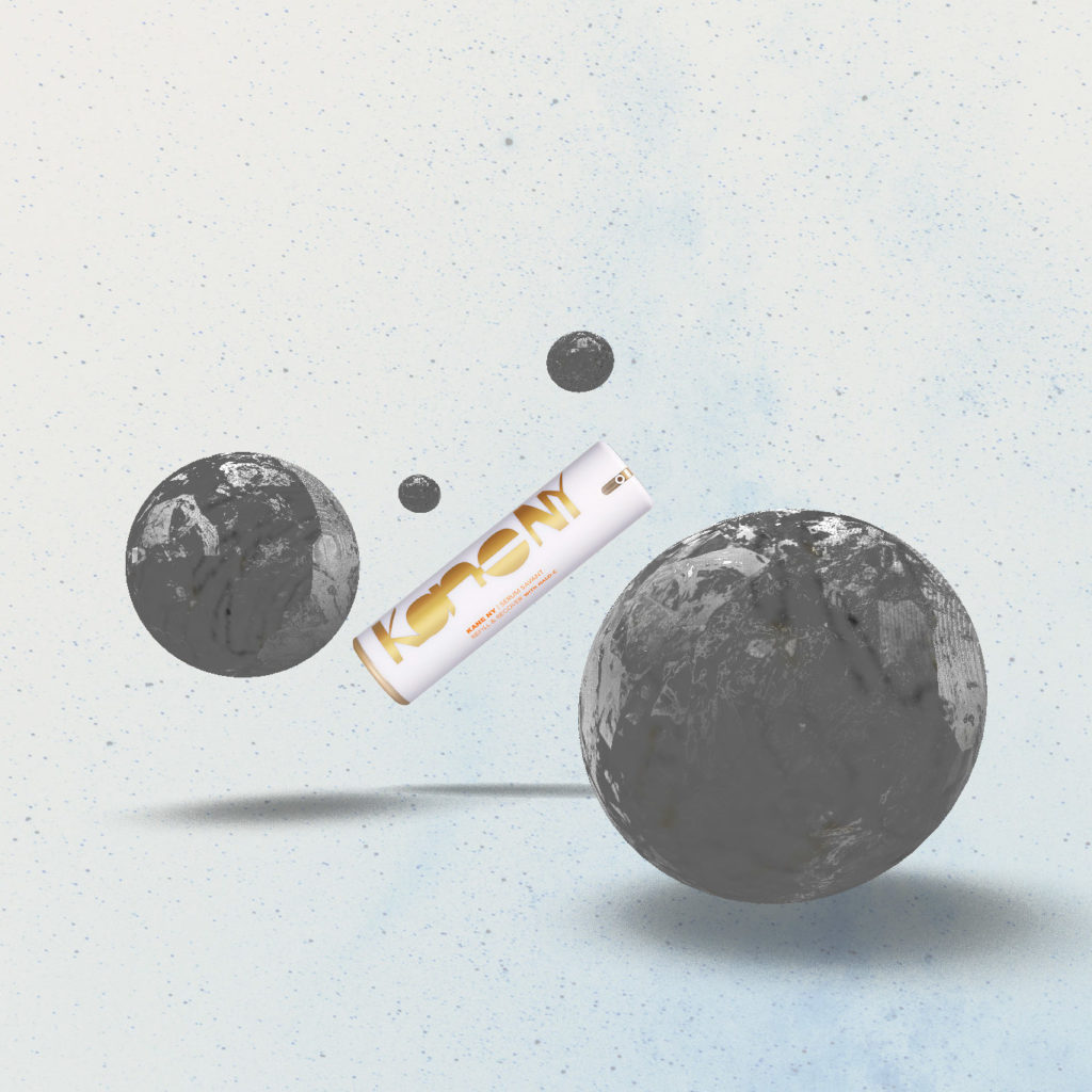
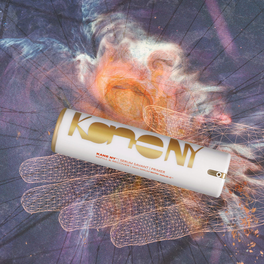
During our merger last year, we made the conscious effort to evolve away from our original Americana/Vintage branding. We’re huge fans of gradients and the ways designers play with them as a design feature. We also delved into some new tools like Adobe Dimension (previously known as Project Felix) and took some inspiration from the good people at 3D for Designers. We’ve used our blog as a bit of a personal playground where we continue to explore gradients, animation, and play around with 3D. See some highlights below:


Data Concept, Undisclosed Client
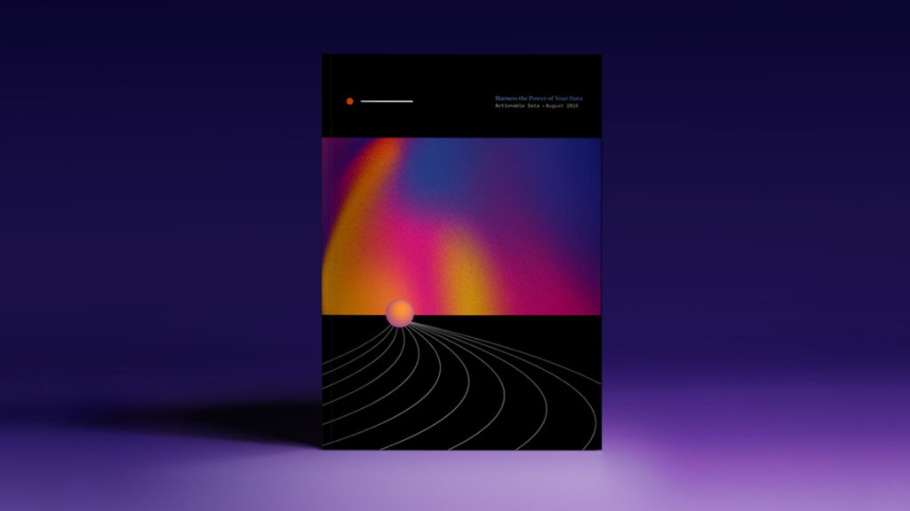
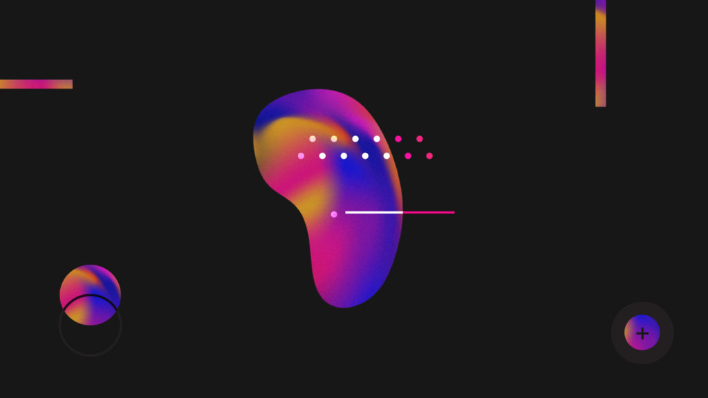
We’ve also done some initial explorations for a project involving data— here, our client was in the beginning stages of branding for a direct-to-consumer enterprise product. Ultimately, the product itself was quite innovative, and our goal was to bring that forward in a cutting-edge design, using amorphous shapes and gradients to signify data points.
Delving into this work is all in anticipation of a larger 3D project we’re super excited to unveil over the next couple weeks, surrounding a product launch for one of our clients. Be sure to follow along!


